 |
| Escape - Susan Stuart, oil on canvas |
That’s about five times as many as the 35 works by 17 artists that were in the same show at the University Art Museum in 2003 (presumably a record low). Think of it – one Regional five times the size of another. It sort of boggles the mind. Just reading a list of the whole roster is hard work, and I’ll prove it by putting that list right here:
 |
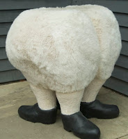
| Mr Swifty - Linda B. Horn Fake fur, foam structure, plaster shoes |
With so many people chosen, I feel compelled to offer a few words of commiseration to those who were excluded: Remember, a juried show is by definition subjective. Don’t give up! There’s always next year … . Then again, I wouldn’t be surprised if some of the included were feeling a little put out to be part of such a broad presentation. After all, how special is it really to be one of the 85 "elite" from the region this year?
 |
| Empire Views with the Green Nedra Newby, Watercolor |
The second room takes us in a completely different direction, immediately understood as being all about color. As a shameless color junkie, I have no argument with that, and found many pleasing pieces gathered there. But, in the next (and largest) room of the museum's second-floor spaces, this crispness of organization begins to break down a bit, and some questionable decisions become apparent. (The layout, by the way, was planned by Hughes.)
 |
| WC #6 - Paul Mauren Aluminum, wood, ceramic tile |
I've heard this increasingly common phenomenon called "curator as artist," and I've seen it work better in truly curated shows - but, when it comes to presenting so many unwitting individuals in a juried regional, I think the artists deserve the respect of less interpretive placement. Had the two DeMarcos simply been placed side by side with the two Burnetts, we still would have gotten the point that they are closely related, without seeing them diminished.
Meanwhile, as I trolled the show for favorites and new discoveries, I found it harder and harder to respond with any energy to the art - even the works I knew immediately to be among the best seemed to have lost their oomph to the crowding and - more to the point - to the juxtaposition with other works that, frankly, should have been edited out. Inclusiveness is a beautiful philosophy, and I think it works extremely well on a youth soccer team. But, when it comes to presenting carefully made and meticulously installed artwork, less is very often more.
If the juror had gone one more round in her process, and retained only the strongest 80 or 100 pieces, all of them would look stronger still. Instead, they are made to keep company with lesser art - not just one or two odd choices, but dozens of them - and this, again, leaves them diminished. Which is a shame, because there is a bunch of terrific art in this show.
 |
| Umatilla - Ken Ragsdale, Inkjet print |
Equally compelling were works by people new to me, including: Ken Vallario's highly polished neo-Surrealist paintings; two paper collage abstractions (and a painted one) by Bart Gulley; Terry James Conrad's intriguing small geometric constructions in paper and other materials; and two luminously dark color photographs by George Gruel.
These and many other works in the show will shine through the clutter and hold your attention as you make your way through this challenging but very worthwhile presentation. Note that admission to the Institute is free on Fridays and two-for-one on Saturdays through August. There will be Artists Gallery Talks at 6 p.m. on the next two 1st Fridays: Aug. 5, and Sept. 6.
Rating: Highly Recommended


5 comments:
Same here, the layout in some rooms was a bit of a problem to me. One of Mark McCarty's piece was on display at the 33rd Photo Regional and it makes a much stronger case with its 2 companion pieces at the AIHA, unfortunately placed vertically. Many pieces were really way way below reasonable eye level. Not going to complain too much though, my 2 photos were in the "abstract/color" space, there was good breathing room here.
thank you for making some salient points and putting my feelings into words. it's nice to know i wasn't the only one who felt that the best work was overshadowed by a sea of mediocrity.
The color & condition of the AIHA walls in several of the rooms really worked against a good deal of the work. This has traditionaly been my favorite venue for the regional but somehow I found myself distracted from the art this year. Hughes did a great diservice to much of the work by her placement & groupings. A very dissappointing show.
I just want to mention that the Upstate Artists Guild (247 Lark St.)curated an exhibition of rejected submissions from the Mohawk-Hudson Regional this year. Salon des Refuses(July 1-22)had a reception in conjuction with the AIHA MHR awards reception. In the future, I hope the Salon show gets more awareness. Thanks to the UAG, I finally got to show my works, after all these years!
Thanks for posting that information - a Salon des Refuses is a great idea. I'm sorry it has already ended - I would have liked to see the show. - db
Post a Comment