Get Visual is the grateful recipient of a grant from The Christos N. Apostle Charitable Trust

Wednesday, December 30, 2009

Best Shows of 2009

Maurice Prendergast, Grand Canal, Venice, ca. 1898–99 Williams College Museum of Art

I had promised privately not to do a year-end list - not because I don't like those lists, but because I thought I may have missed too many important shows to have a right to do it. However, I changed my mind after seeing Karen Bjornland's Top Ten in The Sunday Gazette and realizing that I had seen all 10 of the shows she named. This is not to say that I agree with her on all 10 (though I do on a couple), but I figured if she could do it, so could I.

Still, this will not be a Top Ten. Rather, I will look back over a year of reviews and pull out some moments worth remembering - and, yes, I will name several of the best art shows that I had the opportunity to see and write about.

Amazingly, it has been more than a year since Get Visual came into being, briefly at first at the Gazette, and then in its present form as you see it here in the realm of technology-aided free speech. Since the Jan. 19 Blogger launch, featuring a gloriously controversial negative review of the film Slumdog Millionaire, I have posted about 70 times and reviewed approximately that number of exhibitions (some posts carried multiple art reviews, some carried none). Phew - no wonder I feel so exhausted!

It has been a pretty cool ride. Some of the ups included hearing tons of positive feedback from people far and wide (mostly by email rather than on the blog itself); gaining a bunch of "followers" (I am only slightly embarrassed to admit I don't actually know what that signifies); hitting the 15,000-visits milestone any minute now; and even getting the occasional public comment right here on the blog itself. The downs have included missing shows I wish I could have made it to (more on that in a minute); seeing shows but still having nothing to write about them; and fending off the rare mean-spirited response.

Overall, the miracle of self-publishing while having only the most basic computer skills is an incredibly empowering and, at times, humbling process. Though I had previously written a great many art reviews for quite a few journals over nearly three decades, there's nothing like being your own boss. The bottom line is that I love being an art critic for three reasons: Artists, curators, and presenting organizations need critics; writing about art gives me the opportunity to immerse myself in that world whenever I want to; and modeling that activity gets other people to do it, too.

This last point will not be lost on you, dear reader, but I want to emphasize it. Getting other people to engage with art, in whatever way they choose to do that, is the major goal of my writing - it drives what I do on this blog more than anything else. I truly hope that something I've written here in the past year has made you go out and see a show, or talk about art, or think about it in new ways. If so, I have more than fulfilled my potential as a blogger. If not, then I guess I'll just have to keep trying.

So, on to a look back at 2009. I'm going to do categories, and the links are to my reviews as written at the time:

Best Museum Exhibition (historical art) - Forgive me for being undecided, but this is a two-way tie: Dove/O'Keeffe at the Clark Art Institute; and Prendergast in Italy at the Williams College Museum of Art. Both were superbly well organized, deeply satisfying, and just plain gorgeous. Honorable Mention goes to Rockwell Kent: This is My Own at the New York State Museum - a show I saw, loved, talked about, but apparently did not review. Go figure.

Best Museum Exhibition (contemporary art) - Badlands: New Horizons in Landscape at MASS MoCA. Nobody does it better than MASS MoCA, and this was one of the best large group shows I've seen in a long time. Honorable Mention: It isn't a museum per se, but the Albany Airport Gallery showcases all the region's museums, so I've put it in this category. The show was called Out of This World and it was that, too.

Best Museum Exhibition (theme) - Lives of The Hudson at Tang Teaching Museum. Of the many Hudson 400 shows that the past year spawned, this was the most soulful and intellectually challenging - it was also easier to like than the Tang's offerings sometimes can be.

Best Solo Show (local) - George Hofmann at Martinez Gallery. A tour de force by an ageless master who continues to be at the peak of his powers (at right is his 2008-09 painting titled Rain/Sun). Honorable Mention: David Hornung at John Davis Gallery in Hudson (image above at left).

Best Solo Show (international) - Francis Bacon: A Centenary Retrospective at the Metropolitan Museum of Art (New York City). Blockbusters of this magnitude do not come along all that often. It did not disappoint - on the contrary, I was totally blown away. Honorable Mention: Oliver Herring: Me Us Them at the Tang.

Best Solo Photography Show (local) - A three-way tie: In order of appearance, Harry Wilks at the Albany Institute of History & Art; Christopher Jordan at the Chapel + Cultural Center at Rensselaer; and Dona Ann McAdams at Opalka Gallery. All displayed clear personal vision, tight curating, and classic themes.

Best Solo Photography Show (international) - Luigi Ghirri at Aperture Gallery (New York City). A longtime idol of mine, who died shortly before I discovered his work in 1993, this Italian visionary deserves to be far better known in the U.S. - hopefully, the show and book from about one year ago helped to accomplish that.

Best Show I Missed: Which is to say, the shows I'm most sorry I missed (and those, of course, are very hard to recall). I can at least remember, and regret, these two: Uncharted at the University Art Museum (Albany); and Steps Off the Beaten Path: Photographs of Rome and Its Environs at the Clark. Technically, I could see the second of these two, as it doesn't end till Jan. 3 - but I don't think I'm going to make it. So it goes.

Last word: This has been a crisis year for the arts as a whole - when the economy falters, the arts always suffer first, most, and longest. Please keep that in mind, and try to help out artists and arts organizations in any way you can. Thank you for reading, and have an inspired 2010!

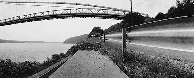
Highland, NY 1992 by Harry Wilks

Sunday, December 27, 2009

Walter Wick at The Arkell Museum

Walter Wick New Fallen Snow 1999 from Can you See What I See? Night Before Christmas

Fact: A bald eagle flew directly over my car as my wife, Karen, and I were on our way to the Arkell Museum on Saturday. Fantasy: Something the remarkably talented Walter Wick weaves throughout his stunning photographs, which are on view at the Arkell through Feb. 15.

This was my first trip to the Arkell in some time, and I was as eager to see the new museum as I was to delve into the pranks and puzzles of Wick's work. The former Canajoharie Library and Art Gallery was built in 1927 by Bartlett Arkell, founder of the Beech-Nut Packing Company, whose important art collection and boundless community spirit formed its core. It reopened as the Arkell more than a year ago after a major reconstruction project, the completion of which was delayed by devastating floods that caused extensive damage there and throughout the neighboring counties.

Situated 50 miles from Albany (for details - including hours, which will change on Jan. 2 - click here), the new facility honors Arkell's memory by deftly incorporating the original stone structure and decorative gardens into a postmodern, almost industrial design, while retaining the small-town public library that Arkell made available to his workers across the street and the rest of Canajoharie's citizenry. A viewer-friendly display recounts the family history, bridging the conceptual chasm between the wood-paneled gallery that showcases the museum's permanent collection and the slick galleries that house changing contemporary art exhibits.

The collection, which includes a big cache of Winslow Homers and several important American Impressionists, such as William Merritt Chase and George Inness, is rightly famous and always worth a visit in itself. Among my favorites here are a luminous snow scene from 1926 by Albany's own Walter Launt Palmer and a gorgeous 1889 portrait of a Victorian young lady by Thomas Dewing titled The Letter.

The genesis of the collection is wrapped up in the Arkell family's interest in commercial art, both through direct involvement in publishing and through the marketing of Beech-Nut's products (example at right is by Cushman Parker). This makes for a surprisingly smooth transition to the studio photography of Wick, who went from Connecticut to New York City to establish himself as a commercial shooter, then returned to his home state to develop the work that would make him famous.

The chances are that you have kids and are well aware of the I Spy and Can You See What I See? books that Wick has been making since the 1990s - in which case you know that this exhibition is a must-see. If, on the other hand, you are like me - childless and scarcely aware of those books - you have even more reason to check this stuff out and be enthralled by the irresistible mix of visual fact and wild imagination that fuels Wick's work.

The exhibition, titled Games, Gizmos and Toys in the Attic, was organized by the New Britain Museum of American Art and includes many enlarged photographs and a number of the models from which they were made, filling three rooms in all. Between the quantity of work shown and the mind-boggling amount of detail in many of the pictures, it could take hours to try to describe even a good fraction of it. Instead, I'll point out some highlights and encourage all children and former children to get out to "Flavor Town" and see the rest for themselves.

There are three distinct components to the exhibition: The major part of it consists of the images and models from Wick's popular children's books; then there is a nice selection of earlier work that focuses more on optical illusions and is targeted to adults; finally, a group of six scientific photographs represents another of Wick's interests (example above left is a microphotograph of a snowflake). Additionally, four black-and-white landscapes show the very beginnings of Wicks photographic work. This last group makes for an interesting "what-if," as they are pretty darn good versions of the style that Ansel Adams and Minor White spread far and wide during Wick's formative years in the early '70s.

For fans already familiar with Wick, the highlight might be a sequence of pictures from 2008's Can You See What I See? On A Scary Scary Night, which is augmented by an elaborate model of the story's sleepy, creepy village. As with the rest of the show, the prints are very large (up to 5 feet across), which allows the viewer to scrutinize them for all the elusive details that give them their raison d'etre. One could easily get so involved as to pass hours in this pursuit, something not so common in the era of minute-per-masterpiece museum visits.

Comparing photo to model is a puzzle all its own, as afforded in the Scary Night room and in examples from 2003's retro-futuristic Dream Machine and the Puss 'n Boots fable. But that's nothing close to trying to wrap your mind around some of the elaborate visual puzzles that characterize Wick's magazine work from the '80s (one example, O Frabjous Mirrors, shown below, has three levels of difficulty in its search-and-find questions). Here you can see that Wick was inspired by creators as diverse as M.C. Escher, Rube Goldberg, Irving Penn, and Lewis Carroll (himself a dedicated photographer and mathemetician in addition to being the author of Alice in Wonderland).

I found the puzzle pictures and the quietly dramatic scientific still-lifes most inspiring. Wick's almost superhuman patience in creating the set-ups (even with plenty of help) and his deep understanding and application of sophisticated visual principles combine to make images that are both extraordinary and easy to access. It's no surprise that he should be popular, but that commercial appeal also raises an obvious question: Is this art?

Going back to the Arkell's history for a moment, one notes images that were made specifically to sell stuff on a grocery shelf (the happy girl eating peanut butter, above) are now shown in this museum framed in gold leaf - and they're very nicely painted, too. So Wick, straddling that imaginary line between illustration and self-expression so deftly, is therefore the perfect fit for the Arkell. His show is enjoyable, but it also challenges us to consider the differences that may make some art "commercial" while other art is "fine."

Even if you conclude that commercial art is low, Walter Wick must be credited with making it in its very highest form. Games, Gizmos and Toys in the Attic is an impressive testament to his outstanding level of dedication to that pursuit.

Wednesday, December 23, 2009

Merry Christmas!

Window Shopping - photograph by Walter Wick, 1999, from I SPY Christmas

To my dear readers, I wish you the happiest of holidays. May you give and receive many gifts of art. And, if you're looking for something good to do, try the Walter Wick exhibition Games, Gizmos and Toys in the Attic at the Arkell Museum in Canajoharie. I will be reviewing it here in the next few days. In the meantime, be well and stay warm.

-db

Friday, December 18, 2009

Three shows in Troy (updated)

There's nothing like a walkable downtown, especially at a time when you're hungry for some good art to look at and many of the region's galleries are closed or between shows or stuffed with holiday fare. So it was with great joy a few days ago that I almost literally stumbled into three worthy exhibitions all within a stone's throw of each other in the beautifully walkable downtown of Troy.

Let's begin with the one that ends first (and very soon - Thursday, Dec. 24, to be exact). The Arts Center of the Capital Region is hosting a savvy and immersive installation titled Electrical Forest: Made in Troy by Brooklyn-based artist Noah Fischer that was created in two phases. In the first phase, which aimed to involve the whole community, Fischer set up a production line for the creation of 10,000 acetate-and-paint leaves, described by him as "a group engineering project."

Phase 2 allowed the artist to fill the Arts Center's entire large gallery with his installation, an environment all its own with various sub-environments within. There are tree elements, including some pretty big chunks of actual former trees, and electrical elements, many of which tend to spin in circles. The overall theme color is a middle blue, and there are lots of lights and shadows or projections that make for many layers of visual experience.

You can find out lots more about Electrical Forest here; it's definitely worth a visit if you can fit it in.

Next up, through Jan. 2 is an all Latino four-person show at Martinez Gallery (limited hours: Weds.-Sat, 2-5), titled Impermanence. The artists - Alexis Mendoza, Roxanna Melendez, Jaime Suarez, and Martin Rubio - are Martinez Gallery regulars with extensive international exhibition records, and are showing work that is not necessarily their freshest, but it is still a refreshing collection that energizes the gallery.

Melendez and Suarez are paired in the front room, where their extremely different styles enjoy a sort of perfect balance with each other - whereas Melendez's paintings are exuberant, colorful, full of real life, Suarez's "clay graphics" (a new medium to me that resembles encaustic) are more introspective or contemplative and purely abstract. Suarez has a narrow palette, an architectural compositional sense, and a complicated directness that will draw you in to study his surfaces from up close.

Every time I see Melendez's work, I am strongly reminded of the prints and paintings of longtime Capital Region stalwart Lori Lawrence, and the impression this time was no less strong. However, Melendez also evokes Matisse with one painting in particular that features a very lucky cat in a charmingly tilted view of a bedroom.

Mendoza, a Cuban color field painter, has several unstretched canvases of varying sizes nailed to the walls of the back gallery; their physicality in this method of presentation goes well with the natural-colored wooden sculptures of Rubio (who, like Suarez and Melendez, is Puerto Rican). While Mendoza emphasizes subtle color relationships, Rubio is all about forms in a classically Modernist way (think Arp tinged by Botero).

Finally, just extended through Jan. 26 is the excellent, eight-person Group Show, Pt. 2 at Clement Art Gallery that features Laura Glazer, Christopher Murray, Sergio Sericolo, Jeff Wigman, Dorothy Englander, Robert Gullie, Joe Putrock, and Erik Laffer (a tantalizing snippet of each is shown above, in that order). It's a lot of art packed into a little space, but that makes for a great, concentrated immersion, like eating a small cup of really tart lemon sherbet.

Of course I have my favorites among these artists, and this show provides some strong experiences of their work in interesting combination. For example, Glazer and Putrock (two photographers who frequently collaborate) have each mounted a grid of nine rather small framed photos, forcing a little face-off across a small space. Also employing the grid of nine are two small pieces by Laffer, while his larger works on view show color variations that are beginning to look more than decorative.

Englander offers some sweetly ethereal seaside landscapes (which I had the pleasure of seeing come into existence in stages, as she shares my studio), and Sericolo continues to plumb the possibilities inherent in painstaking drawing on antique anatomical plates, resulting in fascinating transformations. Most impressive to me here, though, are the concoctions of paint and paper made by Murray, who uses glorious color and clever graphic design to evoke the lushness of the natural world in summer.

All in all, a darn good walk around Troy!

Tuesday, December 15, 2009

Two exhibitions at the NYSM

Black Child, 1815–1825 Phillip Thomas Cole Tilyard (1785–1830) Oil on canvas

I was initially disappointed by the exhibition Through the Eyes of Others: African Americans and Identity in American Art at the New York State Museum in Albany - but then I was annoyed. Like a number of recent exhibitions I've seen, it has elements of being of or about art, but its overriding purpose is as a history lesson. This would be the source of my disappointment (after all, it is part of the Bank of America Great Art Series, which has brought us many fabulous shows over the years that were all about the art); the letdown was made sharper by my high expectations for anything that comes out of the Fenimore Art Museum in Cooperstown.

So what about the annoyance? Here it gets trickier. The show's agenda, as organized and labeled by Cooperstown Graduate Program Director Gretchen Sullivan Sorin, is to explore "the complicated issues surrounding race in American culture as seen in paintings and sculptures from the 19th and 20th centuries" and thereby "to start the conversation [about race] anew." While I'm all for that (and am on the public record saying so), I went away rather uncomfortable with some aspects of Sorin's approach.

On the plus side, she asks a lot of questions. But those questions are often presented as if to a child and, though the NYSM is an educational resource, even kids know when they're being pandered to. Equally, there is a heck of a lot of 21st-century spin going on here - ironic, I think, when what is being considered was 19th-century spin.

So a less than perfectly groomed young black girl, depicted in what seems to me a rather sympathetic light by the popular and skilled 19th-century painter Edward Lamson Henry, is described as rendering "African Americans as less than equal to white Americans" by virtue of their "tattered clothes, [bare feet, or ] ... thick knots of uncombed hair." (An example, titled Kept In, 1889, is shown above at right.) The fact that Henry's depiction is probably rather accurate does nothing to deter the curator's interpretation that it is now appropriate to view it as demeaning or distasteful.

Many ambiguities of this sort populate the exhibition. In the part of the show dominated by caricatures of black subjects is a mass-produced sculpture that shows a white girl teaching her black "Uncle Ned" how to read - the title of Uncle is described as emphasizing inequality. In another room, where we are meant to see a more uplifting perspective on black subjects, a portrait titled Aunt Effie is praised as giving a "dignified" presentation of its subject, with no complaint about her unequalizing handle.

Several examples of recent art by black Americans do a fine job of addressing these issues without becoming either strident or confused, including Kyra Hicks's quilt Black Barbie; a strong mixed-media piece by Whitfield Lovell; and a typically subtle and elegant work by Lorna Simpson. I also especially liked Faith Ringgold's quite large 1967 painting titled U.S. Postage Stamp Commemorating The Advent Of Black Power (which depicts a few dark faces among a sea of white ones), and was glad to see a 1964 Norman Rockwell lithograph titled The Problem We All Live With, which could have been deconstructed or even ridiculed but is presented at face value as a positive statement about the shared white and black struggle for civil rights.

To her credit, Sorin does leave plenty of room for interpretation in between her blatantly pointed comments, especially toward the end of the exhibition, where a comical face jug from 1820-1850 is accompanied by these queries: What makes a stereotype? Suppose this jug was made by an African American - is it a stereotype? Suppose it was made by a white American - is it a stereotype?

A possible answer to these questions comes up in another exhibition at the NYSM, titled This Great Nation Will Endure, which consists of a great many wonderful photographs from the unforgettable FSA (Farm Security Administration) era of 1935-1942. This traveling show was organized by the staff at the Franklin D. Roosevelt Presidential Library and Museum in Hyde Park, and it celebrates that almost ridiculously talented group of FSA photographers with 150 very good prints made from Library of Congress negatives in 2004, and extremely informative wall panels about each of the photographers included.

They range from the super-famous (Walker Evans, Dorothea Lange) to the known-if-you-know-about-that-sort-of-thing (Russell Lee, Marion Post Wolcott) to the nearly unknown (Carl Mydans, John Vachon), but each has photos worth viewing and a story worth learning. The show makes a focal point of Lange, whose iconic Migrant Mother is presented very large here - but it also provides many strong moments from such greats as Arthur Rothstein, Ben Shahn, and Gordon Parks (whose 1942 Government Charwoman is shown above at left).

Parks, the only black photographer in the bunch (who went on to direct the seminal Blaxploitation movie Shaft) is not the only one to present images of blacks in this exhibition - so it offers a nice opportunity to ask some of the same questions that Sorin poses. Is his charwoman a stereotype (notwithstanding her purposeful resemblance to the wife in Grant Wood's American Gothic)? Would she be one if the photographer had been white? What about the other photographs of blacks made by whites (some of whom were Jewish)? What about the stereotyping or exploitation of poor people of any color in museum-quality art?

Whatever your answers, this show is every bit as instructive and provocative as Through the Eyes of Others, but with a bit less academic pretension. It runs through March 14; Through the Eyes of Others will end on Jan. 6.

Thursday, December 3, 2009

Dona Ann McAdams at Opalka Gallery

Geary Street, San Francisco, 1974 gelatin silver print by Dona Ann McAdams

The final exams are over, and the grad student is back to blogging - just in time to talk about an almost absurd abundance of important photography shows going on right here in the fair city of Albany. They include Keith Carter at The College of Saint Rose's Massry Gallery through Jan. 17; a large group of Depression-era photographs at the New York State Museum through March 14; and Berenice Abbott, also at the NYSM and now extended through Jan. 3. I wrote about the Abbott show in an earlier post, and will weigh in soon on the other two.

But first up is Some Women, a solo show by Dona Ann McAdams at Sage College of Albany's Opalka Gallery through Dec. 16 (note: the show was originally scheduled to end on Dec. 11 but has been extended). A collection of 35 gelatin silver prints from 35 years of photographing (mostly) in the street, Some Women is both a personal retrospective and an homage to street photography itself; the title is a purposeful evocation of a very influential book from that genre's heyday, Women are Beautiful by Garry Winogrand, whose work McAdams' sometimes very much resembles.

McAdams' work can also look like that of Henri Cartier-Bresson, Robert Frank, William Klein, and Lee Friedlander - comparisons that I imagine have already been made many times, and that I trust will not bother her in the least, because they are both apt and instructive. At any rate, the resemblances don't diminish this work one bit: it is, honestly, just as good as that of those great earlier photographers, and - most important - has its own clear voice.

McAdams is a fun study, because her work crosses so many boundaries and mixes freely from contrasting sources. First, there is the nostalgia of her traditional, rigorous 35mm black-and-white technique, right down to the 12" x18" darkroom-made prints - in this digital world, we don't see much of that anymore, and it is still refreshingly direct and visually rich. Second, McAdams is extremely politically engaged - yet, thankfully, her work does not put you off with strident messages.

Like all the sincere (I hope) documentarians whose shoulders she happily straddles, McAdams records the world as she experiences it, which in her case means with great sensitivity, clear-eyed passion, a healthy sense of humor, and a very open mind. I expected feminism from this show, and McAdams is most definitely an unapologetic feminist - but not of the sort you worry about running into at a cocktail party; rather, she quite honestly and convincingly portrays women and girls, some of whom are involved in political acts, but most of whom are simply living their lives the best they can, and nearly always looking enchanting as they go about their business.

The range here is impressive, from innocent tots to performance artists, prostitutes to nuns. In a few cases, there is no female person visible in the shot - one shows a well-lived-in room where photo portraits are the only concrete presence of humans; another depicts a crowd of well-dressed young men on Bourbon Street in New Orleans during Mardi Gras - we follow their interested gazes upward and understand they must be watching a woman on a passing float, presumably in some flagrant display of her charms.

But the rest are quite direct - many of them are portraits, always affectionate (like the one above at right), and many are chance encounters that share the pathos of the situation before the camera (such as the image at the bottom of this post). With these, the gallery has added to the fun by creating telling juxtapositions, such as placing a somewhat chaotic Barcelona street scene in which a couple appear at first to be dancing, then to be fighting, next to an equally off-kilter shot from New York City in which women of various shapes are dressed for a Carnaval-style parade, their gazes going every which way like those of the bystanders in the Barcelona scene.

That pair is also side-by-side in the accompanying catalog, which reproduces in good black-and-white every picture in the exhibition. It's a nice little book, and a fitting throwback to the days when photographers regularly produced this sort of ephemera (I'm talking about the '70s and '80s, when printing was pretty affordable), and when McAdams did, too - a display case in the entry area of the gallery shows off six or eight of her artist book efforts from that time.

Some of the other pictures in the show are set-up circumstances, not my favorite approach in general, but here they work: a dozen barechested women lined up on a too-small roll of studio paper, each holding a sign in front of her breasts that says either "porn star" or "feminist"; a trio of women jugglers in everyday attire performing in front of a nuclear power plant; a Spanish wedding couple being pelted with a blizzard of rice.

The one photo that seems out of place in this selection is of the multimedia performer Meredith Monk onstage - though McAdams is known for her pictures of performance artists in action, this theatrically-lit shot lacks the subtle shades of the rest of the work in the show. I guess it was just too hard to resist including something from that series.

Aside from having been extended, this exhibition will have a special guided tour by McAdams at 7 p.m. on Friday, Dec. 4, and the artist will also be present for a screening of the film Guest of Cindy Sherman (in which she appears) at 7 p.m. on Wednesday, Dec. 9. These are both good opportunities to go and see a really great collection of work.

Carrer San Ramon, Barcelona, 1988 gelatin silver print by Dona Ann McAdams

Thursday, September 17, 2009

Note from the publisher

Dear Readers,

It had to come to this - my grad school (MBA) demands are such that I will likely post VERY LITTLE from now until December. My hope is to review or promote a few important shows or events during this period - but even that may be impossible under the circumstances.

Thank you for all of your wonderful support and encouragement. Please do not lose faith - I will be back!!!

db

Tuesday, September 8, 2009

Fall exhibition preview

The season is upon us and we will never, ever catch up with it. But it’s worth trying, no? Here, in chronological order based on their opening dates, are some of the exhibitions that are happening in the region this fall that are on my radar. I will try (and fail) to see all of them, but I promise to review most of them as the weeks and months roll by. Meanwhile, you may want to mark these on your calendars.

Through the Eyes of Others: African Americans and Identity in American Art, which opened today (Sept. 8) and runs through Jan. 6 at the New York State Museum, explores the complicated issues surrounding race in American culture as seen in paintings and sculptures from the 19th and 20th centuries. Many of the art works and artifacts (including Black Child, the oil on canvas by Phillip Thomas Cole Tilyard shown above) were amassed by 19th-century collector Stephen C. Clark and the Fenimore Art Museum in Cooperstown, New York. Additional selections were culled from various public and private collections, including the New York State Museum. I expect it to be one of the top shows of the year.

Also already open, but with a reception on Saturday (Sept. 12) from 5 to 8 is Alchemie, a new show by the painter Laura Colomb. Recently named “Best Emerging Regional Curator” by Metroland for her work at the Saratoga Arts Center Gallery, Colomb’s newest body of work contains large diptychs with elements of Adirondack landscape and nature (image at right). This also marks the last solo show at UpstArt, which will close after a final group show in October, and the departure of Colomb from the area.

Opening Sunday (Sept. 13) is The Play of Light, a solo show at the First Unitarian Society by Oakroom Artist Gary Shankman. A fine painter in the Impressionist style, Shankman will show new work that includes studies of toys verging on the creepy. Reception is the following Sunday (Sept. 20) from 12:30 to 3.

The University (at Albany) Art Museum kicks of its season with Uncharted, a show with thematic ties to the exploration of the Hudson River that includes the work of 10 artists. Co-curated by director Janet Riker and staff curator Corinna Schaming Ripps, it opens with a reception from 5 to 7 on Tuesday, Sept. 15, and promises to be fascinating in a Po-Mo way.

Hudson Valley Community College's Teaching Gallery will host Is It Just Me?, which surveys the last 10 years of New York artist Jennifer Dalton's sculptures and installations that were based on exhaustive “excavations” of herself and her art world surroundings. The show opens with a reception on Thursday, Sept. 17, from 4 to 6, preceded by an artist talk at 3 in the Bulmer auditorium.

Off the beaten track, but truly intriguing, will be a reception and show from 4-7 on Saturday, Sept. 26 at the newly minted Malden Bridge Community Center. Titled Levity and Not So Much, the show features four women artists who will present drawings, paintings, sculptures and installations. Some of you might already know the work of their ringleader, Monica Miller. I do, and it is always terrific - as are her parties. Don't miss it. (The map at right will help you find the site - you can click on it for a bigger, printable version.)

Back to academia, on Sept. 27 a large collection of renowned photography by Texan Keith Carter will be on view at The College of Saint Rose's Massry Gallery. It's a beautiful, new space and Carter's sensual, unassuming work is sure to be a hit with area viewers.

Looking further ahead, another solo photography show will begin on Nov. 1 at Sage College of Albany's Opalka Gallery. Dona Ann McAdams' exhibition is titled Some Women - it features selected works by this street photographer-documentarian from 1974-2009. Expect classic black-and-white treatment of avant garde subject matter.

Still further ahead, Canajoharie's Arkell Museum plans to open Walter Wicks: Games, Gizmos and Toys in the Attic on Nov.15. The traveling exhibition showcases enlarged photographs and models by the children's book illustrator famous for the I Spy and Can You See What I See? series.

Other shows of interest include gallery exhibitions in Hudson through Oct. 11 at Carrie Haddad Gallery (Great Pretenders: An Exhibit of Art Fakery - image above right), Carrie Haddad Photographs (Melinda McDaniel, Joseph Putrock and Arnold Kastenbaum), BCB Art (Arlene Becker, Cynthia Coulter and Carla Shapiro), and the always superb John Davis Gallery (Fran Shalom paintings, plus Douglas Culhane, Erin Walrath, Grace Bakst Wapner, Jeremy Hoffeld and Barry Bartlett).

Friday, September 4, 2009

1st Friday celebrates three years

It seems impossible, but there have already been three years of 1st Fridays in Albany, and tonight's is bound to be one of the best yet. If you don't already know the drill, it is an arts walk (or shuttle ride) that runs from 5 to 9 p.m. and, though centered on Lark Street, it incorporates venues out Delaware Avenue, deep into downtown, and at a couple of key spots uptown, too. You go, meet people, hang out, drink cheap wine, and - oh, yeah - look at art.

The anniversary has prompted an expanded event, far too much for me to describe here, but it includes stuff happening as early as 11 a.m. and an after-hours music series as well. The current issue of Metroland has a big pull-out section you can check, or you can go to the 1st Friday website for more details. I'll focus on a few worthy exhibitions but, beyond that, you're on your own.

1) Assiduity - call it shameless self-promotion if you want, but I'll claim it's alphabetical. Either way, my first choice is an exhibition of 19 Albany stalwarts (myself included) at Albany Center Gallery that has taken the city's one-word motto as a theme. Essentially, assiduity means perseverance, and the gallery is proclaiming that these stubborn artists have collectively served the city with their creativity for more than 400 years. Self-promoting bloggers aside, this is a stellar lineup and a very strong show.

2) Albany Institute of History & Art - always appreciated for the best fare on 1st Friday, they're offering a champagne toast at 6 - need I say more?

3) McGreevy ProLab - this downtown venue (it's on Broadway) is sort of like Mecca for regional photographers, and they're showcasing the work of one of our favorites, Mary Spinelli. Worth a shuttle ride, for sure.

4) The National Upholstering - the best ungrammatical store name I've heard, and a sweet little spot for art, cards, and tchotchkes. This month, photographer Paul Shapiro has taken over the shop, with richly toned, handmade black-and-white prints that show a bleak but lovable America. I wholeheartedly recommend it.

5) Visions Gallery - this is uptown, in the Roman Catholic Diocese of Albany's Pastoral Center on Main Avenue, and they are celebrating 20 years of exhibitions (as well as 400 years of the Hudson) with a big group show revisiting many of their past exhibitors. Like the ACG show, it's something of a who's who (Gail Nadeau gets special mention for being in both), and should be very good. I've seen a lot of shows here over the years and all have been of a high standard.

6) Judy Rosen Real Estate - another Lark Street venue, this is the 1st Friday home of a group of very young artists with great chops. Organized by the capable and professional Meghan Murphy, who also exhibits, this is exactly the kind of grass-roots show that gives me hope for the future. Go support the new kids on the block.

7) And speaking of grass roots, it all wouldn't be possible without Upstate Artists Guild, which is of course going all out for this event; they created it and are still its lead sponsor. Tonight, UAG's TAG! You're It! show celebrates graffiti artists, and the featured artist room will focus on Dwell and One Unit - they know I know they rock, and so should you.

One more thing: You may have heard about the fire a few weeks ago at 40 Broadway that destroyed a popular gallery run by Samson Contompasis and his brothers, Alex and Max. Samson's work is featured in a couple of venues this 1st Friday (4 Central and Spectrum 8 Theaters) and there will be a fundraiser for the gallery at Tess' Lark Tavern beginning tonight at 8. Check with Tess' for details, and please consider a contribution or a purchase.

Wednesday, September 2, 2009

Lina Puerta at Opalka Gallery

Lina Puerta's art brings up a lot of stuff. Her solo exhibition Natura at the Sage College of Albany's Opalka Gallery opened on Aug. 31, kick-starting the new academic exhibition season with well-crafted work that is provocative, disturbing, seductive, fun, and diverse.

Puerta is Colombian-American, and she is an unapologetic feminist - those two facts alone mean she is bound to be controversial. This show is not, however, an in-your-face political assault so much as it is a strongly nuanced personal body of work with political and social overtones, and those are, for the most part, reasonably subtle.

Fitting in with the niche she fills are the nontraditional mediums she employs - clay and fabric most significantly, but also artificial flowers, dirt, synthetic hair, and crocheted bits. Her imagery largely involves body parts (breasts, genitals, heads, hands, legs), augmented by elements from the natural world (pods, plants, trees, eggs, water), and it is all presented in neon-bright coloration.

Fountains are apparently an obsession for Puerta - this show features seven of them - and the room is filled with the sound of trickling water from the large one, set inside an inflatable kiddie pool, that acts as a centerpiece. The others are much smaller (mostly set within ceramic vessels held by vintage suitcases of varying sizes); they are quieter, and are easily among the more successful pieces in the show.

Associations with Puerta's Colombian culture are more oblique than direct here; many of the titles are in Spanish (not translated on the wall labels, but available in English, along with other details, on a stapled printout) and here and there are references to family ties (Flor de mi Abuela holds a vintage photograph) or pan-American culture (as in the installation titled Manantal de las Americas, or Spring of the Americas). Overall, though, the show presents a story both more individual and more universal than all that.

One visitor to the gallery commented to me that she thought the whole show could be analyzed from the psychological perspective, and wondered aloud whether Puerta had some sort of mental disorder, or maybe just a difficult childhood. At the very least, she said, there's a lot of therapy going on here. I'm not schooled in psychology, and I do see her point, but I've seen art far more disturbing than this by people who are not mentally ill, and, hey, who among us didn't have a difficult childhood?

Certainly, some art (maybe all of it) has a therapeutic aspect for the artist (and the audience, too), but that doesn't undermine it at all if it works as art first. While Puerta is neither the most original of artists nor the most skilled, she has a very strong personal vision that has found itself a clear avenue of expression in the mediums she employs. Most convincing is that she has been getting better and better over time - looking at the dates of the individual works on view (there are 39 altogether, dating from 2003 to 2009), I found again and again that the things I liked least were among the oldest, and the things I liked best were among the newest.

Some of those "bests" include the aforementioned suitcase fountains (one is shown at the top of this post); a rather tall fabric work titled Arbol (Tree) (shown above, right), that one sits inside of and which offers soothing comforts and psychic transportation (therapy, indeed!); and a tiny landscape on a stick (shown at the bottom of this post) that transcends its modest size to create a whole new world.

Overall I greatly enjoyed entering Puerta's personal universe of birth, sex, and death, and I ultimately found it charmingly (and a little surprisingly) hopeful. One slight problem with the show is that the gallery's spacious and bright whiteness somewhat overwhelms the work, which is mostly on a small scale - seen from across too much distance, it seems diminished. On the other hand, the work has been supremely well served by the accompanying catalog, with many excellent reproductions and useful text (but not too much of it), in both English and Spanish.

Note: Natura will be open for this week's 1st Friday festivities, but its opening reception will not be held until the following 1st Friday, on Oct. 2, from 5-9. The show runs through Oct. 23.

Friday, August 28, 2009

It’s only the river …

The Hudson River has been a wellspring of artistic inspiration for centuries, and for one very good reason: the light. Anthony Thompson paints that light, and the river, with exceeding skill and concentration, as evidenced by his semi-retrospective solo show, which runs through Sept. 8 at Martinez Gallery in Troy. Though the gallery has limited hours (see below), tonight's Troy Night Out affords a long evening's opportunity to go have a look.

Thompson has been at it for quite some time. Based in Hudson, his professional credentials stretch back to 1964, when he began a teaching career that included long stints at Parsons School of Design in New York City and as head of the fine arts department at Columbia-Greene Community College. This exhibition features 14 paintings from 1999 to 2008; the earliest, titled Hudson Light VII, lives up to its name, as it is bathed in the golden glow of a classic mixed-cloud sky that filters the setting sun over a tiny, lonely Bannerman's Castle (see image at top of post).

Thompson revisits this scene in an equally stunning 2007 painting titled Middle Island that captures a cooler palette, perhaps at dawn (see image near bottom of post). While these and other traditional images make up the bulk of the show, there is a challenging edge lurking at its periphery. Thompson is not primarily a colorist, and he works dark forms into his sometimes extremely assymetrical compositions, using silhouetting to emphasize the light as it glints from sky to water.

A strong example of this process is presented twice in the show - as a "study" (placed in quotes, because it is a fully realized painting) and larger final version of Olana Sunburst (shown at right). This is a rather disquieting image, as tempestuous as a Turner, which seems representative of the dual nature of human spirituality.

Two other pieces in the show confront duality as a more optical game, copying and flipping similar images to create a Rorschach effect. One of these cognitive experiments (in addition to an MFA from Cornell, the artist boasts an MA in cognitive psychology from the New School) incorporates two snapshot-sized color photos of a painting, then adds pooled acrylic blobs on top of them; the other is a highly detailed painting of a pond, 5 by 6½ feet. Though they are oddities among the rest of the work here, they do open a window on Thompson's processes, both visual and mental.

Martinez Gallery's hours are Thursday-Sunday, 2:00 to 4:30 p.m., and by appointment. It would be nice if they were more expansive, but the fact that this commercial gallery has survived in the Capital Region since 2001, which is something of a record, shows they are doing many things right. Go see for yourself what it's about.

And, while you're at it, check out another Hudson River show that opens tonight (Friday, Aug. 28) and runs through Sept. 23 at Clement Art Gallery, which is just a few steps from Martinez. The show, titled Down by the River, presents a large body of black-and-white photographs by John Whipple that are part of a long-term project looking at many aspects of the river and its inhabitants. I recommend it.

Tuesday, August 25, 2009

Out of This World at Albany Airport Gallery


With a name like Out of This World: Transcending the Terrestrial in Contemporary Art, the current show at the Albany International Airport Gallery would seem to be about taking people to new places without even getting them onto an airplane, and in that it succeeds handily.


Featuring seven artists, about half of whom have Airport Gallery history, the show is such a riot of color that one could easily overlook its organizing theme of transformation. Starting with the neon yellow that covers the gallery walls, this is an almost psychedelic experience, optically stimulating and very entertaining – ideal to perk up the weary traveler or distract those waiting to pick up same – but not to be taken all that seriously.

Devorah Sperber, for example, offers three pieces that depict Leonard Nimoy as Star Trek’s Mr. Spock, one made with 1,102 cleverly aligned spools of thread, the other two with chenille stems (for the uninitiated, those are pipe cleaners) that have been placed with digital accuracy to build an image out of color-coordinated dots.

Also working with blobs and dots, but more abstractly, is Betsy Brandt, whose agglomerations of artificial flower parts, hot glue, plastic beads, and other craft store paraphernalia tickle the imagination as they conjure microscopic or undersea worlds and the creatures that inhabit them (a detail of one, titled Akin, is shown at right). Her sister, Susie Brandt, works in fabric. Visitors to the exhibition who take the stairs are welcomed by a Susie Brandt installation that evokes geology with folded and stacked strips of colorful fabric that cling to a narrow ledge and work their way up the wall all the way to the ceiling, like a sedimentary intrusion.

Susie Brandt’s other works in the show consist of fanciful (and, again, brightly hued) hooked rugs that are based on tracings of round city water drains and amoeba-like tree trunks – the latter are displayed on a rectangle of Astroturf, which makes a nice, bright green contrast but is a bit campy. Speaking of green, it’s the dominant color of one of Chris Harvey’s marvelous stacks of objects, this one featuring the heads of many plastic toys (including Shrek, of course), and amusingly titled Totem for the New Green Inititiative.

Harvey made quite a splash last year with a large installation at the Arts Center of the Capital Region in Troy titled The Mandala of Perfect Happiness. A video on view here presents the creation of that piece, very speeded up, with Harvey clowning throughout. His other new works in this show include a row of columns (shown at the bottom of this post) in the rainbow colors of our plastic Wal-Mart culture. Its title, Seven Pillars of Commerce and Pleasure, pretty much sums up the piece’s intentions and results – viewing it is indeed very pleasurable.

The show’s painter is David Miller, recently retired from Skidmore College and, amazingly, showing here for the first time. Two very large pieces of his from 2007 are included: one a highly textural and aptly titled Symphony in Yellow, the other smoother, darker, and more evocative of the show’s theme with its inky black depths and floating figures (it is titled Midnight in the Garden of the Sea and is shown at the top of this post). These are strong paintings, but I was more moved by Miller’s series of seven much smaller panels made this year that have delicate markings and luscious color variations, and resemble views of Earth from a satellite.

Also included in the show are three ravishing sculptures by Ginger Ertz (plus one, a chandelier, that has been hanging above the stairwell for a year or more), all made from those suddenly ubiquitous chenille stems. Ertz emphasizes sculptural form and texture, rather than color, in these sexy and humorous pieces, such as one titled Docking that may depict two odd creatures about to mate, and another titled Odalisque. Ertz, of Schenectady, just received a coveted NYFA fellowship for this work, and it’s easy to see why.

Finally, the show includes another sculptor who uses familiar material in an innovative way – and, unless you live under a rock, you’ve probably seen Jennifer Maestre’s amazing pencil-stub critters on the Internet. Here’s your chance to see them in 3-D and marvel at the technical and formal achievement they represent.

Overall, this is the sort of show we’ve grown accustomed to seeing at the Airport Gallery – hip, innovative, high-quality, and entertaining. It is also refreshing to see so much sculpture in a curated exhibition, which is no doubt due to the fact that Gallery Director Sharon Bates is herself a sculptor – but it is no less appreciated for that. The show runs through Nov. 29, and the gallery’s hours are an unbeatable 7 a.m. to 11 p.m. daily. Whether you’re flying or not, it’s well worth the trip.

Friday, August 21, 2009

Studio visit: Sam Altekruse

View of about half of Sam Altekruse’s studio. The paintings on the wall are finished; the ones on the floor are still in progress. He also uses a table to work on much smaller pieces.

In a very raw space high above the gritty downtown of a Capital Region city, Sam Altekruse paints. The 43-year-old left-hander has lived all over the United States – New Orleans, Los Angeles, New York, South Carolina – and has traveled extensively abroad, including long visits to Mexico, Berlin, and Pakistan. In all these places, he has painted.

Altekruse recently gave me a guided tour of this history in his sprawling, 3,200-square-foot workspace. The visit lasted about two hours and included viewings of a great many paintings and drawings that range in size from a few inches across to about 10 feet square. They are made in oils, watercolor, gouache, pen and ink, acrylics, and house paint. Very few of the works have ever been shown.

There was a time when Altekruse had a gallery, in Atlanta, that sold a steady stream of his works on paper, but they were pleasant landscapes and that was a long time ago. Now, he paints mostly abstractly, channeling the intense energy and imagery of Pablo Picasso filtered through Jackson Pollock and then flavored with Altekruse’s own personal style.

Not that he wants you to think of it that way. Altekruse resists the comparison to the two artists his work mosts resembles, both because he is not trying to imitate them and because he has the natural pride of a serious painter who needs to be recognized for who he is. As he puts it, “Pollocasso … is the cage everyone wants to break,” an interesting perspective on the art that dominated the 20th century so thoroughly that whatever came after it has been affected by it.

So, what does Altekruse do? In addition to having the skill (and formal art-school training) to accurately sketch whatever he comes across, or to expressively riff on that, whether it is figurative, architectural or landscape, he can also create fictions or dramas (as the past and present German Expressionists did and do); and, most important, he can boil all of that down to essential marks and forms that become a unique language, often on a rather large scale.

This last approach is the work that I think most distinguishes Altekruse, as it is bold, muscular, almost primal – but it is also this work that gets him into the “two Ps” quandary. Not that I would mind if I were him. Picasso famously described himself and all artists as thieves, and Pollock quite clearly followed Picasso early in his career – so, all we’re saying when we compare Altekruse to them is that he is working within a tradition. And part of that tradition is to both steal like crazy and to believe fiercely in yourself as an original.

Altekruse upholds the legacy of these and other great painters by working feverishly (fueled by cup after cup of hot tea); relentlessly reworking and rethinking what he has done (many of his paintings have been built up over years or even decades); and keeping fresh with direct observation and a lot of drawing.

Among the best things he showed me were an almost endless stack of works on paper, about 2 by 3 feet (small for him), that meld the almost calligraphic gestures of some of his brushwork with the heavy layering of the larger works on canvas; equally, they incorporate a range of quasi-abstract imagery and recognizable symbols that seem to be the key to where he’s going as a painter. Where his large paintings get really impressive is when these studies inform them – though I hesitate to call them studies, as they can be quite finished, too.

Another exciting part of the process, both with the larger works on canvas and the smaller paper pieces, involves combining compositions together. This can happen in an almost automatic way or more by design. Regardless, the results for me were strongly intriguing and, I think, for Altekruse quite gratifying.

All this work is not without a goal – Altekruse says he would like to be showing in New York City, where he knows people and where some of his old art school buddies have found success. It’s never been easy to pull that off, and now is not the most propitious time for such efforts, as the New York art scene is suffering harsh economic realities and the market is in a severe downward spiral.

But that may make for opportunity where before there was none. I wish him well in making this dream come true, and I honestly believe he both deserves it and has what it takes to get there.

Altekruse ponders the final composition of one of his paintings.

Wednesday, August 19, 2009

Two (or three) Hudson River shows at AIHA

While the Albany Institute of History & Art hosts its landmark exhibition Hudson River Panorama: 400 Years of History, Art, and Culture, which is slated to run through Jan. 3 (and rumored to be extended into June), there are two shorter-term sidebar exhibitions that add further inducement to visit the museum now.

Hudson River Panorama itself is a sweeping collection that, if it were just an art show, would be a large and impressive one - but it is still more of a history show overall, and therefore not something for me to review here. However, Different at Every Turn: Contemporary Painters of the Hudson River, a travelling exhibition of one work each by 17 painters, and the solo exhibition Life Along the Hudson: Photographs by Joseph Squillante are another story.

Different at Every Turn, which opened in June and has just been extended a week through Aug. 30, is the first exhibition to be installed in the Institute's Rice House, and it affords a nice opportunity to get in and nose around those rooms when they aren't filled with folks at a reception. I was amused to find that simply reaching the exhibition space required enough twists and turns to get anyone in the right frame of mind for a show of this title.

The show originated at Kingsborough Community College of the City University of New York, and will travel next to SUNY Potsdam and then to the U.S. Military Academy at West Point. It was organized by Virginia Creighton, who commits a curatorial faux pas by including herself in the group of 17, but there's nothing much wrong with her choices overall, which display a great range of painting styles and approaches.

Variety is the show's key benefit, in that it gives visitors an overview of the many possibilities that artists face, and allows us to enjoy the diversity of these 17 solutions. Among the highlights are a small work by Peter McCaffrey that captures Bannerman's Castle through the mist; a sober aerial view of Manhattan at dawn by the show's best-known painter, Yvonne Jacquette; a fetching Catskills panorama titled All Creation, by the AIHA's own Tom Nelson(shown at top of this post); Diane Kurz's lushly colorful The Hudson River from the Bear Mountain Bridge; and a dizzying watercolor by Bill Murphy (shown above at right).

Photographer Joseph Squillante's show fills two rooms on the museum's third floor, which emphasizes its split personality. The first, smaller room holds a group of portraits, including fishermen, a farmer, and Pete Seeger (the one at left is titled Wildlife biologist Craig Thompson with immature bald eagle). These pictures could be described as journalistic - clearly, Squillante sees himself as a storyteller.

But the second room lays out a far more aesthetic scheme, in which the Hudson as landscape is explored from the lower tip of Manhattan to the top of Mount Marcy. This, for me, was the more successful part of the exhibition, not that Squillante is a better artist than journalist (he's darn good at both), but that the story told by the landscapes is both more coherent and more compelling in its simplicity.

Also, unlike the portraits, which are strongly and necessarily rooted in who they depict, some of the landscapes transcend their subject matter to take us to a new place (the example shown below is titled Peekskill Bay). It is the Hudson River, yes, but it is also anywhere in the world, as well as somewhere in the mind or spirit. This is where I prefer art to take me. You can go see where it takes you, through Oct. 4.

Monday, August 17, 2009

Francis Bacon at the Metropolitan Museum of Art

I was fortunate to catch Francis Bacon: A Centenary Retrospective on its last day at the Metropolitan Museum of Art in New York; and, though I'm sorry to be reporting on the show after it's over, the experience merits comment.

Bacon was without doubt one of the seminal artists of the 20th century. His grotesque figuration went against the Abstract Expressionism that dominated his era, but it triumphed eventually, having presaged the dominant art of the last two decades of that century.

This show made abundantly clear why Bacon matters, with room after room of major works presented decade by decade; it also featured crisp wall texts and a display of artifacts from Bacon's studio, both of which delineated a tormented life of tremendous artistic effort.

Bacon, a homosexual Englishman from a wealthy family who grew up in Ireland, boiled all of life down to three things: Birth, copulation, and death. Lacking formal training in art, he nevertheless established early in his career a highly refined individual style, and he deviated from it very little over many decades of painting. Whether presented singly or in triptychs, the bulk of his paintings as seen in this show were vertical and of the same size (1½ by 2 meters, or about 5 by 6½ feet). The example shown above is the right third of a triptych made at the height of his career, and is as good as any in representing the elements of Bacon's painted imagery.

It won't surprise you to read that a lot of people saw this exhibition on its last day, and very few of them were smiling. It is relentlessly grim stuff - and definitely not for children, though I saw some there - but it is, in its way, absolutely full of life.

I found the early years to be pretty tough going, but was rather delighted by the middle years, where Bacon fused influences of Matisse and Picasso into the best work he'd ever made - colorful, masterfully composed, complex. Even with the same horrific biomorphism that characterizes almost everything he painted, the lyrical spaces and vibrant colors of these middle paintings are unequivocally, lushly beautiful.

Was Bacon trying to use beauty to seduce the viewer into confronting brutal realities? Or was he reveling in beauty for its own sake, even as he reveled in grotesquerie and horror?

The later works retain some of that smooth prettiness but bring back the rougher, spare aspects of the earlier Bacon, possibly because his love life was making a similar reprise. He also turned to portraiture in this period, creating the one sustained deviation from the large format paintings in the form of many 12-by-14-inch pieces, some of which are also presented in triptychs.

Altogether it is quite impressive. Though I exited the gallery with some sense of relief, there was an equal sense of wonder at the stupendous body of work Bacon had produced, and the amazing career he crafted out of it.

Saturday, August 15, 2009

Prendergast in Italy (and more) at WCMA

Maurice Prendergast, Grand Canal, Venice, ca. 1898–99 watercolor and pencil on paper 10 x 13 7/8 inches
Williams College Museum of Art, Gift of Mrs. Charles Prendergast

With all the attention being paid to the Dove/O’Keeffe show at the Clark Art Institute, it could be easy to overlook Williamstown’s other world-class museum, the Williams College Museum of Art. But that would be a grave mistake, especially now, as the WCMA is hosting four exhibitions that are all worth some serious viewing time.

First up is the gorgeous Prendergast in Italy, created in partnership with the Terra Foundation of American Art in Chicago, which draws on the vast Prendergast collection of the WCMA, along with the Terra’s major holdings and several private collections. After it completes its run here on Sept. 20, the show will travel to the Peggy Guggenheim Collection in Venice, Italy, and then in 2010 to the Museum of Fine Arts, Houston.

Prendergast in Italy presents the work of an artist at the top of his game at two distinct points in his career, during travels in Italy in 1898-9 and 1911-12. A consummate craftsman, Maurice Prendergast began as a commercial artist, but then crossed over into fine art after studying in Paris in the 1890s. With his first sojourn to Italy, focusing on Venice as his subject, his success was launched. Always attuned to the development of Modern art, over the next decade Prendergast changed styles; the work of his second sojourn is so different from the first that it is almost like viewing two artists, though the dominant medium throughout is watercolor (to compare, see the images at the top and bottom of this post).

Not to worry: Both are extraordinarily good. The early Prendergast takes an illustrative style and applies it to vividly perceived scenes of Victorian life along the canals. The images are virtually bursting with color, light, and atmosphere (the one reproduced at right is titled Fiesta–Venice–S. Pietro in Volta). Both accurate and expressive, even more than 100 years later they communicate the artist's exuberance at being alive in a place full of stimulation and possibility.

The later work, in keeping with the principles of Modern art, is slightly cooler and more intellectual, even as it is also more primitive. If this seems self-contradictory, consider that Prendergast's main inspiration in adopting the new style came from Paul Cézanne and Henri Matisse. These paintings delight the eye, but don't take you into the action so much as they place you near enough to observe it as a collection of shapes, lines, and tones.

If I could criticize the show, it is that it is perhaps too comprehensive. The two large galleries simply overflow with Prendergast's abundant output. If one is not a fan, it could become tiresome – but for lovers of this artist and period, it is a carnival of marvelous proportions.
Maurice Prendergast, Rialto, Venice, ca. 1911–12 watercolor and pencil on paper
Williams College Museum of Art, Gift of Mrs. Charles Prendergast

Also getting the star treatment at the WCMA is another almost absurdly talented and productive artist, the photographer (and painter) Edward Steichen. Filling a very large gallery almost salon-style is In High Fashion, the Condé Nast Years, 1923-1937. It simply astonishes and overwhelms with the sheer number of masterful portraits of the stars of the day and the groundbreaking fashion pictures that today we take for granted but, when Steichen did them, were a revelation. Again, fans will love it, but others may grow bored. This show ends on Sept. 13.

In a second, smaller gallery, another Steichen show focuses on his personal work. Titled Episodes from a Life in Photography, it features 90 pictures that range from early abstractions (the example above of avocados was made in 1920) to an extended series of landscapes made at Walden Pond, and also includes some commercial images, such as the jazzy 1926 Design for Stehli Silks shown above at right. this show will remain on view through Nov. 8.

Finally, another show of photographs features the work of a Williams alumnus named Ralph Lieberman. While Steichen is a pretty tough act to follow, Lieberman's architecturally inspired black-and-white work holds up very well. Many of the images are classical renderings of their subject matter (such as the one shown here, from San Gimignano in Italy) while others display a more analytical and expressive mind at work. He does Williams proud.

Thursday, August 13, 2009

Christopher Jordan at Chapel + Cultural Center


An extraordinary show of photographs by Christopher Jordan is currently on view at RPI's Chapel + Cultural Center, which is slightly off the beaten track but actually very easy to find and, being a Catholic church as well as a beautiful gallery, it's open pretty much all the time.

Jordan, who came to the area about five years ago to teach at Sage College of Albany, has already moved on to his next teaching job in Tuscaloosa, Ala.; fortunately for us, the show will remain through Sept. 28. Titled Ablation Points, the collection of about 20 pieces in both color and black and white has integrated Jordan's love of landscape photography with his knack for digital tinkering, resulting in an innovative and transformative body of work that confounds our preconceptions about both (you can click here to see examples on his website).

How's that? First, he freezes up a bunch of ice in his home freezer and sets up a studio arrangement that includes a rubber-lined tray of water, cottony cloud fuzz, rocks, lights, and whatever else he may need to concoct an illusory Icelandic fjordscape (and, yes, he has actually been to Iceland). Then he shoots large-format black-and-white negatives with a view camera to capture these fictions in very great detail. Some of the images in the show are beautifully crafted straight silver prints from those negs (example at right), and they are quite lovely near-abstractions; but the rest are something significantly different.

Jordan got his master's degree in photography at RIT, a program known for its adherence to extreme technical excellence - hence the view camera and all that. But he has added the digital arena to his set of skills, and it is in these Ablation pictures that the old and new technologies come together to create something excitingly new.

After shooting a variety of setups, Jordan scans the negatives into a very high definition digital environment and transforms them, mainly by adding color. The amazingly realistic and expressive effects he achieves, without resorting to cheap tricks, is what makes this work so impressive.

Even when the elements of Jordan's images are reduced to a few shapes and gestures, the way they capture atmosphere is uncanny. In this, he rivals his rightful predecessors, the Hudson River School painters. They, too, were using beauty to convey messages that are essentially spiritual and environmental.

Jordan describes these works as "an extended metaphor for climate change," and you do feel the sadness that pervades their sense of awe. The word "ablation," which is a synonym for erosion or vaporization (you can trust me, I looked it up) makes his message clear. While it's doubtful that pictures can help much to protect the future of the glaciers, I feel strongly that Jordan has produced something of lasting value by making them.