Get Visual is the grateful recipient of a grant from The Christos N. Apostle Charitable Trust

Friday, July 29, 2011

Reflections on a Museum at WCMA

Edward Hopper - Morning in a City 1944
I've been saying for years that the Williams College Museum of Art, a personal favorite of mine, gets wrongly overlooked because it is next door to the much larger Clark Art Institute and the even bigger MASS MoCA is just a few miles down the road. Now, this imbalance may be even more extreme - that is, the WCMA, after a recent whole-museum re-installation of the collection, is even more deserving of the attention its neighbors easily gain.

Unknown artist, Gabon 20th century
Mbulu-Ngulu (reliquary figure)
To call Reflections on a Museum a revelation is understatement, because it is by design and intention both revealing and enlightening. Augmented by 50 choice pieces on loan through a collection-sharing initiative from the Yale University Art Gallery, this sweeping and thoughtful series of eight exhibitions allows the viewer to get inside the art-making and collecting processes with gentle help from the WCMA's able curatorial staff (and others), but without intrusive label copy or - worst of all - facile explanations.

Rather, the method is to present a remarkably wide range of objects in challenging (but not needlessly provocative) juxtapositions, and then to offer questions about the objects, their context, their provenance, and their ultimate placement in these two prominent university collections. The result is a virtual tour of human civilization, guided but open-ended, which features curious side trips that focus on how we experience objects and art. The natural questions that we would ask on such a trip are posted for us, and some potential answers are, too, but it never feels that we are being pandered or preached to.

Unknown artist (Roman)
 late 3rd century
Sarcophagus fragment of Hercules,
Triumph of Dionysos
A detailed analysis of this ambitious and impressive undertaking would be exhausting either to write or read, so instead I will just try to point out some of the highlights and, as the curators did, leave you to seek your own experience and draw your own conclusions.

Then again, a friend who accompanied me on this visit, and who is a lifelong art lover now past 70 years old, proclaimed about halfway through our tour that Reflections on a Museum is probably the best museum exhibition he has ever seen. So there's a ringing endorsement if I ever heard one.

Two years in the making, the exhibitions began opening in staggered fashion in April and will remain on view through next June. The scale of the project, and the museum's free admission policy, will surely encourage multiple visits, as will The Gallery of Crossed Destinies, where 25 objects are being installed differently by four different guest curators in sequence through 2011; and the Room for Reflection, where a single work of art is showcased each month (through December).

Robert Wilson
Bridge Chair
with Shadow 
1999
The current iteration of Crossed Destinies presents its intriguing cross-section of objects as interpreted by Jenny Gersten, the new artistic director of the Williamstown Theater Festival. Titled Expressions, this installation of ancient through modern items is arranged in a way that suggests theatrical dialogue and embellished with quotes from plays. The piece on view in the Room for Reflection was a dazzling glass and ceramic mosaic by Maurice Prendergast titled Fiesta Grand Canal Venice - I say "was" because I'm assuming there will be something new there as of Aug. 1.

The museum's first-floor galleries introduce the concept of the exhibitions with a show titled The Object of Art. Here, essential questions are posed: How does art start? What is it? What is it doing here? and so on. The two galleries contain a great variety of objects, from the plainly utilitarian to the utterly conceptual, and we are encouraged to consider them in relation to each other and in relation to our own thoughts, freely formed or inculcated, about what their object may be.

In one fine pairing, a work of art that is a door (by Jim Dine) sits next to a door that is a work of art (anonymously carved granary door from 19th- or 20th-century Mali). The wall text reads "Q. When is a door not a door? A. When it's a work of art." The beauty of this presentation is that it leaves it up to the viewer to consider how this Q&A may apply to the particular doors on the wall, and to recognize that intention and context both determine the meaning of an object and are mutable. Not incongruously, a complex collector's item that consists of a miniature museum-in-a-box of Marcel Duchamp reproductions sits nearby.

Wybrand Simonsz de Geest the elder
Portrait of a Man 1630
The next room is dominated by four portraits - a pair of paintings depicting a prosperous 17th-century Dutch couple, and a pair of glossy photographs depicting an estranged, poor, 21st-century South African couple. All four portraits are effective and revealing on their own but, facing off, they raise many important issues, not least of which is the fact that the Dutch were colonizing South Africa in the 17th century, and the legacy of that exploitation remains there today. Meanwhile, these four faces also remain as bookends to that history.

Zwelethu Mthethwa - Untitled 2006
The subsequent upstairs galleries begin with a large exhibition titled The Medium and the Message, where the same sort of extreme range is attenuated but still reiterated in books, prints, photographs, paintings, sculptures and more, all of which form part of an ongoing dialogue about material and process. Here, a painting by Joseph Marioni was part of the focus for a gallery talk by outgoing Deputy Director and Chief Curator John Stromberg on the color red that also brought us to paintings by Chester Harding and Grant Wood in the next gallery, and by Philip Guston in the one beyond that.

Stromberg, working his last day at the WCMA before departing for Mount Holyoke, made a compelling case for his favorite color, and for its use in the works cited. He also makes, in a short and humbly placed "Curator's Voice" text panel in a gallery dedicated to Cosmopolitan Modernism, a compelling case for the entire Reflections on a Museum exhibition and the spirit behind it. He writes, "I feel that objects have a kind of 'bill of rights': They deserve to be cared for, displayed to best advantage, and interpreted in ever-changing combinations that keep them alive conceptually."

Reflections on a Museum lives up to that credo.

Additional sections of the installation are: Don't Fence U.S. In: Crossing Boundaries in American Art; Art Re: Art; A Collection of Histories; and an Artist's Project by artist-in-residence Jesse Aron Green.

Rating: Must See


Grant Wood - Death on Ridge Road 1935
Note: Special thanks go out to Lee at The Daily Grind in Albany for Internet access, without which this review could not have been posted.

Thursday, July 21, 2011

75th Mohawk-Hudson Regional at AIHA

Escape - Susan Stuart, oil on canvas
The 75th Annual Exhibition by Artists of the Mohawk-Hudson Region, commonly called the Regional, is at the Albany Institute of History & Art this year, and it is huge. Selected by prominent painter Holly Hughes, who considered 1,020 submissions by 235 artists (a record for the Institute, though still far fewer than the nearly 1,500 works submitted by 340 artists to the Hyde Collection last year), the final cut includes 160 pieces by 85 artists.

That’s about five times as many as the 35 works by 17 artists that were in the same show at the University Art Museum in 2003 (presumably a record low). Think of it – one Regional five times the size of another. It sort of boggles the mind. Just reading a list of the whole roster is hard work, and I’ll prove it by putting that list right here:

Mr Swifty - Linda B. Horn
Fake fur, foam structure, plaster shoes
Samuray Akarvardar, Jim Allen, Fern T. Apfel, Jaimee Atkinson, Sebastian Barre, Tina Baxter, Meredith Best, Pennie Brantley, Allen Bryan, James Burnett, Paul Chapman, Yaminay Nasir Chaudhri, William Coeur de Ville, Terry James Conrad, Peter Crabtree, Katie DeGroot, Chris DeMarco, Ginger Ertz, Ray Felix, Abraham Ferraro, Jessica Fitzgibbon, Richard Garrison, Charles Geiger, Barry Gerson, Gail Giles, George Gruel, Bart Gulley, Stephen Bron Gurtowski, Michael J. Gwozdz, John Hampshire, Patrick Harbron, Theresa Hayes, Sarah Haze, Andrea Hersh, Susan Hoffer, Stephen Honicki, Linda B. Horn, Renee Iacone, Mary Kathryn Jablonski, William Jaeger, Paul John, Richard Kathmann, Pooh Kaye, Scott Keidong, Sandie Keyser, Amanda Klish, John Knecht, Ivan Koota, Phyllis Kulmatiski, Gary Larsen, Naomi Lewis, Harold Lohner, Iain Machell, Mona Mark, Paul Mauren, Gwenn Mayers, Mark McCarty, Bryan McGrath, Michael McKay, Jenny McShan, Renata Memole, Michael Mooney, Robert Morgan, Art Murphy, Nedra Newby, Philip J. Palmieri, Liz Parsons, James Paulsen, Kenneth Ragsdale, Marc Rosenthal, John Ruff, Mark Schmidt, Deborah Schneider, Lynn Schwarzer, Jon Segan, Mary-Alice Smith, Charles Steckler, Susan Stuart, Barbara Todd, Ken Vallario, Nancy Van Deren, David G. Waite, Nicholas Warner, Edye Weissler, and Wendy Ide Williams.

With so many people chosen, I feel compelled to offer a few words of commiseration to those who were excluded: Remember, a juried show is by definition subjective. Don’t give up! There’s always next year … . Then again, I wouldn’t be surprised if some of the included were feeling a little put out to be part of such a broad presentation. After all, how special is it really to be one of the 85 "elite" from the region this year?

Empire Views with the Green
Nedra Newby, Watercolor
As it turns out, not so very special at all. The show is, indeed, too damn big. Beginning in the first small room that typically introduces AIHA exhibitions, it gets off to a very promising start with a large, vertical, black-and-white video projection of a doubled rushing waterfall that greets the visitor as if to say "this Regional is bold, get ready for a wild ride." Other works in that room, from traditional oil painting to Sharpie on whiteboard, express weather in many forms, setting an intriguing tone for the show to come - it will have themes in whole rooms or parts of them, an almost necessary strategy for presenting so much diverse work, and a wise one - though it fails to deliver on the promise.

The second room takes us in a completely different direction, immediately understood as being all about color. As a shameless color junkie, I have no argument with that, and found many pleasing pieces gathered there. But, in the next (and largest) room of the museum's second-floor spaces, this crispness of organization begins to break down a bit, and some questionable decisions become apparent. (The layout, by the way, was planned by Hughes.)

WC #6 - Paul Mauren
Aluminum, wood, ceramic tile
What at first seems to be charming quirkiness of placement - a very subtle and small box assemblage by Jon Segan is placed well above eye level; three large color photographs by Mark McCarty are forced into a tall totem - turns into extreme imposition in the form of seven works by five artists being jammed into an awkward and tight group on the gallery's end wall. This type of problem recurs in the next large room, where two color photographs by Chris DeMarco are interspersed with two watercolors by James Burnett, a distracting way to show them.

I've heard this increasingly common phenomenon called "curator as artist," and I've seen it work better in truly curated shows - but, when it comes to presenting so many unwitting individuals in a juried regional, I think the artists deserve the respect of less interpretive placement. Had the two DeMarcos simply been placed side by side with the two Burnetts, we still would have gotten the point that they are closely related, without seeing them diminished.

Meanwhile, as I trolled the show for favorites and new discoveries, I found it harder and harder to respond with any energy to the art - even the works I knew immediately to be among the best seemed to have lost their oomph to the crowding and - more to the point - to the juxtaposition with other works that, frankly, should have been edited out. Inclusiveness is a beautiful philosophy, and I think it works extremely well on a youth soccer team. But, when it comes to presenting carefully made and meticulously installed artwork, less is very often more.

If the juror had gone one more round in her process, and retained only the strongest 80 or 100 pieces, all of them would look stronger still. Instead, they are made to keep company with lesser art - not just one or two odd choices, but dozens of them - and this, again, leaves them diminished. Which is a shame, because there is a bunch of terrific art in this show.

Umatilla - Ken Ragsdale, Inkjet print
Among the highlights for me were new works by familiar names: Richard Garrison's four wittily bloodless Circular Color Schemes; another set of four works by Fern Apfel that blend color-field abstraction with simple realism; Paul Mauren's wall-hung aluminum and wood sculptures; two fine color portraits by photographer Peter Crabtree; and two "non-narrative silent videos" by Bil Jaeger.

Equally compelling were works by people new to me, including: Ken Vallario's highly polished neo-Surrealist paintings; two paper collage abstractions (and a painted one) by Bart Gulley; Terry James Conrad's intriguing small geometric constructions in paper and other materials; and two luminously dark color photographs by George Gruel.

These and many other works in the show will shine through the clutter and hold your attention as you make your way through this challenging but very worthwhile presentation. Note that admission to the Institute is free on Fridays and two-for-one on Saturdays through August. There will be Artists Gallery Talks at 6 p.m. on the next two 1st Fridays: Aug. 5, and Sept. 6.

Rating: Highly Recommended

Friday, July 15, 2011

Transition in Troy (Fence Show, Nadia Trinkala memorial show)


Mixed-media painting by Nadia Trinkala at Fulton Street Gallery

There are two major transitions under way in Troy’s arts institutions, with tearful departures and joyous events tied together. The local news has carried much coverage of the decision of the Arts Center of the Capital Region’s president, Amy Williams, to step down and enter the private sector – and her going-away party at the Arts Center on Thursday drew a huge crowd of friends who were happy to share their appreciation of Williams’ leadership over the decades and to wish her well. 

I was a willing part of that throng, as a close follower of the ACCR’s activities since my association with it in the early 1980s, when it was known as the Rensselaer County Council for the Arts and I was a member of its board of directors. At that time, the RCCA established a budget line for a paid Exhibits Coordinator (before that it was a volunteer position), and Williams was the first person hired to fill that post - part time, at $1,600 a year. She and the Arts Center have come a very long way since then, and I wish them both more great progress in the future.

The other big news in Troy is that the long-struggling Fulton Street Gallery is slated to close – but I have it from a reliable source that, instead, it will remain open under new management, with founding Director Colleen Skiff stepping away but continuing to present art under the Fulton Street name at the Uncle Sam Atrium.

This is exciting for many reasons, not least of which is that it means the current Fulton Street exhibition of work by (or inspired by) Nadia Trinkala will continue through the month of August (hours yet to be determined). It is an extraordinary exhibition of very high quality, made all the more touching by the fact of its protagonist’s suicide this spring (click here to see GV’s In Memoriam for Trinkala).

To anyone who may have doubted Trinkala’s credibility as an artist, this exhibition is a revelation. Comprising work in several media – photography, drawing, painting, jewelry, and more,  all of it sensitive, revealing, well-made, and consistent with a personal vision – the show does her memory justice. Trinkala’s dear friends Ray Felix and Robert Gullie made it happen, and they did an outstanding job of curation, preparation, and installation, producing a finely coherent whole that uses the Fulton Street location perfectly, and underscores the importance of keeping this ideal storefront space open as a gallery.

Meanwhile, back at the ACCR, the Fence Salon will come down on Saturday (July 17), to be replaced by the reconfigured Fence Select, which will open on July 29 (along with a solo show in the President’s Gallery by John Yost, a photographer and video artist who earned his MFA at UAlbany this spring). An annual juried show open to all artist members of the ACCR without an entry fee, the Fence Show’s 44-year history and broad appeal qualifies it in my estimation as “the other Regional,” and this year’s lineup fulfills that expectation with strong work in many media, selected by Hudson gallerist Carrie Haddad.

Viewing the hundreds of entries in the Salon, where those that were selected by Haddad are mixed in but designated by a paper marker, I found myself nodding in agreement over and over again. “Yes,” I found myself thinking, “she’s nailing it!” That is, until I saw a superb trio of color photographs by Chris DeMarco, and searched in vain for the “selected” card. Did Haddad fail to notice them amid the chaos of the salon? A staffer assured me that she had been thorough in her perusal – and that I was just one of a number of people who had asked the same thing on DeMarco’s behalf. So it goes with juried shows.

As it happens, the Fence Show had strangely few photography submissions this year. I have no way of knowing why that would be (it has attracted work from numerous fine photographers in the past), but I wonder if the overlap with the Photography Regional (at Albany Center Gallery through July 16) had an effect – or if the fact that Haddad judged that exhibition in Troy just last year (under Fulton Street’s auspices in the Atrium) made some photographers decide not to bother.

Aside from that, I think we can expect the installed Fence Select to be high quality and well representative of the art that this region has to offer. As for the true Regional, which recently opened at the Albany Institute of History & Art, watch this space for a review to run soon.

Thursday, July 7, 2011

Pissarro’s People at the Clark Art Institute

Jeanne Pissarro, called Cocotte, Reading 1899 - Oil on canvas 22 x 26 3/8 in.
With a museum like the Sterling and Francine Clark Art Institute just down the road, you can tend to get a little spoiled. Every summer for as many as I can recall, the Clark has had a show good enough to top my list of the year’s best: Last year, it was Picasso Looks at Degas; the year before, it was Dove/O’Keeffe; and so on, going back (at least) to 2003’s amazing show of J.M.W. Turner’s late paintings.

This year is no exception: Pissarro’s People is a superb exhibition that brings together a wide range of the artist’s work in unique combinations for a once-in-a-lifetime opportunity. Though it probably won’t draw huge crowds like Picasso or O’Keeffe (and that’s a shame), this exhibition offers rewards beyond the woozy feeling you get when confronted by genius on canvas, largely by telling a whopper of a true story.

The Little Country Maid 1882
Oil on canvas 25 x 20 7/8 in.
In effect, Camille Pissarro’s life and career were so fascinating as to almost overshadow the art itself – born half Jewish and half French in Danish-held Saint Thomas in 1830, he goes on to establish and lead the Impressionist movement and to personally mentor Modernism’s two key founders (Paul Cezanne and Paul Gauguin), all the while adhering to a lifelong anarchist philosophy and raising a brood of eight devoted children.

This amazing story is illustrated, so to speak, by Pissarro’s many paintings and works on paper in the show – a thin slice of his life’s work, really, due to the “people” theme. The works also nicely delineate the artistic process in effective ways. And, along the way, they happen to include enough eye-popping masterpieces to keep even the hungriest sensation-seeker satisfied.

As one of those types myself, I might have preferred an arrangement where just the 10 or 12 knockouts were grouped in a room and the rest of the lesson could be left for the more academically inclined – but that’s not what curators tend to do. Anyway, the lesson is more than worth the trouble, and so is the process of hunting down the best stuff in this selection.

Washerwoman, Study 1880
Oil on canvas 28 3/4 x 23 1/4 in.
Among those standouts is a later painting that’s hung in the first gallery (the show’s organizing principle is based on subject, not chronology), and which all alone would be sufficient to nail down Pissarro’s position among the most important painters of his time. That 1899 painting of one of the artist’s daughters, titled Jeanne Pissarro, called Cocotte, Reading (shown at the top of this post), forms a bridge across the two centuries of Pissarro’s life (he died in 1903), and provides a template for the full-blown Modernism of similar work done by Henri Matisse just a few years later. It’s not surprising that such a piece is in the private collection of Ann and Gordon Getty, he the heir to the oil fortune that funded the family’s sprawling Los Angeles museum.

Cocotte, Reading is part of the exhibition’s first section, labeled Family and Friends (an overview with very informative text and just a few exemplary paintings is provided on the museum’s main floor, while the body of the exhibition is upstairs). Several other fine works are in this section, including many portraits of all generations of the family, and one of Cezanne, in etching, that captures the younger artist’s intensity.

One immediately understands from this grouping that there was not a separation of the personal and the professional for Pissarro, a fact that is reaffirmed throughout the rest of the exhibition. Indeed, his personal, familial, and political philosophies all blended to create a powerful approach to picture-making.

Beyond family, the most represented people in Pissarro’s world are servants, workers, and market-goers; the equal footing each has been given shows their portrayer’s deep commitment to the humanism that was spawned by his early Moravian schooling.

Peasant Woman Lying in the Grass, Pontoise 1882
Oil on canvas 25 3/8 x 30 3/4 in.
Pissarro expressed this equality upon the backdrop of a utopian world of rural work and rural leisure. One fine example is an oversized tempera painting, on loan from a museum in Tokyo, titled The Harvest (and shown at the bottom of this post). It is a fine painting, but the show makes it even better by offering a special treat in the form of several graphite-and-wash studies, which were the basis for some of the figures in the painting, on view nearby.

These and many other studies throughout the exhibition provide similar insights into the artist’s working process, as well as the additional excitement that comes from knowing he never exhibited them himself – most were preserved by family members – but that we have the privilege of seeing them now in a new context.

Leisure is captured best in another outstanding painting, titled Peasant Woman Lying in the Grass, Pontoise, where the pleasure of resting in the sun is as palpable as the countless brushstrokes that build the image. Though not yet Pointillist, this painting prefigures the scientific approach to dots of color that Pissarro would soon immerse himself in. Much of the work to follow would be done in that almost ecstatic style; but, for me, it was a digression that lacks the pure energy and emotion of the work he did both before and after.

Pissarro’s People continues at the Clark through Oct. 2.

Rating: Must See

Note: Also at the Clark are two exhibitions of contemporary art that are both well worth seeing. Ghanain sculptor El Anatsui has three monumental works on view in the Stone Hill Center through Oct. 16; and Spaces: Photographs by Candida Höfer and Thomas Struth is on view in the main collection area through Sept. 5 (filling space that was liberated by an international tour of a large group of the museum’s Impressionist holdings).

Robin Kelsey, Shirley Carter Burden Professor of Photography, Harvard University, will present a gallery talk on Spaces at 12:30 p.m. on Wednesday, July 13. The talk is free with admission.

The Harvest 1882 - Tempera on canvas 27 11/16 x 49 9/16 in.

Thursday, June 30, 2011

Now that’s more like it! (Sculpture in the Streets)

Rectangles Horizontal Jointed, Big, Thin, Small 1990
A year ago I posted a review of Sculpture in the Streets, a program of the Downtown Albany BID, that was titled For Shame! because I was appalled at the BID’s decision to feature the work of Seward Johnson, an artist with popular appeal but very little else to offer.

It’s a pleasure to report that this year’s installation is a complete turnaround. Five strong pieces by the late, great George Rickey comprise the walking tour, which is in place through next March, augmented by previously existing installations of four other Rickey sculptures in Albany, Colonie, and Troy. The result is an extraordinary opportunity to experience the elements of time and space in the direct way that only the best art can offer, and sculpture in particular above all other media.

Column of Four Squares Excentric Gyratory III, Var II 1990
Rickey worked in nearby Chatham, and his local friends and followers are many – two of them, Matthew Bender and Charles Liddle are among the financial sponsors of this event. They and the other private and corporate sponsors, as well as the project’s planners at the BID, deserve applause for providing this gift to the public. They already know what I hope any newcomer to Rickey’s art who takes the time to follow the walk will soon discover: that his work is worthy of the greatest admiration, and that we are incredibly lucky to have so much of it to enjoy here right now.

Rickey's innovations included the application of sophisticated engineering to the construction of kinetic steel sculpture, by which he created large, heavy objects that easily dance and sway in the slightest wind, always striking unexpected and remarkable feats of balance while changing composition and orientation almost constantly.

Three Squares Gyratory I 1971
His persistent use of stainless steel, finished with the whorls of a handheld grinder on every surface, is another stroke of genius, because it gives his pieces both consistency and an innate subtlety that belies their heft and hardness. This is especially important for two reasons: that the sculptures are rigorously geometric and that they are placed outdoors (except for the ones at the airport and the Albany Institute of History & Art, which are indoors but still exposed to a great deal of natural light).

This swirly finish allows the sculptures to float visually by catching and reflecting light with a level of intensity that blends with the background. And, in the case of the backgrounds seen around the works in this particular installation, there is great variety, making for wonderful appearing-and-disappearing effects.

Here’s some advice for getting the optimal experience when you go to visit these nearly living entities:

  1. Allow enough time: While it may be appealing to ride by in a car or pass quickly on foot during lunch or between errands, that won’t work. Even when there’s a good breeze, the sculptures may not do much at first – but, almost as if by magic, when you stop and watch, they will begin to perform.
  2. Speaking of that breeze: If the day is still, forget it. The slightest wind will activate these remarkably engineered constructions, but no wind will mean no action.
  3. Be sure to move around the sculptures: You’ve done it when confronted with a more traditional statue (say, in marble or bronze), and you must do it with these 360-degree objects as well if you want the full experience.
  4. Pay attention to the setting: These pieces have been thoughtfully sited, providing a lot of neat relationships between their shapes and surfaces and those around them. While Rickey himself tended to place his work in natural settings, the city siting suits them particularly well. Kudos once again to the show’s planners for choosing a great location for each piece.
  5. Bring a friend: It’s always more fun to share something lively, and this work is lively by design.
A downloadable tour map is available on the BID's site.

Rating: Must See

Wednesday, June 22, 2011

Environment and Object: Recent African Art at the Tang Teaching Museum

Yinka Shonibare - Black Gold I
It can be easy to do if you live nearby, but please don't take Skidmore College's Tang Teaching Museum for granted. While other local museums regularly present wonderful exhibitions of art we love, shows at the Tang often take it a step further - challenging us to think about art in new ways and helping us to see a bigger picture of the world than we are accustomed to seeing.

While this process at times can be unpleasant, a current Tang exhibition titled Environment and Object: Recent African Art makes the most of the visual joys of a group of well-established African-identified artists (not all of whom live on the continent or were born there) to expose and explore some very difficult issues that Africa currently faces. Curators Lisa Aronson and John Weber have chosen well, highlighting the process, the politics, and the pictorial results in equal measure to create a show that is as enjoyable as it is disturbing, with art that feels both relevant and exotic.

Romuald Hazoumé -
Claudia Maigre
Though many name artists are included, this selection of 16 has a pair of stars around which the rest seem to revolve - the internationally renowned Ghanaian artist El Anatsui and his Nigerian student Bright Ugochukwu Eke each re-use discarded material to make vast tapestries of form and color (analagous to the vast continent itself). Eke's two site-specific constructions of plastic drink bottles (some of them still a bit sticky) and charred slices of fallen timber were made with the help of a legion of Skidmore students, an ideal application of the "teaching museum" concept, and they look great in the space (to watch videos about the process, click here).

Anatsui's wall-hung piece titled Some Still Come Back appears woven but is made of many thousands of aluminum liquor bottle caps and bands, flattened and sewn together with wire into a flowing, vibrant sheet of color and pattern 10 feet across. It is so impressive as a physical work of folkcraft that it can be easy to forget one of its implications: that inebriation in massive quantity has serious costs.

The social costs of our appetites is a large subtext of Environment and Object as a whole. The artists Viyé Diba and Nnenna Okore address the mass consumption of the marketplace in their works, the former by re-creating the appalling crowdedness of his native city of Dakar, Senegal, in a lyrical and charming room-sized installation, and the latter through a sinister-looking net made of plastic shopping bags.

Zwelethu Mthethwa - Untitled (from the Coal Miner Series)
Things get even darker in an "oil room" that has been set aside for three artists who are responding to the ravages caused to the environment and economy of African countries by our thirst for that fuel. Here, in photos by George Osodi and sculptures by Sokari Douglas Camp, human beings are more directly represented as desperate victims of circumstance; while that grim feeling is abated by a ravishing wall piece by Yinka Shonibare (shown at the top of this post), the damage, as it were, has already been done - we are no longer having so much fun at the museum.

Nearby, that theme continues, but with more subtlety, in the form of two huge photo-portraits by South African Zwelethu Mthethwa of a coal miner and a garbage scavenger. In these images, the dignity of the subject outweighs his circumstances - but does it really? Certainly not in the thoughtfully arranged works of Congolese photo-collagist Sammy Baloji, which aim at the heart of industrialization and its negative effects on the African colonies even decades after they have regained independence.

Barthélémy Toguo -
Stupid African President 2
A lighter note is achieved in photographs by the Cameroonian performance artist Barthélémy Toguo, who sends up foolish and dangerous post-colonial African leaders, and in ingenious and humorous masks by the Benin-born Romuald Hazoumé, which update old traditions of using the materials at hand, in this case empty plastic jugs and phone wires rather than carved wood and iron nails.

Environment and Object: Recent African Art also includes photographs by Garth Meyer, Georgia Papageorge, and Lara Baladi, and paintings by Jerry Buhari and Chéri Samba, and is augmented by a great deal of technological wizardry, including a "web feature" and a cellphone tour. The show opened in February, and continues through July 31, after which it is expected to travel throughout the Northeast.

Rating: Must See

El Anatsui - Some Still Come Back

Thursday, June 9, 2011

33rd Photo Regional at Albany Center Gallery

Sebastien Barre - Poolside
Wandering into the freshly hung 33rd Photo Regional at Albany Center Gallery is a little like stepping into the past. Very few of the 35 pictures in this year's show reveal anything of having been made in the post-digital age. In fact, outside those few pieces, this could almost be the 3rd Photo Regional rather than the 33rd.

Deb Baldwin - Bryan
If that sounds like a criticism, it's not. In fact, I take this circumstance as a positive sign that our fascination with the potential of digital photographic techniques may be waning, in favor of the tried-and-true traditional techniques that allow photographers to do what their medium has always done best: directly record and transmit visual experience.

Selected by a savvy pair of curators (Ian Berry, of the Tang Teaching Museum, and Melissa Stafford, recently of Carrie Haddad Photographs), this show maintains a level of quality typical of its 32 predecessors, which is to say that it has some soaring moments of revelation, along with some "I wonder why they chose that" moments, and the thematic inconsistency inherent in the juried-show format.

That inconsistency is exacerbated by the fact that all but six of the 29 photographers included are represented by just one picture each - and, even of the six people with two pictures each, just three present a related pair, while the other three present two clearly unrelated pictures. A broad range of styles is expected in a regional, but it is difficult to get much of an impression of the individual artists' intentions when nearly all the pictures shown are singletons.

Jeff Altman - Crime Scene
Fortunately, ACG's new creative director, Tony Iadicicco, has structured this rich stew with groupings and sly juxtapositions that make the most out of the hidden themes among its elements. So, for example, one corner plays a game with lines and patterns that link images of architecture, landscape, and the figure. Another spot connects back views and gestures in photos of vastly differing scale; and another sets two very different but equally penetrating portraits in relation to each other.

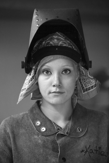
Anthony Salamone - Katie the Welder
Part of the fun of every juried show is seeing who gets the prizes. At this writing, the show has had an opening reception, but the awards reception is yet to come - which gives me the opportunity to try to predict who the judges have favored. Of course, they've already culled nearly 500 submission by 101 artists to the present group, which makes my job pretty easy.

Here are my picks: Mark McCarty's greatly enlarged cellphone snap, Sebastien Barre's wry industrial post-mortem, and Deb Baldwin's Surrealist throwback in black and white will all win prizes. Also worthy of note are two shots by Anthony Salamone, one of which echoes important color work by Philip Lorca DiCorcia; Deb Hall's thought-provoking digital manipulations of large-format views; and an improbable but almost believable conjunction of sea and sky by Linda Morell.

There will be an Artists' Reception at the gallery from 6 to 8 p.m. on Saturday, June 11th, with awards to be announced at 7. Get there early to make your picks - then we can all check to see how we did.

Rating: Recommended

Mark McCarty - MK # 0570