Get Visual is the grateful recipient of a grant from The Christos N. Apostle Charitable Trust

Monday, December 6, 2021

Short Take: Fence Select 21 at ACCR

A New Blank Tablet: January 20, 2021 12:00 PM EST, oil on cradled hardwood by Susan Hoffer, is the juror's top choice in Fence Select 21
I’ve been remiss in taking so long to get to this year’s Fence Select show at the Arts Center of the Capital Region in Troy, because it always features a wide swath of the region’s best and upcoming artists, and it ends this Saturday. But, as I am often forced to say, better late than never.

This year’s edition of the show was juried by Dan Cameron, a noted critic whose local presence seems to be increasing lately, and the 51 artists included are overall quite worthy. I regularly refer to this annual exhibition as “the other Regional,” and this year’s edition pretty much lives up to the title; seven of the included artists were also in the 2021 Mohawk-Hudson Regional, and several others have been in previous editions of that show.

William Fillmore's Red Warning #2;
in the background is a painting
by D. Colin
photo provided
My biggest quibble with the current edition of Fence is that only a few of the selected artists have more than one work in it (specifically, six artists have two each) and those works aren’t presented together in any case. But the gallery looks good with the show as installed, and there are very few clunkers in it (I’ll leave it for you to decide which they are).

Among the outstanding pieces to my eye and mind were the following:

  • First-prize winner Susan Hoffer’s impressively self-actualizing studio view titled A New Blank Tablet: January 20, 2021 12:00 PM EST
  • ORT Project Rockwell-Nelson’s Anthropocene Epoch: Eat the Rich, a super-sharp photograph that features a live baboon in an oval-framed still life arrangement
  • Chris DeMarco’s lush, yet delicately colored photographs of a trailer park
  • Karen Gerstenberger’s two coastal monotypes
  • Jaime Courcelle’s oil on canvas It’s Not Goodbye
  • Take Out, a timely and wry nod to Edward Hopper by Marion Reynolds, and
  • Michael Oatman’s elegiac stack of unwatched 9/11 videotapes (shown below)
The exhibition’s other prize-winners are Royal Brown, for a futurist reinvention of found objects; Jeff Wigman, for a Bosch-like painting on wood panel, and William Fillmore, for a strikingly geometric steel sculpture.

The ACCR is open every day but Sunday; Fence Select 21 ends Saturday, Dec. 11.

Sunday, November 28, 2021

A parallel play of Parallel Plays

Sculptures and drawings by Chris Duncan are part of a four-person show at the Schick
Art Gallery on the campus of Skidmore College
all photos provided
In an odd coincidence, two shows that are separated (joined?) by about 30 miles of Northway and overlapping in schedule have the same title: Parallel Play. The term refers to a behavior that young children at an early stage of development will engage in, where they do not interact, but play at the same activity side by side.

In the case of the first of these shows, which ends on Thursday (Dec. 2), Skidmore College’s Schick Art Gallery in Saratoga Springs has gathered four sculptors and is exhibiting works by each in both two and three dimensions – the parallel between those dimensions is what’s referenced here.

The other show, which continues through Dec. 18 at the Lake George Arts Project’s Courthouse Gallery in Lake George Village, is a solo by the Troy-based fiber artist Barbara Todd, who has mounted a multilayered installation of related works, exploring a parallel within her meticulous working process.

Wind, by Mary Neubauer
(DeWitt Godfrey's Ander in background)
Both shows are excellent examples of making the most of a small but high-quality exhibition space, and well worth a drive to see. We took that drive on Saturday, and it lifted our spirits amid sunny skies and frigid temperatures. I’ll discuss the Schick show first, as it ends so soon.

Co-curated by Schick staff and Skidmore sculpture professor John Galt, this Parallel Play features the work of Chris Duncan, DeWitt Godfrey, Coral Penelope Lambert, and Mary Neubauer in a slightly crowded installation of approximately 35 works covering a healthy variety of media. A few additional works are exhibited in a display case near the entrance to the Saisselin Art Center, where the gallery is housed, and another is on an outdoor patio, underscoring the sense of a space nearly bursting its seams.

As with our exemplary toddlers, these four artists play nicely together, each pursuing strong directions while balancing into a whole that, for me, elevates an awareness of materials and processes. It’s not so common around here to see a showcase for sculpture and, though this work is mostly smaller in scale, the effect of three-dimensional objects, with their strong physical and tactile presence, is fully felt in this selection.

A DeWitt Godfrey drawing
The show’s premise, which places each artist’s two-dimensional works in juxtaposition with the 3-D ones is also effective. Three of the four include drawings (almost always the first building block of a sculptor’s ideas), while one features photographs. This last, Neubauer, derives her forms from massive weather-related databases, which could have been translated as well into graphic representations that may have felt like sketches, but as color photographs they come across more like finished works in their own right. Her sculptures firmly occupy the space around them, bulky, beautifully patinated, and displayed on custom pedestals.

Duncan, a sculpture professor at Union College, presents a total of 13 works here, revealing an artist in full command of his medium, whether paint on paper or anything you can crush or fold into a form and then embellish with color and texture. While Neubauer’s work clearly aims to discuss our changing climate, Duncan is content to express himself more obtusely, delivering emotional jabs with gloomy, calligraphic gestures and bright, shiny splashes of color.

Insipid Sun, by Coral Penelope Lambert
Godfrey is represented here by just two drawings and one steel sculpture, but they dominate one wall of the gallery and provide perhaps the strongest pairing of those two media in this show. His on-site installation entitled Ander evokes the natural growth pattern of a many-celled organism, while putting the viewer in touch with the straightforward process of cutting sheet steel into loops and then letting it rust. I always like an artist who can produce work that is both relatable and innovative, and Godfrey handily delivers on that promise.

I found Lambert’s work the most challenging in the show. She combines cast iron and welded steel with felt flocking, creating a contrast of the stereotypical masculine and feminine traits of hardness and softness. Her drawings are playful, even childlike, while her three sculptures shown here are as serious as military hardware. That said, rarely have I been so unable to resist touching a work of art in a gallery (generally a harsh no-no), in this case seduced by both color and texture.

A segment of Barbara Todd's installation at Lake George Arts Project

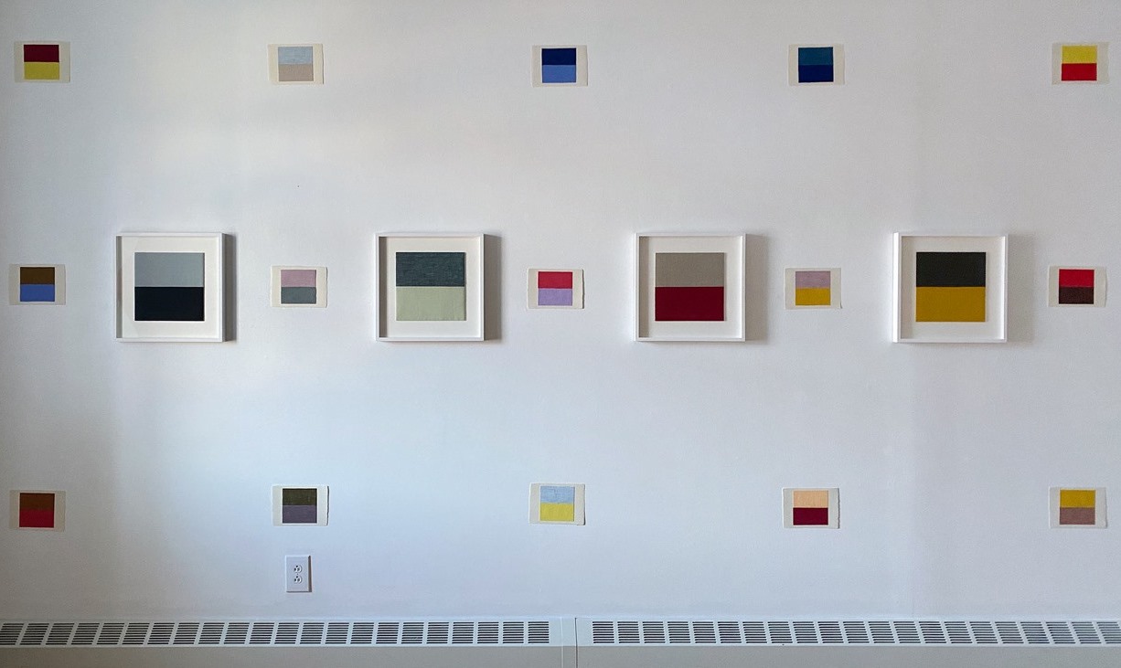
Barbara Todd has become a friend, but before I ever knew her, I was struck by her big, abstract quilts as seen in the Mohawk-Hudson Regional. Over the years, Todd has participated in other local group shows, but the current one at Lake George Arts Project is her first solo in recent memory, and it is a smash.

Combining miniature fabric-swatch sketches, medium-sized finished works of the same materials, and five larger quilts, her Parallel Play has been installed in three overlaying matrices of theme and variation that sing in vibrations of pure color.

Dragon Fried Fish, Albany, NY, January 12, 2014
At first glance, the casual viewer may not understand what Todd has going on here, and that's understandable - in all but a few of the pieces, there's nothing more to meet the eye than two juxtaposed rectangles of colored fabric, forming a perfect square on a background field of white. But Todd's persistence in this pursuit has a cumulative effect, as her tendency toward reds and yellows, greys and blues, builds into a secret but knowable language, like semaphore.

It could help to understand that every work (and there are several dozen, at least, shown here) is based on an actual experience, a sighting captured in a photograph that forms the starting point for the work. So what may appear to be simply a soft purple over a cool grey is also a specific time and place: Morning mist, Highway I 90 near Utica, October 8, 2016. And so on, and on.

In addition to the layers of private meaning in each linen piece, there are varying textures, weaves, and mixtures of thread that make up the colors, providing a lot more to reward close inspection than one might expect. Beyond that, Todd has developed some of the selected moments into larger quilts, made of luxurious wool fabric, which are warm and inviting, even while still having been built upon cool, color-theory bones. These five works are the stars of the show, but the overall installation glows brightest. See it if you can.
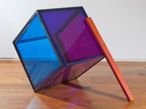
Sunday, November 14, 2021

Too much Tucci?

It was the early 1990s when people began telling me that there was an obscure television actor who looked just like me. Not being much of a TV watcher, I had no idea who he was until the movie Big Night* came out in 1996, and I realized they'd been talking about Stanley Tucci. I’ve been a fan ever since.

And yes, he still looks like me - but now he’s famous, and he’s written a nice little book about his lifelong love affair with food. As Tucci puts it, he is "Italian on both sides" … so obsessing about food comes naturally. He’s also an experienced writer, with several film scripts to his credit, making Taste: My Life Through Food much more than the average celebrity memoir. And, when it comes to food, he’s got plenty to talk about.

You may already be aware of a TV series that ran last winter on CNN called Stanley Tucci: Searching for Italy, in which our hero goes to various regions of Italy and explores some of their local food specialties, oohing and aahing in ecstasy along the way. It's a great series, slated to continue until (I hope) all 20 regions of Italy have been covered.

Me and Stanley - He's got a better makeup
man, but I speak better Italian ... so I guess
that makes us even!

photo: Robert Blake

Between the first six episodes of Searching for Italy, and the book Taste, you get to know a lot about Stanley (or The Tooch, as I like to call him), including various facts about his family, but most of all you learn just how completely obsessed with food he is and always has been. Me, I don't resemble the Tooch in this way - which became a problem about halfway through the book, as I skipped over most of the recipes and, I'll admit, some of the slightly overlong descriptions of whatever Stanley loves to eat.

For true foodies, I'm sure this wouldn't be an issue, but I disclose to be honest and thorough. On the other hand, I am probably even more of an Italophile than the Tooch himself, so his stories that involve anything cultural fall on wide-open ears. And, boy, does he have stories, which he shares in a fluent, likeable voice that is clearly his own (no ghost writer here). Stanley seems to think of himself as great company, and for a time I thought so, too - but, after a while, that particular voice began to seem a bit self-indulgent, and I grew tired of it.

Another aspect of Taste that I found a bit of a bore was the name-dropping. OK, given that Tucci hangs out with the likes of Meryl Streep and George Clooney, it's understandable that he'd want the reader to know that ... and, maybe to his credit (I can't decide), he calls himself out on the name-dropping each time he does it. But it's still name dropping, and it's still tiresome to old, un-famous me.

The book also contains two big revelations, which ***spoiler alert*** I am about to detail. The first is that Tucci recently had a pretty bad form of mouth cancer that not only threatened his life, it took away his ability to enjoy food for two years. And that plain sucks. Luckily, treatment and endurance won out and, by the end of the book, he was back to eating almost normally.

The second revelation is even more disturbing - that Tucci has tired of acting and really just wants to feed people from now on. Aw, jeez, Stanley! As we aren't in the realm of Meryl and George (or of the Tooch's other friends and relatives), that makes us the losers. I will definitely miss Stanley Tucci the actor. Though there remains the fact that CNN has renewed his wonderful TV series ... and I can't wait to see what regions of Italy he'll visit next (my Italian-American wife is rooting hard for Abruzzo)!

*Big Night is a terrific independent film starring Tucci, Tony Shalhoub, Minnie Driver, Ian Holm, and Isabella Rossellini that put Stanley’s name on the map and boasts a 96% rating on Rotten Tomatoes.

Tuesday, October 26, 2021

Running at 63

It isn't getting any easier! My first 10k race.
photo by Denis Nally
One thing about runners is that we are persistent. While a lot of people let the pandemic keep them indoors and out of shape, we just kept on running, even if the usual races that keep us motivated were mostly canceled (or virtualized).

This year's running season was an improvement over last year's, in that we got incredibly effective vaccines (thank you, scientists!) which allowed many of the regular road races in the Capital Region to come back live.

My personal goals stayed the same, which is to just keep at it and try to maintain the pace I had established in recent years for my usual 5k distance. But that's getting harder with age. In fact, I now think, in my 64th year, that I've already peaked. Which is OK - and that's the meaning at the heart of today's story.

Now, that doesn't mean I couldn't improve my times - barring injury, it would definitely be possible, as I believe any trainer would attest. However, it would take more and more time and effort at this age, which to me is simply not worth it. After all, the benefit - and purpose - of all this is to be healthy, not to be faster than someone else. And it's well documented that the speed you run has almost nothing at all to do with the health benefits you gain from running.

So, this year, as before, I continued to run approximately every other day, for about two to five miles each time, totaling around 10 to 12 miles per week. I participated in seven races, including a couple of virtuals, and one 10k race, the rest being 5ks. I do have one more 5k race to go, a tiny one in Alplaus, where my in-laws live - so I'll have a nice little cheering section, and one last chance to set a PR (that's runner slang for personal record) for 2021 before the cold weather sends me back to the indoor track.

Happy after a lovely virtual race on the
Shining Sea Bikeway in Falmouth, Mass.
photo by Karen Ciancetta
My best 5k time so far this year is 26:20 - not too bad, and only a bit behind last year's best time of 26:11. (Interesting fact: Statistically, a runner loses 7 seconds per year per 5k, which puts me right on course in my decline.) In the races I ran this year, I placed second in my age group twice, which is similar to my prior results after age 60, but still somewhat meaningless, as it really depends mostly on just who shows up.

Case in point: For this year's JCC Dunkin' Run (my "home" race, as the course is right by my house), I decided to try the 10k distance, even though I was the defending champion in my age group at the 5k distance from the last time they had the race in 2019. I'd run 10k a few times in training and figured I could break 58 minutes or, if having a really good day, maybe even break 57.

In the end, I gave it my all (as you can see in the finish-line snap at the top of this post) and clocked in at 57:20 - finishing last out of seven men in my age group. It's not like it was even close - four of those guys were a full 10 minutes ahead of me - which is like 25 runs in baseball - and I honestly can't begin to understand how they're physically able to do it. But, for me, it was still a PR for the distance, and a successful effort.

Also, underlining the fun that comes from joining the runners' community in these events, the person who finished directly in front of me was the women's 15k winner and directly behind me was the second-place finisher - you heard right, they ran 50% farther than I did in about the same time. Two weeks later that same pair - 30-year-old Caitie Meyer and her friendly 37-year-old rival Karen Bertasso Hughes - finished 4th and 6th in the Freihofer's Run for Women. Nice company to be with on a weekend morning!

In the end, I am most grateful simply to be able to run as a senior, and to be in good health at this perilous time in our history. I may never again break 26 minutes for a 5k run, but I hope to be able to run, however slowly, for many years to come.

Sunday, October 3, 2021

Ruminations on the Regional

The 2021 Mohawk Hudson Regional is a bit of a head-scratcher, not because it fails to represent the region’s range of outstanding artists (which is the show’s basic mission since its inception 85 years ago), but because it does so in a very cumbersome manner.

I submitted to the show this year, and so I can’t in good conscience write the critical review I’d like to, but it’s too important an event to merely pass over, so I’ll try to take an objective approach with this brief report.

First, some history. Over the past dozen years or so, the Annual Exhibition by Artists of the Mohawk Hudson Region (its formal name) has been rotating among three sponsoring organizations: The Albany Institute of History & Art (its original organizer), The Hyde Collection in Glens Falls, and the University at Albany Art Museum. A prior host, the Schenectady Museum, changed its mission from art to science some years back, leaving the Regional to wander a bit every third year, until the Hyde stepped up to fill the role of a third regular host. During that time, the show landed at least once at the Albany International Airport Gallery, a fact I mention because, this year, it’s there again (in part).

With the Institute, the Hyde, and the University as regular hosts, the Regional was doing fine, until COVID-19 hit. This disrupted the University Art Museum’s schedule to the point that it had to cancel its 2021 position in the Regional’s regular rotation, after which it was decided that the show would be managed by Albany Center Gallery (ACG). Being physically too small and insufficiently staffed to host the show alone, ACG then recruited additional space and support for the venture from The Sage Colleges’ OpalkaGallery and the Airport Gallery.

This solution, though a compromise, offered additional perks. Now, rather than having just one big show with one juror (the longstanding tradition), there would be three shows, each with its own juror, with all of the art still being drawn from a single pool of entries. Each venue selected a juror: Hudson gallerist Pamela Salisbury for the Opalka, local artist Alisa Sikelianos-Carter for ACG, and Seattle-area artist and arts administrator Tommy Gregory for the Airport – and the stage was set for a unique event.

The resulting tripartite exhibition features 143 works by a record 96 artists (14 of whom were also in the 2020 Regional). Unsurprisingly, this horde includes a number of familiar names, as well as a goodly smattering of new or lesser-known artists, the diversity of which the organizers had said was a goal for this year’s exhibition. While I didn’t love the new format, as an artist I was excited to think that I had three chances to be chosen (alas, that didn’t happen); an additional decision by the organizers to reduce the entry fee to just $10 (from about $40 in past years) made it even more appealing.

Now, as an audience member, I have a couple of problems with the arrangement. First, in order to take in the entire selection as one show (like in all prior years), it’s necessary to find time and the means to go to all three venues, not to mention somehow keeping in mind what you’ve seen in each to meld it all together. Second, two of the venues have set rather short runs for their parts of the show (Sept. 7-Oct.9 at Opalka and Sept. 10-Oct. 9 at ACG), compared to prior years in which the Regional would typically run for at least two months (which the Airport segment does this year), putting further pressure on the viewer’s resources.

Worse yet, several of the included artists are featured in two locations, and one is in all three, making it even more difficult to absorb and understand their contributions as a whole. (I think all artists would agree that they’d rather not have their work scattered like this.) Even within the venues there are distribution problems. Nearly half the total artists (44 of them) have their works crammed into the confines of ACG, making for a salon-style installation where items are stacked and grouped, and where some individual artists’ have multiple included pieces separated from each other within the room.

While I find all that unfortunate, there’s a lot of energy amid the clutter at ACG, and many intriguing works to be found in the mix there.

In contrast to ACG, the Opalka’s more generous space seems rather sparsely filled. Salisbury selected mostly abstract art, a form I dearly love, but this segment of the show somehow comes off strangely flat. I think this is a consequence of the exhibition being divided – if these mostly worthy works were intermingled in a larger museum space with the other jurors’ choices, it would have created a much more stimulating conversation.

That more appropriate balance seems to have been struck at the Airport – possibly because the juror there is more experienced in putting together large exhibitions for mass consumption in his role as the curator for the Port of Seattle. If only the entire show had been mounted there as it once was, this might have been another great Regional. But that would have been impossible, as the formerly vast space of the airport's third-floor gallery was recently reduced to a much smaller one.

On the plus side, that space is open from 8 am to 10 pm daily, and that segment of the show runs through Nov. 8, so there’s no excuse for missing it.

Viewers peruse a corner of the 2021 Mohawk Hudson Regional at the Airport Gallery

Friday, September 17, 2021

All Together Now at The Hyde, the Tang, etc.

Installation view of Summer Bomb Pop at The Hyde Collection; from top, left are
works by Myron Stout, Sarah Braman, Mindy Shapero, Robert Reed, and Steve Roden
Though summer is on the wane, a constellation of shows that began to emit from Skidmore College's Tang Teaching Museum in the spring will continue well into the fall, and so could nicely serve as a buffer to the inevitable end of our warmest season.

All Together Now is a wonderfully conceived project in which Tang curators, other art venues' curators, and Skidmore students collaborated to bring elements from the Tang's collection into other spaces, where they interact with related works from those museums' collections. It's my impression that this concept was birthed by the COVID-caused closure of the Tang to non-Skidmore viewers for more than a year (it reopened to the public on July 10th), and a desire to bring some of its holdings into the community during this shutdown. It also fostered some cool collaborations, and fed fuel to the fire of those students' educations, which is a core mission of the Tang.

The resulting eight exhibitions, six of which are still on view, cover a lot of ground, from sculptural wooden hat forms, to 19th-century photographs, to contemporary abstract paintings. Among the collaborating institutions are The Hyde Collection in Glens Falls, Yaddo and The National Museum of Racing in Saratoga Springs, and the former Brookside Museum (now the Saratoga County History Center) in Ballston Spa. Two of the shows have closed - one at Saratoga Arts and one at the Tang; and two are not easily accessible - at Yaddo and the Saratoga Performing Arts Center; so I recently visited the four that remain, including one at the Tang that opened on July 10 (the prior one closed in June).

From left, works by Augustus Thompson, Bridget Riley,
Richmond Burton, and Man Ray are grouped in
Summer Bomb Pop
all Hyde photos by Arthur Evans
The grand tour, taken up with a culture-vulture friend riding shotgun, proved to be exhausting but awesome. We started at the northernmost point, where recent works of art from the Tang's holdings are blended with selections from the Hyde's Feibes & Schmitt collection of 20th-century abstraction in the museum's main gallery. (The Hyde has several other worthy shows also currently on view, but we'll focus on just this one for now.)

Summer Bomb Pop: Collections in Dialogue is rich in significant stand-alone works, or in tasty juxtapositions if you choose to view it that way, with a smattering of explanatory labels that delve into the history of some of the works and artists on view. Most of the labels are student efforts, but several are by prominent art critic Dan Cameron, and add worthwhile insights.

The show's title (taken from a 2008 painting by Chuck Webster that leads the installation) is a clear message that this should be fun - and it delivers. I was surprised after immersing myself in what seemed to be a great big show, that there are only 26 works in it, but many are both large and complex, and they powerfully command the spacious gallery with scarcely a false note.

Sarah Braman - Fall Friend
Introductory wall text states that Summer Bomb Pop intends to "stimulate compelling new conversations in American abstraction," which it has achieved by careful selection from both collections, resulting in a satisfying representation of well-known names (Man Ray, for example) and fresh discoveries (at least to me). Some of my favorites included Augustus Thompson's 2014 acrylic painting Untitled (Like a Kingsnake), Ellsworth Kelly's 1980 shaped oil painting Diagonal with Curve XII, Blue #611, and Sarah Braman's 2012 sculpture Fall Friend, which Cameron describes as "motivated by an urge to spruce up the visually drab ... Minimalist Art movement of the 1960s."

What struck me most about this show is that so many young artists today are continuing and expanding on the Modernist traditions of abstraction, even as postmodern art has long since dived into a maelstrom of other modes of expression, including video, performance, environmental art, and all manner of identity politics, along with anything else you can imagine. I had no idea minimalism and abstraction were still so alive and well, and I am delighted to find that they are, and playing so nicely at the Hyde with their estimable forebears.

Four Greens, Upper Manhattan Bay, 1957
Our next stop was the Tang itself, where we were greeted by a mind-boggling collection of well over 100 postcard collages by Ellsworth Kelly, all lovingly matted and framed in soft white. Grouped more or less chronologically (or thematically), and covering nearly 50 years of playful exploration by the artist, they are drawn from a total of 400 such works still held by Kelly's surviving spouse, Jack Shear, who has generously loaned them to the Tang.

Front Street, 1978
Simply entitled Ellsworth Kelly Postcards, this is one of the most exciting art shows I've seen in years. Not only are the images almost universally witty, visually sharp, accessible, and clearly related to Kelly's more "serious" art, they provide a window into the artist's process that few exhibitions do, which is quite a gift to contemplate.

All but a handful of the works on display retain the diminutive scale of a standard postcard (typically 3 1/2 by 5 1/2 inches), and most combine very few elements to create a powerful transformation of the mundane into the - dare I say? - transcendent. One is particularly struck by how precisely Kelly has again and again fitted two disparate elements into a cohesive whole. Simple? You try it!

Images des Antilles (Stephanie de Monaco) 1984
It may seem easy to play around with paper every day for fifty years or so but, I promise you, it's very hard work and, in my opinion, represents a triumph by the artist over the vexing problem of life itself. 

Walking through the Postcards show, I tried to imagine old Ellsworth toiling away at a little desk upstairs while everyone else was at the beach or drinking by the pool. He was a very soft-spoken guy (we met once, briefly), and modest, despite his wealth and success; these tiny creations mirror that personality.

I went away elated, and deeply impressed at Kelly's persistence. I will be going back to this one.

Working our way south, we next stopped in Saratoga Springs at the National Museum of Racing, a very expensively built and beautifully managed operation I'd never before visited (sorry, but my interest in horse racing is basically zero). We were there to view a small but significant installation of Eadweard Muybridge's photographs of animals in motion, part of the Jack Shear collection at the Tang, which were paired with three of the  Museum of Racing's horse paintings by Henry Stull.

Four photo sequences by Eadweard Muybridge are shown
with a painting by Henry Stull at the Museum of Racing
When Muybridge was commissioned by Leland Stanford in 1870 to use stop-action photography to prove that a galloping horse will have all four of its hooves off the ground at once, the expectation was that this would happen when the animal's legs were all extended in a great leap forward. Instead, the proof was achieved - but with the surprise result that the four hooves would only be off the ground while gathered under the horse's belly.

The concise installation at the Museum of Racing, entitled Muybridge and Motion, perfectly illustrates the impact of this revelation by showing a Stull painting from before 1870, in which a race horse is depicted with its four hooves extended, and two Stull paintings from after 1870, where the horses are depicted correctly with their hooves gathered underneath. All three paintings are prime examples of such art, and enjoyable to examine. While the Muybridge photographs on view do not include his original experiment, they do include a similar sequence, a nice smattering of other horse studies, a nifty sequence of fallow deer on the run, and a couple of grids that show the motion of common birds in flight (a pigeon and a red-tailed hawk).

A wooden hat form
made in New York City
Our final visit was to the Saratoga County History Center in Ballston Spa, where a very engaging display of hats and hat forms is spread onto shelves and in vitrines. The five wooden forms (also known as blocks) are from the Tang collection, while the 25 hats, covering an impressive range of styles from the newsboy cap to ladies' elegant bonnets, are from the History Center's collection.

A nice printed booklet accompanies the show, which is entitled The Social Lives of Hats, providing solid descriptions and well-founded historical notes, all of them researched and written by Skidmore students. I must comment on the hat forms as really cool objects, works of art in themselves, even if by accident. But I may be biased, as I happen to possess a couple of similar wooden forms my uncle rescued from the streets of Manhattan decades ago.

The shows I've reviewed remain open through the following dates (more details are here):
  • Summer Bomb Pop at The Hyde, through Oct. 31
  • The Social Lives of Hats at the SCHC, through Oct. 31
  • Ellsworth Kelly Postcards at the Tang, through Nov. 28
  • Muybridge & Motion at the Museum of Racing, through Jan. 2
An installer poses hats and hat forms at the Saratoga County History Center


Wednesday, August 18, 2021

Keith Haring at Fenimore Art Museum

Installation view of Keith Haring: Radiant Vision at the Fenimore Art Museum
photo provided
Keith Haring was born in 1958 (one month before me) and became a defining artist of his generation before he died of AIDS in 1990 at the age of 31. Keith Haring: Radiant Vision, on view at the Fenimore Art Museum in Cooperstown through Sept. 6 Oct. 11, tells the story of how that remarkable career happened, and explores what it meant. The exhibition uses a clever graphic timeline, wall text, and ample quotes from the artist to recount Haring's history, and features a broad and deep sampling of the artist's work (including more than 100 works from a private collection, and a very impressive gigantic etching from the Fenimore's collection).

A news release about the show states that Haring "was arguably the most accomplished and prominent American artist of the 1980s," a claim I can neither fully agree with nor effectively refute. As an exact contemporary of Haring's, I can only say that he never held a lot of interest for me, partly because of the very commercial nature of his work, and partly because, though incredibly successful, he didn't have the chance to reach his full potential as an artist.

Radiant Vision offers an excellent opportunity to see for yourself what you think about a young man whose contributions included helping to bring graffiti art and hip hop into the mainstream, extending the art-for-all populism of his good friend Andy Warhol, and combining art with activism, perhaps more successfully than anyone else, before or since. The latter two achievements are, to me, the more valuable, but all of it is astonishingly impressive for a person whose career lasted just 10 years.

Keith Haring is seen at an early exhibition
of his work at Tony Shafrazi Gallery in New York
photo by Allen Tannenbaum 1982
Haring was essentially a graphic designer whose pictures relied on super-simplified line drawings of iconic symbols to communicate primal messages, just as corporate logo designers strive to do. And he was incredibly good at it. He used pure primary and secondary colors, vivid unmixed paints and inks, big shapes, and empty backgrounds, along with words and symbols, to make exuberant, bold statements about life as he saw it.

As seen in this exhibition, Haring invented his own visual vocabulary - a crawling baby, angular barking dogs, leaping stick figures, etc. - and rode it to vast global dissemination. He also used these skills in eminently worthy campaigns against AIDS, apartheid, and drug abuse, work that is well documented here, and which shows how effective simple graphic art and youthful sincerity can be. 

However, there are a few outliers scattered here and there throughout the exhibition that hint at a much more subtle artist who may have been trying to emerge from behind the public Keith Haring. That artist worked looser, with less clearly defined boundaries, used thinner lines and more shading, and employed a less bright palette to evoke deeper meanings and messier emotions. Some of those works reminded me of Miro' and Picasso and, as I walked around the exhibition, I found that I liked that version of Keith Haring a lot better than the one we all already knew.

One of the best aspects of Radiant Vision is the way it demonstrates Haring's humility and humanity, through quotes on the wall, in which he repeatedly explains how much he wants art to be accessible to all, and through a charming TV show interview in which he asserts an almost selfless modesty, alongside a crystal clear vision. These were the things in the show that did the most to convince me of Haring's significance. Though it goes without saying, it's a terrible shame that he died so young. Despite his own almost superhuman optimism, I simply couldn't shake the sadness.

Checkerboard, polychrome assemblage 2020
by Laurene Krasny Brown
Also currently on view at the Fenimore are a pair of shows that opened a couple of weeks ago and will remain there through Dec 31. Toying with the World: Works by Laurene Krasny Brown and 
Believe In Yourself: What We Learned From Arthur, which features the work of illustrator Marc Brown, stand alone in separate galleries but are closely linked, in that the two artists are a married couple.

Marc Brown is known to anybody with kids through the Arthur books and TV series, and the exhibition does a fine job of sharing the process involved in creating those products. Brown is an absolutely first-rate illustrator and, like any successful commercial artist, he clearly works his tail off. It was great fun to see the thumbnail sketches and story boards that lead to a finished book, but even better to see the exquisitely detailed paintings that are so easily taken for granted once they're on the printed page.

Laurene Krasny Brown is a much more interior artist, working with modest materials to pursue an almost mystical personal vision built around the concept of games. Where I was expecting stuff more childlike, instead I found a persistent exploration of geometric and architectural themes, characterized by a soft palette of early-American colors in paper and gouache. Brown's playfulness was apparent, but tempered by the same seriousness that I've observed in certain active toddlers.

Both shows are well worth spending some time with. By the way, admission to the Fenimore is free for those 19 and under for the duration of these exhibitions - so feel free to bring the kids.

A painting by Marc Brown from Wild About Books


Friday, August 6, 2021

Spiritual Roots: Wendy Ide Williams at Laffer Gallery

Night Blooming Riot - mixed media on paper 2019
It's been quite a while since the painter Wendy Ide Williams has been the subject of a solo exhibition, and her current tour de force at The Laffer Gallery in Schuylerville, entitled Spiritual Roots, shows just how overdue this event is.

I've been following Williams' career since the late 1970s, when we were both art students in Providence, R.I., and she was already pretty good back then - but I can easily say that she just keeps getting better. The selection of 48 paintings on paper or canvas currently at Laffer presents an artist absolutely on fire.

Bathed in Deep Water, mixed media on paper 2019
More than half the show consists of a grid of same-sized small works on paper, all of which are quickly made drawings in ink and watercolor from the last couple of years. This display alone would be worthy of a show, as it eloquently delineates the complex and heartfelt process of daily exploration that is the backbone of Williams' process. In contrast to the larger works on paper and the much more layered acrylic paintings on canvas that make up the rest of the show, these pieces have a lightness and a more visibly direct connection to nature that reveals an essential quality of Williams' otherwise persistently abstract imagery.

Flowers, mixed media on paper 2018
That tension between the abstract and the representational is at the core of Williams' painting, such that the generally non-narrative canvases read as pure shape and color, yet within them there is always a recognizable presence of natural forms, ranging from plants and paramecia to birds and (if you let your imagination go with hers) even humans. These subjects, however, are hidden in a network of patterns, chains, cells, stripes, and dots, often distributed almost evenly over the picture plane and, always, in a riot of vivid colors.

One of Williams' tricks is to cast the majority of her compositions in a vertical format, adding some square canvases to a mix that includes very few horizontals. This is one way of avoiding the confines of landscape while, in fact, often depicting natural subjects. Williams also increasingly employs intense color combinations, sometimes so busily covering the painting surface that there's no relief, but also regularly providing restful zones of white or black.

Unburdening, acrylic on canvas 2021
Some of the most recent pieces in this show veer toward a darkness that I found myself very drawn to, and in them the black areas serve to make the other colors look even richer to the eye (a technique I first observed in paintings by Matisse and Picasso). These more heavily worked paintings are among the best in the show, and the best I've seen Williams make. They show not only skill and vision, but aggressive and persistent technique that dares to take chances by going beyond the first or second solution to a problem. It's harder work - and more dangerous - than most non-painters would ever know.

In the Jewelry Box, mixed media on paper 2019
Perhaps best of all, in a certain sense, is that these paintings are selling like crazy. Gallery director Erik Laffer told me on a recent visit that it may be the most successful show commercially that he's ever had, something really striking to consider given the fact that the paintings are non-representational and not at all purely decorative. Maybe that's a sign - could it be that well over a year of living with a terrifying pandemic has caused art buyers to dig deeper? One can hope.

In any case, it's a very healthy sign for both Laffer and Williams that art lovers are lining up for challenging work from a regional favorite. Without a doubt, she has earned it.

Spiritual Roots will remain on view through Aug. 22; The Laffer Gallery's hours are from noon to 5 p.m., Thursday to Sunday, or by appointment.

Covid Gift (Previous a Caterpillar), acrylic on canvas 2021


Friday, July 16, 2021

Nikolai Astrup at The Clark

Nikolai Astrup, A Clear Night in June, 1905–07, oil on canvas: That Nordic glow

This year, the Clark Art Institute in Williamstown, Mass., has taken a different tack with its big summer show. Rather than feature a blockbuster on the level of Renoir (2019), Van Gogh (2015) or Turner (2003), the region’s most venerable museum has mounted the first North American show ever of a little-known early-20th-century Norwegian painter named Nikolai Astrup.

Organized in collaboration with Norway’s KODE Art Museums, and curated by British art historian MaryAnne Stevens, Nikolai Astrup: Visions of Norway aims to convince its audience that Edvard Munch had an unjustly overlooked contemporary who – perhaps - should be regarded as his equal. It’s an intriguing and challenging argument to engage, and one that, in all honesty, can’t be concluded – but, in the process, we are given a strong show that is without a doubt well worth seeing.

The Parsonage, n.d, oil on canvas
I am delighted by the irony that, in this era of unrelenting wokeness in the arts, a leading museum is willing to stake its reputation on a dead, white, heterosexual, male painter. What nerve! What verve! What fun. Well, it could be fun, if Astrup weren’t so generally gloomy. But how can you blame him? After all, he lived in rural Norway, the son of a parson, sickly from an impoverished childhood, underappreciated.

Gloomy – yet glowing. Despite his isolated circumstances and shortened lifespan (he died in 1928 at the age of 47), Astrup burned with a passion for his chosen subjects, the Norwegian landscape primary among them - its particular light, its plants, its folk traditions, its rustic buildings, and its people. This passion led Astrup to work feverishly, not just in paint, but also extensively in Japanese-style woodblock printing (ukiyo-e), which he executed extremely well, whether in multiple colors or in monochrome.

Bird on a Stone, woodblock print
with hand coloring c. 1905–14
Fortunately, a significant portion of the expertly laid-out exhibition is devoted to the prints, including several examples of the original blocks, themselves alone worth the price of admission. But it is the paintings that dominate and best tell the story of a man in love with his rural existence and an ancient culture. This is expressed above all in the night paintings, which capture the peculiar half-light of the extreme North in summer and the opportunistic plants that explode in its short growing season.

We learn from the concise wall text that Astrup was an enthusiastic horticulturalist, and we see evidence of that in the lovingly rendered trees, bushes, and flowers that pervade his works. No shade of green escaped his searching eye, but he also exercised plenty of artistic license in his renderings, in one case featuring identical rhubarb plants in two entirely different landscape views.

Rhubarb, 1911–21, oil on canvas
We also learn that, mid-career, Astrup weathered a crisis in the form of negative criticism of his work in a Berlin exhibition, which caused him to rethink his approach and strive to modernize it. I can imagine that the comments attacked two weaknesses in his work, one of which would be equally derided today, and that is sentimentality. The other (and I’m just guessing) could have been his awkward handling of human subjects – if he’d given them half the life force he gave his plants, many of these paintings would be far better.

In any case, the later work is indeed stronger overall, as is particularly evidenced in repeated depictions of a Midsummer Eve bonfire ritual that Astrup recalls from his youth, when his strict parents forbid him to participate, as they considered it pagan. Several of these paintings and prints are presented in the final gallery of the exhibition, making a clear concluding statement about Astrup’s life, values, and skills as an artist.

Midsummer Eve Bonfire, before 1916, oil on canvas
While I’m not a huge fan of folklore, I enjoyed immersing myself in Astrup’s personal celebration of it, especially as he worked and reworked themes in paint and prints over many iterations. But I responded more viscerally, and with great pleasure, to his formal concerns, especially where color takes on its own life in certain paintings, and where otherworldly light emanates from his subjects.

This is most apparent in some of the landscapes painted at night, and in a couple of still lives made late in Astrup’s career in the interior of his home. For me, though the subject is quotidian, private, and momentary, the painter’s approach to it has taken it beyond those limits to the universal and the eternal. Perhaps, had he lived longer, Astrup would have followed this path to a place where the question of a revival would be moot.

But, whether he was truly a great modern painter, or merely a talented also-ran, Astrup’s contribution is significant enough to be worthy of the showcase he’s now receiving at the Clark and beyond.

Nikolai Astrup: Visions of Norway will remain on view in the special exhibition galleries of the Clark Center through Sept. 19; from October to May, it will travel to museums in Norway and Sweden.

Nikolai Astrup, Interior Still Life: Living Room at Sandalstrand, 1926–27
oil on canvas

Two additional exhibitions currently on view at The Clark are also of great interest. Claude and François-Xavier Lalanne: Nature Transformed is an intriguing collection of Surrealist sculptural works by a non-collaborating French couple who each innovated with materials to create striking visions inspired by nature. It will remain on view through Oct. 31 in a glass-enclosed gallery on the ground floor of the Clark Center that also affords views of several pieces by the Lalannes that are installed outdoors.

Erin Shirreff, Four-Color Café Terrace (Caro, –––––,
Moorhouse, Matisse)
 2019, dye sublimation prints
on aluminum and archival pigment print

In the café area downstairs in the Clark Center, and in the nearby Manton Research Center, are several large works by Erin Shirreff, a Canadian multimedia artist who combines sculpture and photography in unique ways. While her single long video stream and simplified photographic constructions are built with layers of references from other sources, they remain fresh, not derivative. Indeed, Shirreff's elegant abstractions are successful postmodern transformations and well worth spending some time with. The yearlong installation, entitled Erin Shirreff: Remainders, runs through Jan. 2.

Finally, Dürer & After, a new exhibition drawn from the Clark’s extensive holdings, is slated to open tomorrow (July 17) and remain on view through Oct. 3 in the Eugene V. Thaw Gallery for Works on Paper.


Thursday, May 20, 2021

Go Home: Paul Akira Miyamoto at LGAP

Plank - oil on canvas 2021
A fine solo exhibition by the painter Paul Akira Miyamoto is on view through June 5 at the Lake George Arts Project's Courthouse Gallery.

Go Home presents a rare opportunity to immerse oneself in a world both real and imagined, within which Miyamoto has crafted a deeply personal tribute to his Japanese-American ancestors, while simultaneously presenting a critically important history lesson to those of us who would forget the unjust internment of generations of Americans during World War II by their own government.

Miyamoto is Sansei - third-generation Japanese-American - and his Issei grandparents, Nisei parents and older siblings lived for more than three years in the remote Poston concentration camp in Arizona, where they used their farming experience to domesticate infertile land, just as they had been forced to do when living free in California before the war.

Promise - oil on canvas 2021
Miyamoto's paintings reimagine these two scenarios as one serialized fever dream, sketching the sun-baked, clear-skied, surveilled family existence of a stoic, racially profiled people who did the best they could in nearly impossible conditions. The body of work gives voice to those people, but it is more celebration than lament. There's a quiet dignity in Miyamoto's figures, a subtle joy in his colors, and a simmering triumph in this gathering of paintings.

Miyamoto's project actually began long ago, but the majority of works in this show were made in the past year - a time in our nation's history that, unfortunately, could hold a mirror up to those terrible times and see itself fairly clearly. In addition to exploring his personal history, the artist seeks to remind us that we are in danger, even now, of such injustice being perpetrated again on American citizens if we aren't vigilant.

Shoulder - oil on canvas 2021
Along with the 14 paintings on view (ranging in size from 24"x30" to 48"x60"), there is a small selection of framed ink drawings on paper, displayed in a newly dedicated side gallery that the Arts Project has made nice use of for this show. These pieces are both more spontaneous and more specifically detailed than the paintings, featuring delicate monochrome washes of ink and tight pen renderings of camp buildings (one is shown at the bottom of this post). Made in 2018, the drawings seem like a prelude to the paintings, but stand alone as well.

Additionally, Miyamoto has created a site-specific installation in the main gallery, which is a minimalist reconstruction in tar paper and wood of a camp-type building. Stark, black, geometric, it balances the colorful paintings rather than dominating them.

Though I'm emphasizing content here, I want to point out that some of the formal and technical qualities of Miyamoto's painting are quite outstanding, with strict control of form, color, composition and, in particular, soft brushwork that makes them perhaps surprisingly sensual and seductive. His human forms are generalized, suggestive rather than specific, but crafted in such a way that their gestures speak clearly.

At a recent viewing, I noticed that several of the paintings had been sold to private collectors. This is wonderful, of course, but I hope that perhaps some of them will also end up in a museum somewhere. They're that good, and that important. Try to see the show in person if you can.

Camp #8 - ink on paper 2018


Tuesday, May 11, 2021

In Memoriam: Joel Chadabe

Joel Chadabe performs in the 1970s, using a very early PC as part of his equipment
On May 2, my dear friend Joel Chadabe died at home in Albany at the age of 82. Joel was a groundbreaking electronic musician and composer who taught for many years at the University at Albany, Bennington College and, more recently, New York University.

I first met Joel in 1987, when we each were renting studio space in a renovated factory in Albany's West Hill neighborhood, and we soon embarked on a friendship that featured many facets: Technical support, creative discussions and collaborations, countless homecooked meals, and an extended series of annual New Year's Eve and Fourth of July parties at the home he shared with Françoise and Benjamin (wife and son - for more detail, see the Times Union obituary from May 9, and the New York Times obituary, which came out on May 26).

Those parties always featured a core group of the Chadabes' friends, many of them associated with UAlbany, but also often included visitors from afar. It wasn't unusual for several languages to be spoken in those evenings, and for subjects from dance choreography to theoretical physics espoused upon by actual experts. The evenings inevitably concluded with Joel at the piano and those bold enough singing songs both familiar and exotic. It was an experience of a time nearly lost to my generation, when friendship, creativity, and love of life seemed enough to conquer the world.

Throughout, Joel worked, shuttling back and forth from college to college and from Albany to New York City, where he always had some big project going on, whether a concert series, publishing venture, or recording studio. In 1997, he published an unassuming but seminal paperback book on the history of electronic music, Electric Sound, which I enjoyed immensely, despite my nearly nonexistent musical education. Joel loved sharing his knowledge and, especially, his enthusiasm for everything creative, and that attitude shone throughout the book.

In later years, Joel and I saw less of each other. He was often in New York, the old New Year's crowd was diminishing, so the parties ended, and I got busy with my own working life away from the arts. But the connection remained, and the sadness I feel from his premature departure is acute.

Joel Chadabe was truly one of a kind, a generous soul full of childlike joy, and he will be greatly missed. May he rest in peace.

Some things never change: A recent photo of Chadabe at work with a MacBook.