Get Visual is the grateful recipient of a grant from The Christos N. Apostle Charitable Trust

Friday, May 20, 2011

Four Years of Art Nights!


Art Night Schenectady celebrates four years of events today with an ambitious slate of activities, including a fashion show, an international exhibition, and a new collaboration with the city of Beirut, Lebanon. All I can say is WOW!

The poster reproduced above just shows what's at Proctors ... there are many more venues, shows, events, etc. to celebrate tonight. Congratulations to ANS founder and current organizer Mitch Messmore - and here's wishing for 40 more years of arts action in Schenectady.

Friday, May 13, 2011

Commencement

It's the time of year for graduations, and with that comes a spate of annual shows of culminating work by seniors and graduate students from the region's major art degree-conferring institutions.

Currently, the UAlbany MFA show at the University Art Museum tops the list, with Sage College of Albany's BFA exhibition at the Opalka Gallery and Skidmore College's Senior Thesis exhibitions at the Tang Museum right behind. (Already ended, in quick sequence, were the Senior and Graduate shows at The College of Saint Rose's Esther Massry Gallery; the Student Exhibitions at Hudson Valley Community College's Teaching Gallery also recently closed.)

These exhibitions are important to see if you have an interest in the regional art scene, because it's almost guaranteed that many of the new graduates will quickly rank among the most prominently shown professionals on that scene (past and current examples abound), and these shows often provide your first good glimpse of what they do.

I make a point of catching the thesis shows every year if I can (not always easy, as they sometimes have very short runs), and they're usually intensely interesting. Still, I won't be writing any critical commentary on them, neither this year nor in the future.

Why not? My editor offers two reasons:

1) Even though they're graduating, and technically are not students anymore, these fledgling artists may not be ready for the feedback a professional critic provides. Once they're out of the institution, whether showing in a coffee shop or a museum, we'll let the slings and arrows fly - and hope we all get something useful out of it. But until that time, these student artists deserve to bask in the glow of their achievement without critical attention from the press. Also, there's no doubt they've all had endless critiques on this work already as part of their degree qualification process, and that's enough for now.

2) While the writing on this blog occasionally ventures into other areas of commentary, it is first and foremost a forum for art criticism - not educational analysis. We feel that to enter into a discussion of the merits of any group of students at a particular institution while they're still within its walls gets too close to engaging on the subject of the choices that institution has made in its admissions, hiring, and degree-awarding policies - and we just don't want to go there.

That's also why Get Visual's no-student-show policy extends to faculty shows - and why the current exhibitions by Martin Benjamin at Union College's Mandeville Gallery and Regis Brodie at Skidmore's Schick Art Gallery will also go unreviewed in this space, as each is (or was) a professor at the host college. That said, I will go out on a limb and say they are both strong artists whose work is well worth seeing.

One more thing - I happen to be among this year's graduates, and will walk on Saturday in cap and gown to receive a master's degree in business administration from The College of Saint Rose. You should be relieved to know that I don't expect any of you to read the 100-page analysis of a Chinese solar energy company that comprised my MBA team's final project - but I hope you will take time to check out the thesis shows of all those worthy fine art grads.

Finally, to all of them I offer sincere congratulations, and best wishes for future success.

Friday, May 6, 2011

M.C. Escher: Seeing the Unseen at Berkshire Museum

It had been several years since I'd gone to the Berkshire Museum in Pittsfield, and I am so glad I got back there this week for the current exhibition M.C. Escher: Seeing the Unseen. Founded in 1903 with a dual mission to present material on natural science and fine art, the museum completed a major renovation three years ago, adding climate control, a modern entryway, and fresh galleries, and updating its approach to the same worthy mission.

The result is special - and the Escher show perfectly fits the museum's family-centric and dual goals by offering an experience that can be taken in by all ages and on many different levels.

For those of us who grew up in the '60s and '70s, Maurits Cornelis Escher's work was ubiquitous and highly influential. No doubt, visitors of baby-boomer vintage to Seeing the Unseen are finding it more than a little nostalgic and will recognize many of the images presented (as I did). Equally likely, their kids or grandkids will delight in this accessible yet intensely fascinating imagery as a new discovery. Either way, it was a smart choice by the folks at the Berkshire to organize this exhibition, and I expect it will draw crowds everywhere if it gets the road tour they are seeking for it.

While some would be inclined to dismiss Escher's art as mere illustration, or to take it less seriously because it was (and still is) so popular, this collection of 120 works representing about 45 years of the Dutch native's output should put such thoughts to rest. On the basis of technique alone (in painstakingly rendered woodcuts, lithographs, mezzotints and drawings), it's clear Escher was as good as it gets.

Though he was, apparently by nature, a bit dry compared to many of his more histrionic contemporaries, nearly every item presented transcends the realm of pedestrian graphics to stand up as Escher's personal expression of awestruck wonderment at the way things appear and the way things maybe really are. In fact, he was ahead of his time, not behind it, in his integration of mathematical and scientific knowledge into the creation of a personal vision.

The show (which relies on loans from the Boston Public Library and a couple of commercial art sources) begins in a smallish gallery where both the earliest and some of the latest works can be seen and compared. Here, numerous examples of drawings and prints from Escher's formative 10 years spent in Italy show not only how he honed his vision and technique, but how those agrarian Italian vistas and geometric towns remained a key influence on that vision for the rest of his life (such as the 1930 lithograph Castrovalva shown at the bottom of this post).

The early drawings and prints also demonstrate how deeply Escher studied nature, setting the stage for him to later become enthralled with math and physics. And they provide a fresh perspective on an artist perhaps too well known for certain eye-tricking visual puzzles that became icons for the psychedelic generation (such as Up and Down, shown below at left).

That Escher's sometimes fantastical vision was deeply rooted in nature is key to understanding his work, and the range of images in this first gallery of the show makes that clear by linking the early and later works (such as a 1933 lithograph titled Phosphorescent Sea, and the 1955 litho Three Worlds, which is shown at right).

The first gallery also establishes the show's own graphic style and informative intentions with hanging and wall-mounted panels of text and photographs that illustrate the man and his influences. Here I found two Escher quotes that function almost as bookends to his aspirations. The first, "Only those who attempt the absurd will achieve the impossible," is apt but a bit arrogant, while the second, from very late in his life, shows humility: "I try in my prints to testify that we live in a beautiful and orderly world, and not in a formless chaos, as it sometimes seems."

Throughout the rest of the exhibition, the thoughtful inclusion of rare artifacts and related materials provides context for the marvelous images, most of which are masterfully hand-printed and so detailed that the many magnifying glasses placed in racks here and there are sure to be put to good use.

Among the extras are several short videos that animate and further transform some of Escher's most illusory designs; '60s-era clothing with Escher patterns; vintage black-light posters, properly illuminated and accompanied by beanbag chairs for comfortable contemplation; videos of people with elaborate Escher tattoos; and reproductions of Escher imagery on book covers, in puzzles and plastic toys, and in one recent case as a New Yorker cover featuring an oil-dripping pelican.

But, for me, nothing beyond the still mind-blowing original art was needed to create a deep impression and be uplifted by the outpouring of work from one artist's lifetime. The show ends on May 22 - try not to miss it.

Rating: Highly Recommended

Thursday, May 5, 2011

Curators Beware!

In an odd coincidence, on the same day last week that a card arrived in my mailbox publicizing an exhibition at the Munson-Williams-Proctor Art Institute that was curated by high school students, an item appeared in the Times Union about a series of shows at the Williams College Museum of Art that will be curated by non-professionals, including a florist, an athletic coach, and - you betcha! - some high school students.

Now, it so happens that the MWPAI and the WCMA are two of the most respectable museums within the sound of this blog, and they both have especially important and large collections. So it's almost guaranteed that Follow the Light at the MWPAI (already open, and set to run through July 7) and The Gallery of Crossed Destinies, as the WCMA series is titled (and which currently features the curatorial efforts of a group of 9th-graders), include high-quality and intriguing art that will satisfy and inspire viewers.

But what does this say to the rest of us - especially those who either have worked very hard to develop the ability and credibility to organize art exhibitions, and those who respect and admire them - about the value of curatorial sensibility and expertise?

Not to overreact - Follow the Light is the result of a course in Exploring Museum Careers, and The Gallery of Crossed Destinies provides the same carefully selected 25 objects to each of the participants to install in their own way (an Edward Hopper and a Georgia O'Keeffe among them), so there is some control here - but I do have some doubts about this trend.

Why not try this next time: Assign a number to each of the objects in the WCMA collection (let's say there are 3,000 of them), and then use a computer to generate 25 random numbers between 1 and 3,000 - and then have that be your show, curated by ... I don't know, anybody got a clever name for a computer program that curates?

Probably would be a huge draw.

Friday, April 29, 2011

Graphic Design - Get the Message! at AIHA

Most of us have tried to figure out where you draw the line between fine art and commercial art. My own favorite answer to that slippery question is that it is entirely a matter of intent (not, as some would have it, a matter of quality).

This sentiment is mirrored by the opening quote of the wonderful exhibition Graphic Design - Get the Message! at the Albany Institute of History & Art (through June 12), which ponders that and more while making great use of the Institute's permanent collection and other local resources to present a broad swath of commercial design by talented artists over several centuries.

Organized into thematic sections (Foundations, Graphic Design and Commerce, Political and Social Messages, and The Creative Process), Get the Message! sprawls through four galleries and features seemingly countless original examples of printed matter in two and three dimensions, augmented by electronic, digital, and multi-media material - an appropriately dense barrage that captures so much of our overloaded everyday visual experience.

After an introductory room that touches on the range of themes with examples as intriguing and diverse as war propaganda posters and a powder-blue Tiffany box, the show delves into history with a large display of old-fashioned letterpress equipment and 19th-century broadsides that represent the birth of modern graphic style.

This room also holds a distracting installation of photographs and pulp bales illustrating the papermaking process as practiced today by key exhibition sponsor Mohawk Fine Papers. While it is a blessing to a struggling museum (is there any other kind these days?) to have such prominent corporate underwriting, I must say it's a shame to see it come at this sort of price.

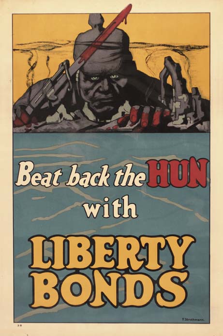
The next, largest gallery puts out the really colorful stuff we readily think of as showcasing the classic elements of graphic design - illustration and typography - in the form of bright and clever posters from the past hundred or so years (examples shown at the top of this post, and above at left).

It could be argued that the 20th century, with its political causes, social unrest, and explosion of commercial advertising, was the golden age of graphic design, and this room shows why. Whether selling war bonds, popular entertainment, educational toys, or soap, the artists behind these designs knew how to get our attention and make a lasting impression.

I had the company of an old friend and longtime graphic designer on this visit, and it was a pleasure to watch how he viewed the work in this section - moving in close and often marveling at the fine-art techniques, such as charcoal drawing and oil painting, that were employed in the service of these pitches. He frequently commented with amazement at the elaborate lettering that these pre-computer artists routinely hand-painted - a nearly lost art today.

For me, it was the simplest designs that held up the best. One artist featured prominently throughout the exhibition is Woody Pirtle, an internationally-known designer active in the Hudson Valley, whose politically-charged posters use color, shape, type, and iconic images in effortless concert to illuminate, anger, or amuse (example shown above at right).

Pirtle is among several top creators - all with local connections - featured in the last section of the show (Creative Process). The others are illustrators Dahl Taylor and William Westwood; design firms Vicarious Visions and Spiral Design; and early 20th-century designers Will H. Low and Hajo Christoph. All are of the highest quality in the business and have found significant commercial success - who knew the Capital Region was such a hotbed of creative design?

The Creative Process section has the expected preparatory sketches and such, but it also shows elements of the commercial design world not typically seen outside its own confines - promotional pieces in expensively elaborate detail that design firms use to give clients an idea of what they can do. Here, Spiral Design is the mind-blower, and it's here that I think the line gets crossed back over into fine art - because, in this case, the client is the artist, and the intention is to show the artist's skill. It's some pretty amazing stuff, from all the participants, and an impressive capstone to the show's historical lead-in.

Hajo, as he was known, is also featured in a separate exhibition one floor up from Get the Message! that details his personal journey from Berlin to Castleton, where he forged a career designing witty and sophisticated packaging for many local manufacturers (example shown at the bottom of this post). There are abundant examples of Hajo's extraordinary work in both exhibitions, including delightful personal art in watercolor, oils, gouache, and other media.

By the way - here's the quote that starts the exhibition, from Paul Rand (world-famous designer of iconic logos for firms such as IBM, ABC and UPS):

Design is the method of putting form and content together.
Design, just as art, has multiple definitions; there is no single definition.
Design can be art. Design can be aesthetics. Design is so simple, that's why it is so complicated.

Food for thought, no?

Rating: Highly Recommended

Note: Throughout the run of Graphic Design - Get the Message!, there has been a series of related lectures and events. The next two are coming soon - at 6 p.m. on Friday, May 6 (in conjunction with First Friday), illustrators Dahl Taylor and William Westwood will present; and at 2 p.m. on Sunday, May 8, Ellen Lupton, the author of Thinking with Type and other design guides, will address the topic How to Do Things with Typography: Introduction to an Art.

Further on, at 2 p.m. on May 22, graphic designer, typographer and calligrapher Paul Shaw will speak and sign his latest book, Helvetica and the New York Subway System; and at 6 p.m. on June 3, Laura Shore will speak on the topic The Truth About Paper.

All the events are free.

Thursday, April 21, 2011

A very brief visit to New York City

Museum of Modern Art patrons view a black painting by Ad Reinhart at Abstract Expressionist New York

It had been a long time, but I finally made it to New York City last weekend, partly to catch the AbEx show at the Museum of Modern Art before it ends (which will happen on April 26).

Formally titled Abstract Expressionist New York, the show occupies several large galleries in the painting section of the museum and is made entirely from MoMA's permanent collection.

What struck me most on this rainy Saturday was how intensely crowded the museum was. It took 20 minutes just to check bags and jackets, and then the process of viewing the art became a subtle of battle of wills, wits, and patience. I really felt bad for the guards, who had to somehow try to keep watch over this priceless art, most of it unprotected by any covering or barriers, as the hordes rushed and bumped about.

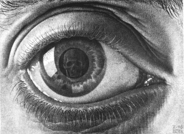
Still, it was possible to find short intervals of peace - even joy - while viewing the incredible wealth of paintings, sculptures, and photographs that are included in the show. Among my best moments on this visit was the discovery of Robert Motherwell's small 1941 gem Little Spanish Prison (shown at right), a painting I don't recall having seen before, possibly because it languished in the museum's storage (though that's just a guess).

Another epiphany came from the mesmerizing effect a certain purple, brown and blue Mark Rothko painting had on me - it literally caused a sort of vertigo, and I found it almost impossible to tear myself away from it. Obviously, the painter had honed his craft to the point that he knew exactly how to use color, texture, and composition to enter the brain via the eye and create this intensely meditative experience. Astonishing.

It was gratifying to see a smaller room filled with wonderful black-and-white photographs as part of this exhibition; most of them, naturally, are by Aaron Siskind, whose supremely silvery prints could make you pretty nostalgic for the old darkroom technology. Also represented here in relative abundance are Harry Callahan and Minor White, while most of the rest of the photos shown are one-offs by the likes of Walter Chappell, Fred Sommer, and - surprisingly - Nathan Lyons.

Speaking of photography, another current show at the museum offers a historical survey of the medium seen through the eyes of women. Not being much in the mood for a ponderous lesson, I jumped ahead and then homed in on my favorite of the bunch: Helen Levitt, represented by a glorious set of 14 color prints from the '70s and '80s (one is shown at left).

Levitt's happy eye never fails to delight, and her uninflected observations of life in the streets of the city are unparalleled. Adding to my bemused amusement was the thought that many young viewers of this work may very well be seeing a phone booth in use for the first time in their lives.

Earlier the same day, my constant companion and I were drawn into a brawny and spare display of sculptures by Tom Doyle at Sundaram Tagore Gallery in Chelsea (through April 30). The calligraphically gestural works in rough-hewn wood and colored bronze (one is shown below) resonated in my memory later, in a room at the Modern dominated by Franz Kline paintings and David Smith sculptures.

Doyle's work would have provided perfect company to those two, and there would have been room for one or two of them. Ah, well, wrong generation - but, thank goodness, it seems Abstract Expressionist New York is still alive and kicking.

Wednesday, April 13, 2011

In Memoriam: Nadia "Trink" Trinkala


A shining light of the Capital Region art scene was extinguished on Thursday, April 8, when Nadia “Trink” Trinkala died suddenly on Peebles Island in Waterford. She was 44 years old.

Nadia (pronounced Nay-dee-ah) was known to all gallery-goers as a smiling free spirit with fantastic taste in clothes and an extremely generous personal warmth that touched all who came in contact with her. A recent Times Union article described Trinkala as “a painter and jewelry designer, [who] was part of the artistic resurgence of Troy when she opened a gallery, design and furniture business on River Street in 2004.”

But Trink’s story didn’t end or begin there. After a career as a travel agent, and then selling vintage furnishings in Los Angeles, Trink returned to the Capital Region in 1997; in 2002 she opened a gallery in Cohoes that had a big impact on that city and on the lives of some of the artists involved.

Co-directors Tom D’Ambrose and Bob Gullie helped put on a show at Trink Gallery, titled Visions and Vibrations: The Visual Art of Musicians, that included work by already famous creators such as George Frayne (Commander Cody) and Martin Benjamin, as well as kick-starting the visual-art careers of such musical talents as Michael Eck, Chip Fasciana, and Sergio Sericolo, all of whom have gone on to significant local and regional recognition.

According to D’Ambrose, the gallery’s grand opening drew 1,000 people and caused traffic to back up along Remsen Street. He adds: Nadia had the most beautiful creative spirit of anyone I have ever known ... . She inspired creativity in a countless number of people in upstate New York and New York City, where she had been living for the past few years in DUMBO. Nadia rocked every city she had a gallery in ... Cohoes, Troy, and Hudson. The last time I spoke to her she wanted me to join her in a project that I feel had the potential to bring her beautiful creative spirit to a global stage. She was committed to changing the world through art and music. The world has lost its brightest supernova … .

Later, Trink (the furniture store) moved to Troy, adding a gallery called CJ Gallery at Trink, which showed the work of Wren Panzella, Piper Brown, Christopher Murray and others. D’Ambrose relates a highlight of that experience, when Kid Rock bought two Panzella paintings from the gallery on Labor Day Weekend. (That’s a Panzella painting in the photo of Trink at the top of this post, and one of her own works at right, above.)

A later incarnation of the furniture store and gallery had a brief tenure in Hudson, after which, according to the Times Union obituary, “Nadia … turned her energies toward her natural calling in life - to help others through her compassion and creativity. She began working with the disabled at ARC, Center for Disability Services, Carriage House, Living Resources, and Questar. Her honest spirit, which saw the person as opposed to the disability, led her to reach people in remarkable ways.”

She went on to seek certification in the field of Creative Arts & Music Therapy at The New School in New York and had recently been researching a practical and philosophic framework around the idea of "The Human Citizen." A LinkedIn page listed her occupation as “community enhancement.” She will be greatly missed.

Note: A memorial service for Nadia Trinkala has been scheduled for 2 p.m. on Saturday, April 30, at Cohoes Music Hall. For more information on this and other initiatives in Trink's memory, click here.