Tuesday, December 27, 2011

Best Shows of 2011

Cocotte Reading - from Pissarro's People
It's a time for looking forward and a time for looking back. As I check last year's Best Shows post, it amazes me how much things have changed as well as how much they have remained the same, at least for Get Visual.

At this time a year ago, I was crowing about how much traffic had increased on the site during its second full year. Well, this third year has seen the traffic rate double, tallying about 40,000 page views in 2011, with a peak of just under 5,000 for the month of November. Admittedly, a good number of those are probably just folks in Uzbekistan trolling for Norman Rockwell images to steal - but, hey, I'm not choosy!

George Rickey - Four Squares
from Sculpture in the Streets
Meanwhile, the product has remained consistent - 59 posts (last year had 54), representing at least that many exhibitions in a region that is so rich in fine venues; a milestone in the form of our first review written by a guest, that being Sara Tack's fine effort on the Michael Bierut show at The College of Saint Rose's Esther Massry Gallery (still there till Jan. 11, by the way), which went viral by our standards to draw 1,200 visits and counting; and the addition by host platform Google Blogger of easy captioning for images, making the posts more browsable.

Our regional cultural scene has also held up well despite the odds and the never-ending economic crisis that continues to hurt the arts more than any other category. This year we witnessed the birth of MoHu (still a work in progress, but a welcome addition to the overall energy); the near eviction of Upstate Artists Guild (still in intensive care but, hopefully, out of the woods); the death of Nadia Trinkala; and a wave of leadership changes at such institutions as the Williams College Museum of Art, The Albany Institute of History & Art, The Arts Center of the Capital Region, the Berkshire Museum, Fulton Street Gallery, Albany Center Gallery, Union College's Mandeville Gallery, and probably more that I don't know about or can't recall.

cant and wont - from Victoria Palermo: RAUM
The bottom line: Once again, we saw so many great shows in the past year that a simple Top Ten list will not suffice. However, because I now use a rating system, my job here is a bit easier. So, I will do a list this time - and then augment it with some excellent also-rans. Eight exhibitions that I reviewed received the coveted Must See rating; one exhibition that was rated Highly Recommended, in retrospect should have been a Must See; and two others would have gained that rating but were not reviewed due to conflicts of interest - they will round out this year's Top Eleven, which follows, arranged in the approximate chronological order of the exhibitions. Links are provided to the original Get Visual review where available.

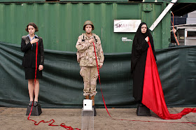
Arm - from Mark McCarty: Skin
One more "by the way": Last year's list did not include The Jewel Thief at the Tang Teaching Museum, because I hadn't seen it yet - but, as predicted, it did rate a Must See; however, it is not on this year's list because it belonged on last year's. Also, as hard as I try to get around to every worthy exhibition and site, there are always some I miss. If you know of a show or venue that should have been noted here but wasn't, please feel free to mention it in a comment.


The Top Eleven
Also outstanding:
It's worth pointing out that Sage College of Albany's Opalka Gallery made the list three times - that's because the Opalka has made a rare commitment to mounting solo shows by outstanding regional artists who may have been unjustly overlooked. It just happened that three of those shows came in the same year.

All in all, it was quite a year for most of the Capital Region's exhibiting venues - a good sign that the future remains bright in the region. For all of them, and all of you - here's to an outstanding 2012! And thanks for reading ...
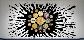
Yinka Shonibare - Black Gold I - from Environment and Object: Recent African Art

Thursday, December 22, 2011

Holiday time at the Albany Institute

Young Washington - lithograph by Alex Katz
The holidays are a great time to visit the Albany Institute of History & Art, both because the museum shop there overflows with fabulous options for cards and gifts at Christmas, and because the museum's educational/artistic vacation offerings for kids are always first-rate. But I'm here to talk about the exhibitions - and in that department this season has something for everyone.

For the history buff, there's First in the Hearts of his Countrymen: George Washington, which is described as "a visual exploration of America's fascination with Washington's image, ... and how Americans have used it to convey a sense of patriotism and shape a national identity." For the kid in all of us (especially we Boomers), there's Kid Stuff: Great Toys from our Childhood, which features all the toys you'd expect and ample room to try them in. And for the lover of all things shiny, there is A Gather of Glass, filling four freestanding cases with a few centuries' worth of glittering objects from the museum's collection.

George Washington was at the top of my list on a recent visit but, on my way up to the third floor galleries to see it, I could barely resist the siren call of all those nostalgic toys in the main second-floor space. I stopped, took a few hungry glances around and then, with my editor's voice ringing in my ears, got back on the assignment. Though the Washington show is long on historical context and a little thin in the serious art category, it held my interest with a densely packed tour of all kinds of artifacts, including statues, plates and pitchers, printed fabrics, postage stamps, medallions, engravings and more, all bearing the image of that towering figure.

Among the real curiosities are a cast metal savings bank representing the father of our country, an 1812 broadside printed in Albany that proudly proclaims having been "executed with American materials," and a walking stick fashioned out of a branch cut from a tree that grew near GW's grave. There are also several serious works of art, including a decent oil portrait based on Gilbert Stuart's famous one; two large, color lithographs commissioned by the Lorillard Tobacco Co. in 1975 in anticipation of the nation's Bicentennial and then donated to museums across the  land; and a very fine framed bronze bas relief profile of Washington by Charles Calverley.

items in A Gather of Glass
Naturally I was most drawn to the contemporary artworks in this show. The two big lithos, by Alex Katz and Audrey Flack, speak to history in at least two ways, by their own purposely representational content, and by their recognizably 1970s stylistic approach, now more than a generation in the past. A more recent work of art by Michael Vinson Clark, in which he paints whimsical background patterns on three color postcard reproductions of his own interpretation of the Stuart portrait, fits right in with them due to its overt Pop references. The show runs through May 20.

Back to Kids Stuff, there was enough personal history there to render me wholly unobjective about the experience. I think my sisters and I must have had at least 80% of the toys on display, from Hot Wheels to Barbie to Spirograph. My friends with children tell me things haven't changed much: their kids have Lincoln Logs, Slinky, Silly Putty and the rest as well. Go and enjoy, whatever your age (it runs through March 4).

A Gather of Glass is a delight. From functional bottles to Tiffany art pieces, its objects tell their stories, and ours, and sharply underline what a rich trove the Institute's collection is. The show continues through June.


Thursday, December 8, 2011

Dualities: Martha Bone and Bart Gulley at Architecture for Art

Painting by Bart Gulley from Black and Blue series
On a recent visit to Architecture for Art in Hillsdale, Bart Gulley and I discussed dualities as I perused his two-person show with Martha Bone in the two-floor exhibition space. It was our first meeting and my first time at AforA, so there was a lot to take in and digest. AforA director Liane Torre was also on hand, explaining the unlikely genesis a year ago of this brick-and-mortar setting from a longer-term, ongoing web-based project of the same name.

Gulley's work first caught my eye in the 2011 Exhibition by Artists of the Mohawk Hudson Region at the Albany Institute of History & Art (see review here); he makes Modernist paintings and collages with great purity, having evolved from a more Expressionist style in what appears to be a reductive maturation process. The work is crisp, clear, and somewhat dry at times, but seethes with a passion beneath the expertly rendered surfaces.

Bone's installation is, according to Torre, her first exhibition of any kind, and it is an engaging and impressive debut that effectively occupies the space it was designed for. Her explorations include a wide variety of materials - plastic cable ties, rubber hose, fabric, hand-built pottery forms, and ink on paper - yet come across in a surprisingly coherent manner (an example is shown at the bottom of this post). I look forward to seeing more from her in the future.

Paper collage by Bart Gulley
So, what of the dualities? Gulley mentioned his own distinction (or lack thereof?) between a landscape-oriented approach and a tabletop arrangement. I noted that his work sometimes hovers in a grey area between image and object. Then there's the issue of graphic design (Gulley's longtime profession) vs. fine art, as well as the given duality of the mission of AforA itself. This, too, suits the topic of Gulley's painting, as it is both architectural and abstract.

As is often the case with artists immersed in various media, collage is a touchstone for Gulley. While the upstairs space holds mostly paintings (and the Bone installation), the much smaller and warmly cluttered downstairs space (think museum shop) has a powerful series of five large collages in it that are every bit as accomplished as the bigger paintings. Based on our discussion, I would venture to say that Gulley values the collages more than the paintings - with good reason, as they have the advantage of being more personal and direct in their physical presence.

Altogether, each feeds off the other. The paintings could not exist without the collages (which often act as sketches for them), but the collages gain credibility from the fact that their maker is also a highly skilled painter. Yet another duality; perhaps we'll get to discuss it the next time we meet.

Rating: Highly Recommended

Note: Martha Bone and Bart Gulley remains on view at Architecture for Art through Dec. 18; the gallery is open Saturday and Sunday from noon to 5 p.m. and is located in the heart of Hillsdale on Route 23. If you go, plan to enjoy the drive, as it is particularly lovely country around there.

Wall installation of ceramic, fabric and rubber by Martha Bone

Wednesday, November 30, 2011

Victoria Palermo: RAUM at John Davis Gallery (and other Hudson shows)

cant and wont - platinum cured silicone rubber


Here's a heads-up for serious followers of contemporary art: There's less than a week left to see the exhibition Victoria Palermo: RAUM at John Davis Gallery in Hudson, and you don't want to miss it. If Palermo is new to you, this is as good a time as any to start following her work; or if, like me, you've followed her career for decades, you will be deeply gratified to see this amazing new work.

Palermo (no relation to Blinky), has always worked intimately with color - painted onto found sticks, poured onto paper from a nail-polish bottle, printed in patterns like wallpaper or, in this case, infused into the jellylike body of sheets of pure silicone rubber. Equally, Palermo works with form - her work relates to abstract approaches, but never completely leaves the referential realm - and she is as much a designer as she is an artist. In other words, she has always carefully constructed her pieces, even though there is also a degree of expressive freedom in them.

more or less
The earliest pieces I know of hers verged on expressionism; this new work, instead, pulls from the purity of Modernist architecture to develop miniature worlds of space and light - and, of course, color. Her nine freestanding works in this show are all on the scale of a model, and are presented near eye level on pristine stands crafted of white panels set on top of galvanized steel legs.

This elevated point of view is effective, helping us to get in close and experience the little spaces from inside and out. Moving around them, their varying degrees of transparency and translucency create ever-changing blends of color. One can also imagine that different lighting, especially the cycle of natural light through a day, would add to this engaging process.

Like many artists today, Palermo gives her works curious titles that, like the pieces themselves, hover between the literal and the fantastic, such as no beginning no middle no end, and cant and wont (apostrophes purposely missing). Some of the titles are more playful, as are some of the pieces they label, like bookish, plaidish, and in candyland. Speaking of candy, this work tantalizes the sense of taste by closely resembling jelly candies (I'm waiting for one to be titled Turkish delight); forget the nearly irresistible temptation to touch these gooey, wiggly structures - you'll struggle with the temptation to take a bite.

domino theory
In addition to the sculptures, Palermo has created a number of relief pieces in the same material that are mounted in frames under glass, an effective and less expensive alternative approach that retains the physical fascination of the other work but lacks the changeability of the full-round pieces (one is shown at left); the show also includes a few acrylics on paper that read more or less as sketches of architectural ideas related to the sculptures.

Take note: Victoria Palermo: RAUM ends on Sunday, Dec. 4. The gallery is open Thursday to Monday from noon to 5 p.m.

Rating: Must See


Also showing in Hudson (through Dec. 11) is a five-woman collection playfully dubbed Hudson River School of Women at Carrie Haddad Gallery. Haddad's annual landscape show has no surprises, but this is a worthy showcase of regular gallery artists who are all very good painters of landscape themes (the tongue-in-cheek title does not announce any real school here).

Jane Bloodgood-Abrams (an untitled piece of hers is shown at right) comes closest to the Hudson River School style, in that she favors mystical skies and sunsets; her larger paintings are rather misty (which may bother others like me who don't see as clearly as they used to), while the smaller ones virtually glow from within.

Juliet Teng works in a style that recalls the great American painter Wolf Kahn; like his, her treed landscapes are recognizable but stretch the boundaries of natural color to interesting places (a piece of hers is shown below). Similarly, Tracy Helgeson sometimes reverses color from sky to ground to trees, but Helgeson's palette is narrower than Teng's, relying largely on neon pinks and reds, where Teng ranges through the whole spectrum.

Perhaps the most intriguing of this group is Laura Von Rosk, whose style over the years remains consistent, but who grows subtly stronger over time (or else I am growing subtly more receptive to her style over time). These small, intensely hued and highly polished works on panel play a little game with viewers, by representing sweet, folk-artish fantasy landscapes in all seasons, but always clearly referencing strong female forms in mounds and V-shapes. Also represented in the show, by just two large, textured paintings of birches, is Susan Stillman.

Rating: Recommended
Pink Trees - oil on canvas by Juliet Teng

Another fine show in Hudson is a retrospective of works on paper by D. Jack Solomon at the Hudson Opera House, a nice public space in the open central foyer of a large performing arts center. I have written at length about Solomon's work here, so these comments will be brief - suffice it to say that this selection of 25 years' production is a very fine representation of the artist's evolving styles.

Comprising samples from several large bodies of work dating from 1986 to 2011, 25 Years in the Hudson Valley - On Paper offers some wonderful surprises even to those of us who already know him, and firmly supports my opinion that Solomon is one of the area's most important painters. The show runs through Dec. 10; the gallery is open daily from noon to 5 p.m.

Rating: Highly Recommended
Restoration - mixed media on paper mounted on wood by D. Jack Solomon

Friday, November 25, 2011

Kiki Smith and Whiting Tennis at the Tang

Two artists of both shared and contrasting sensibilities are presented in solo shows at Skidmore College's Tang Teaching Museum through the end of the year. Kiki Smith is by far the more famous and influential of the two; her show did not originate at the Tang, having been brought in from the Henry Art Gallery at the University of Washington in Seattle. Whiting Tennis, who hails from Seattle himself, is the subject of a Tang "Opener," whereby the museum's curators make a point of introducing an artist not previously broadly exposed in this area. So we have the known and the unknown side by side; the Seattle connection may be intended or not.

I Myself Have Seen It: Photography and Kiki Smith includes a very great number of photographs, but it also features sculptures, drawings, prints and mixed media, all of which are what the artist is widely known for producing. She is considered a feminist, in that her work runs counter to male-dominated viewpoints regarding the female body in art, and she is clearly very much of her time - a child of the '60s and '70s, wild and undisciplined in many ways.

The installation of I Myself Have Seen It is highly structured, however (see view at the top of this post), prominently featuring a narrow ledge at the bottom edge of the gallery's walls that supports an array of countless 4x6-inch color prints in minimal plastic box-frames, running like a subtitled narrative below the entire text of the exhibition. On the walls are many larger, properly framed photographs, as well as the other works, in great big groups and sequences.

Smith's imagery is process-oriented, often derived from ongoing sculptural installations, and it is gritty, grim, even gruesome by turns. Bodies are depicted nude, distorted and dismembered; faces are expressionless. This is not easy work to confront and, despite a lyrical patina to some of the colorful photographs that belies Smith's overall deathliness, difficult to enjoy.

In contrast, Tennis, who has his own flirtation with deathly imagery in the form of gallows- or coffin-like forms, is like a breath of fresh air. Where Smith is grim, Tennis is playful. Where Smith seems to carry the scars of a brutal childhood, Tennis seems to be carrying on the joy of childish exploration. Like Smith, Tennis is comfortable working in a variety of media; unlike her, he seems to have mastered his techniques, whereas Smith appears to be locked in a never-ending struggle with them.

Tennis shows a curious mix of influences: Pablo Picasso, Philip Guston, and Ed Ruscha all come easily to mind when viewing this collection. One room, which contains just five pieces, all dated 2011, represents all these influences and more. A painting titled Droopy (shown at right) is loosely brushed in narrowly limited shades of grey (Guston); another painting with collage (shown below), similarly structured but far more colorful, picks up the Cubist vein (Picasso); and an all-white wall relief that accurately depicts a streetscape has uninflected observation at its core (Ruscha). Then there is a perfectly formed geometric octagonal prism atop a crusty, wooden found table - going in another direction entirely, yet still in harmony with the rest.

Two crowded groups make up the highlight of this show in the sense of revealing Tennis's process. On one wall, a constellation of 36 drawings, prints, paintings, and constructions mirrors the type of installation used in Smith's exhibition downstairs. These works are variously cast, painted, printed, texturized, stamped, or shaped. Tennis is one of those artists who doesn't worry about how he makes it, he just has to make it however it needs to be made.

In another space, a large display of objects on shelves (shown at the bottom of this post) provides potential hours of perusal - there are 108 little sculptures in it, all around 6 inches tall, all handmade. It's an impressive display of ingenuity and skill, but also of freedom.

A lot of the work in Tennis's show is from the past year, showing an artist who seems to have really hit his stride; it's a pleasure to discover this work, which is exactly the experience intended by the Opener series.

Ratings: Smith - difficult to recommend; Tennis - Highly Recommended

Friday, November 18, 2011

Richard Deon: Paradox and Conformity at the ACCR


Installation view of Richard Deon: Paradox and Conformity
Photo by Richard Deon


You probably remember the Richard Dreyfuss character in the film Close Encounters of the Third Kind, whose obsession with a curious monolithic shape takes over his life. Another Richard D. has a similar obsession, as evidenced by a fascinating solo exhibition at the Arts Center of the Capital Region in Troy titled Richard Deon: Paradox and Conformity.

The show represents an extremely adept artist with a conceptualist’s thought processes, an installation artist’s approach, and an illustrator’s skill, who is not afraid to employ a wide range of media (acrylic on canvas, sculpture, collage, inkjet) to articulate his vision. And a rather peculiar vision it is, drawing heavily from elementary-school primers, historical references, and ideas about painting and corporate culture, just to name a few obvious influences.

Remaining Palette
acrylic on canvas by Richard Deon
Deon’s style is a confounding mix of the personal and the coldly technical. His notes to the exhibition, placed next to key pieces, reveal a quirky and deeply felt connection to the images and their content, while the manner in which the works are made borders on the mechanical. In one note, he refers almost passionately to a “blister yellow” field of color on a canvas that is “text ready.”

Most important, the work is almost fiercely consistent, making for a unified presentation of five years’ worth of material (augmented by a couple of related works that date several years earlier) that tightly fills the Arts Center’s ample main gallery. In contrast to nearly every show I’ve see in this space before, where sparseness has been the rule - and not always to good effect - this show is a bit overcrowded. If the work were not so clean and texture-free, it could be claustrophobic.

Peace Deal
painted wood, wheels by Richard Deon
The primary element in Paradox and Conformity is a flat shape that appears in nearly every piece, whether painted, cut out, formed in plastic, or blind-embossed. Apparently taken from the silhouette of a tabletop microscope with a cover on it, this iconic shape functions as an archetype, taking on different scales and meanings in different contexts. Whether as a sail, an award, or a talisman, the shape gains power from placement and repetition, just as symbols always have done throughout history and in human culture today.

Deon uses other archetypes in this body of work, among them a pedantic scholar, a stoic Everyman, and a small airplane, all of which are rendered in a flat-black shorthand. One can't help but ask the question over and over while exploring the show: What does it all mean? Clearly, it is the artist's intention to stimulate this quizzical state, but his game is not without a payoff - one is likely to leave the show with a pretty good idea, conscious or unconscious, of what we think it means, just as we do when we contemplate our everyday lives.

And that, I think, is the strength of this work. Though it is artificial almost in the extreme (and it's no accident that the first three letters of that word spell "art"), it is also deeply connected to who we are, where we come from and - one would suspect - where we are going.

Rating: Highly Recommended


Early Morning by Fern Apfel
Also on view, in the Arts Center's Foyer Gallery, is a sweet, strong exhibition by Fern Apfel titled Studio Wall. Apfel is a longtime favorite of mine, and this collection shows why - modestly sized but with an ambitious mix of media, Apfel's art is like a cultural note-taking process with beauty as a requirement. Be sure not to miss it when you go to see the Deon show. Additionally, upstairs in the Faculty Student Gallery there is a solo exhibition by landscape painter Deborah Bayly.

Wednesday, November 9, 2011

Michael Bierut: 30 Years/90 Notebooks at Esther Massry Gallery

By Sara Tack

It’s not often that a graphic design show appears in a gallery or a museum and even less often that one shows up in the Capital Region. That’s why it is pretty exciting to see a show of the magnitude of Michael Bierut: 30 Years/90 Notebooks get curated specifically for The College of Saint Rose’s Esther Massry Gallery in Albany.

Bierut, a partner in the renowned design consultancy Pentagram, has had a brilliant career, designing for a host of national and international clients. He is the author of 79 Short Essays on Design and founder of the popular online journal Design Observer. He’s a senior critic at Yale School of Art and frequent guest speaker at design conferences and organizations across the country. His work has won every design award there is to win, including the prestigious American Institute of Graphic Arts medal.

What distinguishes Bierut’s work from much of the design we see on a daily basis is that his pieces use clever, conceptual twists that create messages we have to think twice about. His ability to do this so poignantly is grounded in his knowledge of the subject at hand, his understanding of how to use modernist form to imply meaning, and a natural gift: intuitive wit.

Most of the pieces in the show are posters and most are in black and white. Sometimes the work has (what appears to be) such a simple concept you wonder why you hadn’t thought of it yourself. Yet the beauty comes from just how profound he makes “the simple.”

In one of the few multi-colored works - Obama Fifty State Strategy, 2008, a campaign poster for Barack Obama - every U.S. state’s name is re-presented and strung literally together without word spacing. Separated only by color, we read the play on words starting with Alobama and proceeding alphabetically through Wyobaming.

In the 7th Annual Book Fair to Help the Homeless, Bierut turns a black-and-white image of an open book upside down to create the roof of a house. At the bottom of the poster is a small, out-of-scale, solitary wooden chair. In a poster advertising the play The Well of Water, at the Parallax Theatre (one of many posters for the theatre in the show) we see a stark charcoal line drawing of a woman’s hair and upper torso. The rest of her face is created from stylized photographs. The eyes are hot and cold faucet knobs, her mouth the spout of the faucet where the water emerges. What is he saying about The Well of Water using a faucet metaphor to represent a woman's face? One would have to see the advertised play to find out.

There are quite a few stunning pieces in the show designed for the Architectural League of New York. Usually their purpose is to announce a lecture, or an event series. My favorite is Scale. This 36-by-48-inch horizontal has a solid black circle just under 36 inches in diameter anchored to the left edge of the poster. On the far lower right end of the circle is one word reversed out to white. The typography - all caps, san serif bold letters, not more than 1/4” in height - reads “SCALE.” The sheer literal contrast of scale focuses us on one of the most defining principles in art and architecture. This is extremely powerful.

Light Years, also for the Archi- tectural League, overlaps the letters of these two words laid directly over the other in varying translucencies. Without any literal illustration or photography, the layering of the letters on a solid black background visually suggests distance over time as we read the words “light years.”

Another set of posters for the Yale School of Architecture runs the gamut of Bierut’s thinking. Architecture and Psychoanalysis Symposium is both clever and funny. A modernist, 1960s-style psychiatrist’s couch is turned 90 degrees running vertically up the side of the poster. At a moment’s glance our minds transfer the image of the couch into an architectural structure/building.

Then we realize what we are looking at and can’t help but laugh at being let in on the visual and verbal play. Furthermore, we realize that, although the poster was installed vertically, it could also be presented horizontally (as shown above). It is more difficult to read the detailed text in this orientation, but that text now takes on the role of the architectural reference, suggesting a city skyline.

So what does the title 30 Years/90 Notebooks have to do with the show? There are two cabinets displaying many of Bierut’s black-and-white composition notebooks that he started using in 1982. He has accumulated 92 books in his 30-year career and can’t go anywhere without his most current notebook. They are used for everything from client meeting notes to thoughts on design, miscellaneous ideas, doodles, conceptual sketches, and working out his design process on any given commission. Many of the displayed pages allow viewers to make connections and see the thinking behind the work on the walls of the gallery.

Two-page spread from a Michael Bierut notebook

A commemorative poster was designed for the exhibit by Bierut himself and is available for sale at the gallery, signed or unsigned. Michael Bierut: 30 Years/90 Notebooks is on view through January 22, 2012.

Rating: Highly Recommended

Guest reviewer Sara Tack is principal artist at Smith and Jones and adjunct professor of visual communication & design in the Electronic Media Arts and Communication department at Rensselaer Polytechnic Institute.

Friday, November 4, 2011

Mark McCarty: Skin at Opalka Gallery

It is appropriate that the exhibition Mark McCarty: Skin at Sage College of Albany's Opalka Gallery begins with a self-portrait, because this show is as much about McCarty as it is about the many people depicted in it. Long awaited (McCarty's last solo show - aside from a wonderful mini-exhibition of iPhone pictures that just ended at McGreevy ProLab - was in 2004), comprehensive (the show presents 35 pieces, 36 if you count the one that is, inexplicably, included twice) and focused (all the works are black-and-white portraits) Skin happened because Opalka Director Jim Richard Wilson recognized that it needed to happen.

McCarty has been making both personal and commercial photographs for over 30 years, and both have brought him considerable recognition. But the effort to mount a major art exhibition is easy to leave aside when you are dealing with clients, raising a family, meeting deadlines. So McCarty continued to make the personal work - that's essential - but has tended to only show it in dribs and drabs, usually at one or another regional group exhibition.

Now, we have the opportunity to look at a broad and deep slice of those pictures - still limited to a particular long-term project or two, but a good choice was made to present a very personal segment of the total output, rather than a more diverse survey. It tells a deeply compelling story of lives written on the skin of those living in it, and of McCarty's place amid those lives as participant, observer, and compassionate collaborator.

Like a lot of commercial shooters, McCarty is well versed in a great array of technical skills and styles. This show includes a couple of grainy 35mm shots; 11 images from a square-format rollfilm camera; and 23 prints from 8-by-10-inch sheet film (these in two sizes). All the prints have been produced by digitally scanning the negatives and printing in ink on heavy paper - but you would hardly know it, as they have the look of gelatin-silver prints in texture and tonality.

More than half the pictures are of McCarty's immediate family - wife and children - including his first wife, Vicky, who died of cancer when their daughter, Kate, was still a baby. One of the most affecting images in the show (and no less so for being about 4 by 5 feet) shows Vicky and Kate from behind, their oval heads in rhythm, the regrown hair on Vicky's not nearly as thick as the first-grown hair on Kate's.

In this, as in nearly every image in the show, the subjects are unclothed; those who are not part of the nuclear family include a number of elderly Alzheimer's patients, and others of all ages. Almost never is the picture a "nude," though some get near that when the subject's face is obscured or cropped out. Not surprisingly, those tend to be the less compelling images.

The textures that give the show life are mainly those of the face, with all its lines and freckles, the hands (ditto) and, in certain strong instances, the hair and nails. One very expressive portrait of the photographers' nude second wife crops out her head, but allows her hands to receive the treatment of a sensitive portrait. Another image, of a woman identified as Emilee, shows mainly her torso from the side, folds of fat, stretch marks, scars and all. And another, of the only non-white person in the show (named Miss Ada), is full-face with eyes squeezed shut - but behind one set of lids, there's a hollow socket.

Though the pictures in Skin go back to 1985, it is worth noting that these last three were all made in 2011, clearly demonstrating that McCarty remains at the peak of his creative and expressive abilities. Still, the exhibition works very much as a whole, as a timeline of one life's intimacies and contiguous looks outward in the form of portraits. McCarty's world is here, as is his world view. It is a vital viewing experience.

Rating: Must See

Note: A very handsome catalog, with an opening statement by the artist and essays by Phyllis Galembo and Lyle Rexer, has been printed to accompany the exhibition Skin. Larger and more sumptuously designed than past Opalka catalogs, it is priced at $20, a nice deal. Be sure to check it out when you go.

Monday, October 31, 2011

LOL at Albany Airport Gallery


At left, Granny Panties for My Ex-Girlfriend by Benjamin Entner;
at right Self Portrait by Spring Hofeldt
In a way, the Albany International Airport Gallery is like an ongoing Whitney Biennial of the Capital Region. Curator Sharon Bates mounts just two shows a year, usually around a pithy theme, and she often populates these shows with work by artists she's spotted at other venues around the area, in a sort of sifting and consolidation process.

The downside of this approach is that regular viewers of local galleries and museums will encounter things in these shows that they've already seen before, sometimes quite recently. But those are not the viewers the Airport Gallery targets; rather, Bates creates for an audience of travelers, many of whom are not from around here and will never venture beyond the terminal as they seek ways to kill time between flights.


And, in more than 10 years of honing that aim, Bates has adopted a formula that really works - even achieving national recognition for excellence in cultural programming at airports. So, it's no surprise that the new show at the Airport Gallery, titled LOL, is fresh, funny and - yes - surprising, despite including some familiar work.


OMG by Brian Kane
While being humorous would seem to be a prerequisite for inclusion in this exhibition, there are many kinds of humor, and not everything here evokes giggles or guffaws. But some of the artists do purposely go for the laugh, particularly Tim Davis, whose sly, slapstick video sequence titled Upstate New York Olympics features such hilarious pursuits as Lawn Jockey Leap Frog and Snowman Jiu Jitsu, in which the artist is seen nonchalantly launching himself over little statues on display in yards of every economic demographic, and violently assaulting unsuspecting Frosties, ninja fashion. I like slapstick and, yes, watching Davis did make me laugh out loud, as it did the Three Stooges-loving friend who accompanied me.

Other work had a more sardonic appeal, such as Roger Bisbing's meticulously detailed, miniature construction titled Shaker Air, in which stoic wooden furnishings are arranged in the configuration of a 737 jet. Created specifically for LOL, this work's humor depends on your understanding of Shaker life, and the fact that the airport is on Shaker land.


Also thoughtful and evocative is Michael Oatman's installation titled Cesare Lombroso's House of Pizza, in which a slightly tongue-in-cheek narrative explores the unlamented stereotyping of the mustachioed Italian pizza man. Sixteen silkscreened variations of the character are arranged in a grid to illustrate the cultural phenomenon, but it's hard to get to exercised about a happy pizza guy when, well, happy pizza guys are such a good thing.


This is how you repay me? by Gregor Wynnyczuk
Oatman also collaborated on Forest Freshner with Brian Kane, in which the artists made an oversized version of the classic pine-tree car freshener, shaped and scented like a new car, and photographed it being hung in the great outdoors. Kane's solo contribution to the show is equally witty and Pop-inspired: a big, red word balloon that says "OMG!," just like every tween alive.


Also notable for dry wit and impeccable technique are the drawings of Andrew DeGraff, an illustrator who likes to tilt at iconic figures, and who makes you smile but also makes you think. His We are All Descended from Homeless People is, rightly, the poster image for the show; and his The Lord's Typewriter and The Selection of Darwin are wonderful comments on scientific and religious objects of worship, which also happen to be beautifully crafted works of art.


Equally beautiful are the three small paintings in the show by Spring Hofeldt,  which are more playful than funny, but which are so well painted they make you want to see many more. Her self-portrait distorted by a glass vessel in front of her face shows that not all postmodern feminist artists take themselves too seriously.


Two of the other three women in the show cover domestic topics (Minna Resnick on the family vacation; Joy Taylor on garden tools and personal accessories) in fun or self-mocking ways, but don't completely avoid the heaviness that seems to curse so many women artists since the awakenings of the '60s, and which doesn't plague the men quite so much, leaving them free to go completely off the wall.


Technically far more crude than Hofeldt or DeGraff, but just as clever, are the found-art musings of Gregor Wynnyczuk, who elevates kitschy paintings to the level of existentialist philosophy by placing black vinyl text on top of them, then adding evocative titles, such as What's gotten into you lately? and I'm not like the others. But his indirect take on personal issues is dwarfed by Benjamin Entner's 7-foot-long Granny Panties for My Ex-Girlfriend, which just dives right into the outrageous way relationships make us feel.


The other artists in LOL are Torrance Fish, Linda B. Horn, Steven Rolf Kroeger, and Owen Sherwood. The exhibition, which is accessible to the non-flying public from 7 a.m. to 11 p.m. every day, will remain on view through Mar. 25, 2012.


Rating: Highly Recommended

 
Forest Freshner by Brian Kane and Michael Oatman

Saturday, October 22, 2011

Myth in Metaphor: The Etchings of Steven Hazard at Clement Art Gallery

I don’t know Steven Hazard personally, but his show at Clement Art Gallery in Troy says a lot about what sort of person he must be. Like many artists, he is obsessed – but unlike most people, artists included, he appears to be singularly devoted to his obsession, giving his entire existence over to creating a very particular world in carefully rendered and heavily layered imagery.

At his home studio in Albany, Hazard makes etchings, which he frames himself and takes on the road to sell at craft fairs and such; these travels have allowed Hazard to make a living, but have largely prevented him from pursuing traditional gallery shows. Myth in Metaphor is the first local show I can recall that features more than just a few of his works.

So this is a welcome opportunity to take in the scope of Hazard’s output – especially because, despite the small scale of the gallery, it’s a comprehensive collection that spans from the 1970s to the present. Then again, for me the show is perhaps too complete – Hazard’s images are so dense that it is a challenge to take in very many of them at once, and the result is that the experience is somewhat overwhelming.

The show includes a great deal of text, most of it written by Hazard to explain the complexities of his ideas and images, some of it taken from other sources. One such quote says his prints “often represent the sensory overload ... of the modern world,” which mirrors my own reaction; I would add that they also draw from the ancient and medieval worlds to further populate this Bosch-like, crammed universe that Hazard so relentlessly depicts.

Apart from the many etchings on view (both framed on the walls and stacked unframed in bins), the show features several pencil drawings, which provide a bit of respite from the dark, layered prints. One of the drawings, titled Four Elements and dated 1999, provides the template for a same-size print also on view. At about 20x34 inches, it is large for Hazard and, being in graphite rather than ink, it is both lighter in tone and more richly detailed. One could spend hours just exploring this single piece in all its intricacy.

Another drawing, Article of Faith, is dated 2011 and features softer marks in a couple of colors on textured, grey paper. While its content is similar to the other work on view, it has a lighter touch, and its use of a rabbit as the main subject makes it more approachable than many of the more forbidding subjects presented here.

Those consist of the human figure, animals, mythological characters, machinery, architecture and landscape – sometimes all in one picture – and all of it elaborately staged to tell a story in actions and symbols.  The many black or brown single-plate etchings shown here are augmented by quite a few colorful multiple-plate etchings, as well as some lovely hand-colored etchings.

Hazard displays great skill with drawing, spatial perspective, and visual invention, and his well of creative ideas seems bottomless – but I find the technical quality of his prints to be wildly inconsistent: some are crisp and clear, others very muddy, and many are too heavily inked, which causes a lot of blocking up in the finer details. In work such as this, where it’s not just about the lights and darks, or the shapes and lines, but where every bit of information carries intent and meaning, that matters.

Note: Myth in Metaphor: The Etchings of Steven Hazard closes on Weds., Oct. 26, so you must hurry if you’re planning to see it; also, the gallery will publish a catalog of Hazard’s work by December, adding to the lineup of quality publications it has brought out for its artists over the past few years.

Rating: Recommended

Thursday, October 13, 2011

Are We Having Art Yet? Bill Griffith at BCB Art

Irreverent, absurd, existentialist - Bill Griffith’s Zippy the Pinhead embodies these traits as only a character born out of the San Francisco underground comics scene of the 1970s could. Yet in 2011 he is going stronger than ever, in syndication to about 200 daily newspapers, out in a new book, and now appearing in an inspired exhibition at BCB Art in Hudson.

Titled Are We Having Art Yet? Selected Drawings 1978-2011, the show presents numerous original inked versions of daily strips, several inked originals of a 1990 Zippy calendar, a few pencil renderings of early Zippy covers, and signed inkjet prints of other Zippy material. All the work on the walls is in ink or pencil – i.e. no color – and was, of course, created for reproduction, so it has that special quality of blacks and whites, of hatching and cross-hatching, that gives all graphic art a certain eye-appeal.

But, rather than let the monotony of monochrome get overwhelming, Bruce Bergmann, the gallery’s owner, has placed most of the work along a bright yellow rail, backed by a garish band of the same yellow with a pattern of big, red polka dots. The design scheme is taken from Zip’s costume, but it also imparts a properly carnivalesque atmosphere to the exhibition. Yes, it says, you may be in an art gallery, but you don’t need to take anything too seriously here.

An art calendar drawing by Bill Griffith
As these are comic strips, naturally the show is a hoot; but what makes it really special is that all the strips are specifically art-related. It is certainly a comic fan’s delight – but it is also an art critic’s paradise. Griffith went to art school and attempted a career as a painter before stumbling into comics in 1969, and he loves to send up the posturing of serious artists and pundits. Jokes about Picasso, Giacometti, Pollock and Magritte here coexist with jokes about Ingres, DaVinci, ancient Greece and cave art.

With the irrepressibly idiotic Zippy as his guide, Griffith has no fear, and the results are hilarious.

For most, including myself, Zippy is an acquired taste. His bizarre appearance, politically incorrect moniker and – above all – chronically off-the-wall pronouncements are not going to be for everybody, even those of us who are used to edgy stuff. But he grows on you – his sweetness, his persistence, his inability to grasp basic reality – it all adds up to irresistible charm.

Whether you like the humor or not (and in the case of these strips, it helps to be conflicted about modern art), seen up close in the original, the drawings show that Griffith is no pretender – he’s got the chops to draw anything well, and he’s got the graphic sense to know what to draw and what to leave out. It’s clear, crisp communication.

While much of the work is simplified, and much of the content goes in the direction of one-liners, some of these drawings also have a great deal of complexity built in, and with lengthy perusal will yield new secrets. Mostly, though, it’s about the humor of absurdity and, in this particular selection, the absurdity of the art world. Which works real well for me.

Rating: Highly Recommended

Friday, October 7, 2011

MoHu

Some day we will all be bragging that we were here for the first MoHu festival. Let's get out there and make it real!

Tuesday, October 4, 2011

Ten Years: Remembering 9/11 by Marie Triller


In the inevitable push-pull between form and content that lies behind all photographic imagery, the work of Marie Triller falls squarely in the middle of the argument. But it’s a pretty big middle and, as seen in the just-published collection titled Ten Years: Remembering 9/11 ($29.95, John Isaacs Books), her work covers much of that range.

Triller, who earned an MFA at SUNY New Paltz and works as a high school art teacher, has had a quiet but persistent presence on the Capital Region art scene for decades, and for much of that time she has exhibited expertly made, digitally captured color photographs that represent human culture, often from travels to distant places such as Belize, Ireland, and the American Southwest. One might argue that these pictures were clearly documentary in purpose – and that would be true – but it is equally true that they were intended as personal artistic expression. The pictures presented in Triller’s new book are no exception to this duality.

Beginning with a full-bleed cover shot of a motorcycle gas tank embellished with an exquisite painting of a New York City skyline dominated by hovering ghosts of the twin towers of the World Trade Center, the book teases the eye as much as it plucks at the heart strings. Immediately, the parameters are shown: This photographer use color, shape, composition, and point of view in ways that your everyday documentary photographers do not.

Perusing the sequences of images inside, which are organized into nine chapters of equal length, one gathers a cumulative sense of the deeper meaning behind the work. The result of 10 years’ worth of anniversary visits to the site of the WTC attacks, these 97 pictures were culled from thousands, then thoughtfully sequenced to offer Triller’s interpretation of the chapters’ themes: Memory, Security, Expression, Reflection, Community, Courage, Place, Justice, and Spirit.

Triller explains in a short opening essay to the book that she avoided the press photographers’ territory in “the pit” at Ground Zero, choosing instead to focus on “the periphery, the crowds who gather each September 11 morning, and who tell a truer story of that bright, dark day.” I think Triller would say that, through these pictures and this book, she is attempting to share that story – their story – with the rest of us.

But a photographer – an observer – cannot set himself completely aside from the story he photographs. And, so, Triller’s book is the record of her experience of that story, filtered through her eyes and her lens. What I see when I look at these pictures is a wonderfully sensitive, open set of eyes, guided by an equally open heart, which is thrilling and impressive; I also see a highly trained and critically honed eye, which is delightful – and impressive.

Which moves me more? In this work, each depends on the other. The picture of a dark-skinned woman clutching a bouquet of multicolored roses is pure visual candy – made bitter by the knowledge that she has brought them not to celebrate a love, but to remember the loss of one. On the page opposite, low-angled sunlight hides a man’s face in shadow under a red-white-and-blue hardhat; the picture is as balanced as a still life, as the man bows his head reverently, the hat emblazoned with signatures of other surviving rescue workers.

There are American flags visible throughout this collection, hanging gigantically on buildings, stitched onto clothing, and everywhere in between. This is inevitable given the book’s source material, but it is also, perhaps, a sly nod to two seminal photography books of the past century: Walker Evans’ American Photographs and Robert Frank’s The Americans, both of which used the presence of the stars and stripes as a visual cue woven into the fabric of the books’ layout schemes.

Triller uses the same technique, placing a photo with a prominent flag at the start of the book and often beginning each section of the book with one, too. But her tale is not a patriotic or political tract – it is all about the people who come each year to remember the tragedy of 9/11 at its epicenter and who are presented here with their raw emotions on full display. Included among them are many in uniform, in family groups, in work clothes, business dress or biker attire. Many also have their own creative or political message to share, duly recorded by Triller’s camera.

The photos are presented without titles or captions – we are meant to take them in visually and draw our own conclusions about what they may mean. This is one of the book’s great strengths. It’s difficult to approach a subject so charged without succumbing to the temptation to preach, but it may be even more difficult to craft a narrative with images alone, as Triller has done very successfully here.

Text is provided in the form of a foreword by Sen. Kirsten Gillibrand, Triller’s introduction, and a thoughtful afterword by Eleanor Heartney – all are brief, leaving the pictures to do the real communicating. They do it eloquently, and beautifully.


Note: There will be an exhibit of 11 of Marie Triller’s 9/11 photographs at The College of Saint Rose’s Massry Center for the Arts atrium gallery, 1002 Madison Ave., Albany. The show opens on Sunday, Oct. 16, and will run through Sunday, Dec. 11. Triller is an alumna of the college.