Get Visual is the grateful recipient of a grant from The Christos N. Apostle Charitable Trust

Sunday, March 29, 2015

Nicholas Krushenick at the Tang

Installation view featuring the painting titled Electric Soup at left
photo by Arthur Evans
It was 1979: Punk rock was at its peak, rents in SoHo were still cheap, and Nick Krushenick was nearly a forgotten man. My college painting class was on a field trip to New York City, where a visit to Krushenick's studio had been arranged. The artist showed little enthusiasm, reluctantly pulling a few paintings from a leaning stack, far less interested in talking about his work than he was in bragging about his son's band, which had just cut their first record.

Nicholas Krushenick - Battery Park, acrylic on canvas
Flash forward to 2015, and the late Krushenick is now the subject of a solo show at Skidmore College's Frances Young Tang Teaching Museum and Art Gallery, such a rarity that the 20 major pieces it has brought together represent the biggest collection of his work ever seen publicly. Nicholas Krushenick: Electric Soup, on view through Aug. 16, is a brash, bold exhibition that spans over 30 years of output with pristine, large-scale acrylics that appear so fresh they just about jump right off the wall.

Krushenick is considered a pioneer of Pop abstraction, but is not easy to label: Wall text at the show explains that he "developed a distinct style that straddled the lines between Op, Pop, Abstract Expressionism, Minimalism and Color Field." Krushenick himself is then quoted as saying, "They don't really know where to place me, like I'm out in left field all by myself. And that's just where I want to stay." Rightly so, as that's exactly where a truly original painter belongs. Krushenick's work, being mostly hard-edged and flatly painted, would be easy to copy yet still appears innovative and unique.

Quick Red Fox, acrylic on canvas
But Krushenick didn't work in a vacuum - he took direct influence from Matisse's cutouts, making paper collages himself as he experimented with style, then picked up the habit of outlining every color in black (check out some Matisse paintings and you'll see a similar technique employed there - it makes the colors look purer, richer, and brighter). Krushenick also severely restricted his palette (as represented here), using only black, white, the three primaries, and the three secondaries (and, of those, mainly orange).

Though square and angular geometry is prevalent, Krushenick also used softer forms, curves, flowing lines, and shaped canvases. Four of the earlier pieces in the show, from about 1962-3, are painted freehand, so the black outlines are irregular, and they have a lot of painterly texture below the surface, a touch that disappeared in all the later works. The four also share an element of woven forms that do not reappear in the later work, except as flat grids. Among these is Quick Red Fox, the Tang's signature image for the show, and one that also uniquely features the color silver (shown above at left).

CBGB  acrylic on canvas
The latest piece included, which is among the few horizontals here and much smaller than the rest of the work, is 1994's CBGB. The title presumably refers to the legendary music venue in New York (where I'm guessing the younger Krushenick may have performed) and the painting presents a distinct proscenium. Indeed, a number of these works suggest curtained openings, and at least one, Battery Park, is notably vaginal or sphincter-like in its forms. Others suggest flower petals, clouds - or word balloons - and the type of splots you'd see in a Batman comic. These call to mind another painter of the same era, Peter Max, whose style was famously used in the animated Beatles movie Yellow Submarine. So I'd say the Pop label really does fit Krushenick best.

In the end, I found the work speaks with a clear voice across more than 50 years of densely packed history, and was a real pleasure just to hang out with. But you can still take this art seriously - I'd argue that one painting in the show, 1993's Space Map, is influenced by both Willem DeKooning's and Wassily Kandinsky's later works - and if you do take art seriously, or just want to enjoy a fun show, then don't miss this one - it passes both tests with flying colors.

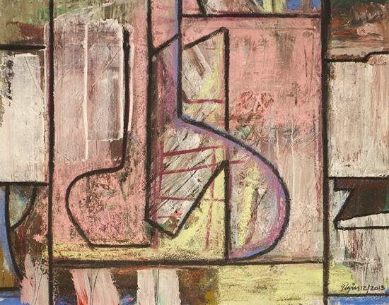
Jeffrey Elgin -Thus Passed Some Days, mixed media on paper
Another show of paintings at Skidmore that should not be missed is a 20-year retrospective by Professor Emeritus Jeffrey Elgin, presented in the art department's Schick Art Gallery.

Elgin's earlier work evokes Cubism in both its rigorous fragmentation of shapes and its dark palette - but as the years go by, he lightens up, resulting in more penetrable and joyous work. I was amazed by Elgin's ability to invent new forms constantly, and to avoid the pitfalls of representational associations - though, when he does appear to have a "subject," such as a window view or a row of common objects, it still works. I liked the show so much, I bought a painting.

Jeffrey Elgin - Thus Passed Some Days: Twenty Years upon an Overgrown Path is accompanied by a nicely produced 20-page catalog, which is available free in the gallery; also, there will be an artist's talk there at 4 p.m. on Thursday, April 9. Please take note, the show ends on April 26.


Wednesday, March 18, 2015

37th Annual Photography Regional

Beau Comeaux - Rubble
The 37th Annual Photography Regional is both a glimpse of the past and a window on the future. Hosted this year by The Sage Colleges' Opalka Gallery, the Photo Regional's present iteration is a truly fresh experience that also speaks clearly to the show's long and influential history.

Steven Fink - SX-70 iPhone, 2014
Featuring 80 works by 39 artists, the show was ably and amiably judged by the collaborating duo Robert and Shana ParkeHarrison, who filled the capacious gallery with a broad sampling of styles, often choosing three or more pieces by individual makers, which gives the show a welcome depth often missing from such juried affairs. Prizes, chosen by the ParkeHarrisons, went to nine recipients, including two prizes given to student work, a first for the Regional in my memory.

Overall, I got some very strong impressions of where art photography is at in 2015, and I liked what I saw: A lot of black-and-white work (whether digital or traditional); a good amount of strong color abstraction; a great deal of personal documentary; and some experimental/technical stuff - but very little of what I would call "postmodern," especially of the often annoying "created to be photographed" genre.

Erin Shipley - Yielding Defects #3, 2013
In other words, if this is the photography of the future, then the future is having a healthy reconsideration of the deeply felt and, to me, quite righteous photographic concerns of the past. The fact that 11 of the 39 included photographers are students (blindly chosen) is particularly encouraging - actually, some of the best work in the show is by students, and that includes both old-fashioned and progressive styles of work. There are also appearances from some of the Regional's earliest regulars (i.e. folks who showed in the Regional as far back as the late '70s) and, in another possible first, a father and his son (Steven and Jeremy Fink) are both included.

Larry White - Mantle, 2014
And, speaking of Steven Fink, I was surprised that his five large, boldly vibrant color prints, which introduce the installation with a happy shout, did not get even an honorable mention; though I have no quibble with the jurors' prize picks on the whole, I just don't get how you can like it enough to give it that much space, but not better than some other work that was otherwise rather modestly featured. Bold color also makes an appearance in the form of a terrific one-liner from the ironically surnamed Larry White, in which a wild painting above a mantle announces itself with a tiny but sharply visible signature.

Brian Williams - Pieces of 2, 2014
Also appealing are a handful of collaged, montaged, or digitally painted pieces by Liv Zabka, Treha Myth Downey, Brian Williams, and George Guarino. All make great use of a few of the zillions of possibilities that digital photography offers, without overdoing it. Beau Comeaux, a Sage photo professor, also uses the new technology, but he makes moody, timeless, almost spooky images with the big color printer, and they are toned down rather than pumped up, color-wise.

Jess Ayotte - Lucid Dream
But it's the more traditional work that steals this show - whether monochromatic, subtly colored or, as in several cases, using both color and black and white in the same presentation, these works delve into the personal stories and histories that make up so much of the great photography of the past. None is more effective than top prize winner Daesha Devon Harris, who pairs very fine square-format color portraits with small, grainy black-and-white transparencies of the same people seen in earlier times, then adds poetically evocative titles. Her works succeed by making the personal universal, in this case projecting black history onto the black individuals she lovingly portrays.

Also outstanding are three creepy Joel-Peter Witkin homages by Jess Ayotte in delicious black inkjet on paper, and Matthew Klein's lush prints that evoke the great Chicago street photography of Harry Callahan - or that of William Klein (a relative perhaps?), both working in the '50s and '60s. I'm not on a nostalgia trip, but I love seeing this excellent work from so many photographers who may very well be dreaming of the past, or at least look as though they do.

Matthew Klein - Oh Darling, 2013

Friday, March 13, 2015

Adirondack Artists’ Guild's 17th Annual Juried Art Competition

BEST IN SHOW: Elaine Vollherbst - Highway 28N Long Lake
Last weekend I had the privilege of driving up to Saranac Lake to judge the Adirondack Artists’ Guild’s 17th Annual Juried Art Competition. When I arrived, the Guild’s gallery - a pleasant, functional storefront on Main Street - was crammed with 185 entries in all media. My job was to trim these submissions to about 75 for the show, and to choose prizes to be awarded at the show’s opening reception: Best in Show (which carries with it the opportunity to have a solo exhibition at the gallery in November); 1st, 2nd, and 3rd prizes; and five Honorable Mentions. Needless to say, it was a daunting task.

A view of the AAG gallery
Here’s a first-person account:
Feeling a bit overwhelmed by the quantity (and overall quality) of the entries, I first sought to get my bearings. My hosts were three members of the Guild, a cooperative business whose 15 or so joint owners share the effort, expense, and rewards of such an enterprise, and they were graciously helpful throughout the process. They remained quietly alert as I worked my way around the room two or three times, occasionally answering questions I had as to certain relevant details. At this point, I had not yet begun to cut.

FIRST PRIZE: Shawn Halpern - Blue Cedar Vessel
The entrants were limited to three pieces each (maximum), and in many cases it was easy to tell which two or three belonged to the same artist – but not always. It also wasn’t always easy to tell the medium (and, I am embarrassed to admit, one pair of photographs had me fooled to the very end, when I was told they were not, in fact, amazingly detailed paintings). So my helpers provided clarification where needed.

The show drew a great variety of media, including most craft media (such as clay, glass, fiber and wood), jewelry, sculpture, mixed-media constructions, and two-dimensional paintings, prints, drawings, and photographs. I decided I must aim to maintain the diversity of the submissions in my final selections, as this was clearly the spirit of the show, and I delighted in keeping an open mind as to the intention of the artists.

SECOND PRIZE: Susan Hoffer - Connecting to the Protest
While I made judgments based on my own ideas about quality in art (including technical skill) and allowed my personal biases (or taste, if you will) to influence some decisions, I also tried to be receptive to the various styles and concepts that would motivate the artists. Slowly, I began to clarify which work was surely in and some that was surely out. Post-It notes helped streamline this process, and the helpers began to carry the work that I eliminated out of the room.

HM: Richard Nowicki - Lake Placid Outlet
I’m comfortable with all art media and have curated or written about all media for many years, so that was not an issue for me. However, one issue that did arise is that the Adirondacks region is very different from a city (even a small city like Albany, where I live), so I was confronted with a lot of unfamiliar rural and wilderness subject matter, including a good number of paintings, photos, and other media that depicted wildlife. To me this is a subgenre of art with its own set of rules – rules I may not be privy to – but I tried to give it the best consideration I could. After about an hour, I had picked about 40 things I knew I wanted to stay, and had cut an equal amount, leaving maybe 100 others in limbo.

HM: Lynn Taylor - Lake Lilies
Many artists entering a show like this take up certain strategies. For example, some may try to second-guess the juror and submit work that is calculated to appeal to that juror’s taste. Others will try a variety of styles or subjects to increase the chance of hitting something that the juror likes. But these attempts to outwit the juror are tactical errors, because they often fail to represent the artist’s best work or communicate the artist’s personal vision.

HM: Anastasia Osolin - Look
When I judge a show (or write criticism), I am looking for an individual style and a commitment to a personal vision that clearly communicates who the artist is and what they are passionate about. I seek to understand the artist – in his or her own terms – and then decide how successful that effort is. At this point, it became necessary to move things around, so I could see each artist’s work grouped together (the original hanging was totally random and many artists’ pieces were separated). Now the show was beginning to take on a shape, and I could more easily include and exclude more pieces.

HM: Steve Auger - Winter barn
I was trying to find the innate strengths in the work now, more than I tried to decide what I “liked best.” There was a simple but elegant clay bowl; a starkly illustrated woodland scene of an owl with its raccoon prey; a couple of quirky cartoonish drawings in glittery frames; and lots more. Many photographs were submitted - not because I am known as a photographer - but (I was told) because there are a lot of photos submitted every year. So I chose to include many good photographs of different kinds. There wasn’t a lot of non-representational work submitted, but the best of that I opted to include (paintings and fiber art, primarily). And there were many very well executed landscape paintings, including a couple of nearly abstract ones that reminded me of John Sloan; I chose those as well.

HM: Cris Winters - Arc of the Day
Deciding the prizes was a tough challenge that gave me serious doubts, but which ended up being very satisfying. The final cuts always hurt, and some excluded work perhaps deserved to be included, but I feel very comfortable that the best work submitted to this competition is the work that has received the prizes. I think that work displayed the strengths I describe above, as well as representing great skill – whether high or low – in carrying out the artist’s personal vision. Usually, this came across via two or three pieces that worked together as a body, though there were instances of a single piece that was so well realized in itself that I had no doubt about its meaning. Most of the prize-winning work is reproduced here, so you can decide for yourself if you agree or not.

Congratulations to all the artists who submitted work, and many thanks to the AAG for asking me to be their judge this year.

The opening reception for the Adirondack Artists’ Guild’s 17th Annual Juried Art Competition is today (March 13) from 5-7 p.m., with awards to be announced at 6; the show will hang through April 12.

THIRD PRIZE: Phil Gallos - America the Beautiful #17