Get Visual is the grateful recipient of a grant from The Christos N. Apostle Charitable Trust
Showing posts with label sculpture. Show all posts

Sunday, October 30, 2022

In Memoriam: Frank Giorgini

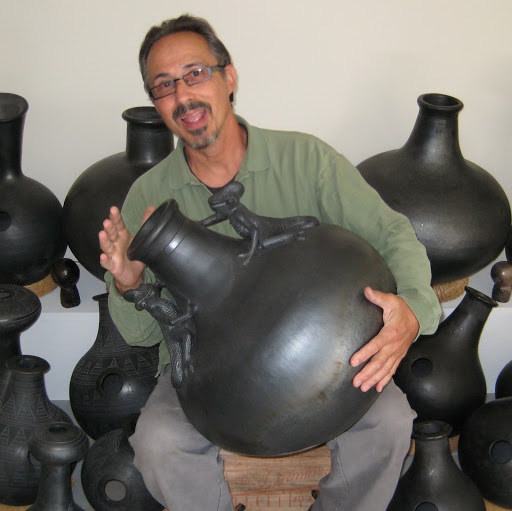
It is with great sadness that I report on the recent death of a dear friend, the world-class ceramic artist and Udu drum maker Frank Giorgini, of Freehold, NY. He was 75 years old and had been undergoing treatment for cancer.

Frank and I first met in the mid-1980s when we both were teaching classes at the Harmanus Bleecker Center in Albany under the auspices of the Albany Institute of History & Art and the inimitable guidance of Monica Miller (also a wonderful artist). One of my favorite memories of that time was when we shared a two-person show at the Bleecker Center that featured Frank’s Udu drums and my photographs, all of it dusky and formal, a lovely pairing of sculpture and black-and-white pictures.

Frank was probably best known for his handmade and commercially manufactured clay pot drums, which are treasured by percussionists all over the world for their unique, earthy sounds and robust shapes, some exquisite examples of which are held in the permanent collection of musical instruments at the Metropolitan Museum of Art in New York City. Frank used to proudly state that he was the only living person whose product was in that collection, though I suppose other living artists’ instruments may have been added after the fact. If not, then there are now none who can make that claim.

But Frank had equal impact in many other aspects of ceramic production, both in the commercial realm as a tile maker and in the fine art realm – though, in his case, the line between the two was fuzzy at best. Many will recognize his tile and mosaic installation in the Whitehall Street station of the Brooklyn BMT subway line, which was commissioned and installed in 2000. Entitled Passages, it traces the history of Manhattan backward in time using numerous airborne gulls as a unifying element (you can see many pictures of it here).

A detail from Passages
photo by Warren Sze
Nature and animals constantly featured in Frank’s personal work. Whether exploring the personas of humble blackbirds in his shimmering raku-fired tiles or adorning a decorative Udu with undulating lizards, he understood and celebrated these creatures as equals. As humans, we were fortunate that he also treated us with the same respect.

Most artists, no matter how talented, need something more in order to be successful – whether it’s a lucky break, an enthusiastic patron, or a trust fund. In Frank’s case, it was his congenial personality. Everyone liked Frank, and I can imagine no one who would have turned down an opportunity to work with him or support his vision.

One way he shared that vision was through teaching. He published books and instructional videos on tile making, and worked as an adjunct professor at Parsons design school in New York. Probably most important to Frank were the summer workshops he held at his Catskills home and studio for people of all ages and abilities who wanted to spend a little time in the country and learn how to build and fire an Udu drum.

Those two-weekend-long instructional experiences took place around Frank’s birthday, and always culminated in a grand potluck supper followed by a Bacchanalian bonfire, which naturally would be ringed by a large, happy throng of Udu-playing revelers. Though I never made an Udu drum, I stoked that fire nearly every year for decades, and danced around it with the best of them. Those Udu Fests will surely be among the most vivid – if slightly blurred – memories for many of Frank’s friends and fans.

Frank also was the proprietor, along with his partner, the great chef Ana Sporer, of Ruby’s Hotel, a delightful garden-to-table restaurant in Freehold that is expected to return to serving dinners after a period of mourning. As bartender and host at Ruby’s, Frank welcomed guests with his consistent good humor and, after dinner, he often shared a taste of his homemade limoncello, created using a recipe from his Italian ancestors, and as strong as it was sweet.

Above the restaurant was a gallery where, for many years, Frank mounted excellent shows of the best regional artists. The gallery was named in memory of another Frank, a close friend of the restaurant’s family and a supremely talented artist himself, who died way too young just before he was to have been the exhibition space’s inaugural director. I hope that the Broderick Gallery, too, will resume activities after a time, in loving memory of both Franks and their dedication to the joy of making and experiencing great art.

That and so much more remains as the legacy of one very fine person who also happened to be a brilliant artist, and a beloved friend to many.

The world was a better place with Frank Giorgini in it. May he rest in peace.

Note: If you’d like to get a taste of the amazing sound of the Udu drum, check out this extraordinary improvisation by Jacob Cole, a former workshop participant who posted it in Frank’s memory.
 

Ana and Frank at Ruby's


Thursday, March 3, 2022

Short Take: refract at Albany Center Gallery

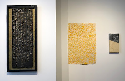
Works by, from left, Royal Brown, Naomi Lewis, and Benjamin Jose
are part of refract at Albany Center Gallery.
photos provided

The five artists in Albany Center Gallery's current show, refract, don't appear at first glance to belong together. Their media vary from video to watercolor to cast iron; their imagery from space-age to delicacy on the page. But a theme does emerge from the selection, which was organized by the gallery's associate curator, Jennie Tang. It has to do with the approach these artists take to their subjects.

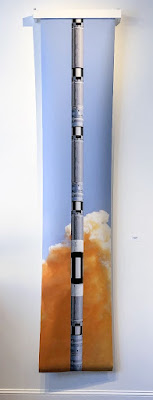
Owen Barensfeld's Is It big Enough?
combines images to make a statement
This concept is best explained by the gallery's written material, which states that the five artists employ "different methods of repetitions, patterns, juxtapositions and distortions" to broaden our understanding and experience of everyday visuals. Here, those visuals have become abstracted and transformed, built of mere suggestions, or created directly out of the simplicity of a grid.

The show, like many at this venue, is spare, featuring just 29 works in all. Nine of those works are by Naomi  Lewis, whose whisper-soft graphite drawings pull you in close, and whose patterned images of bees fill their surfaces expansively, often emphasizing negative space to great effect. Equally wed to overall pattern, Trevor Wilson painstakingly builds large images out of tiny squares in grids of graphite or colored pencil, the results feeling almost equal parts human and machine.

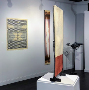
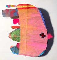
Owen Barensfeld and Royal Brown come from opposite positions to meet in a middle zone of spaceships and technology. While Brown creates colorful models of imaginary craft out of the most mundane of found objects (empty spray cans and such), Barensfeld transforms mass-media images of bomb blasts and moonshots into objects of contemplation. Both have something to say: In Brown's case, it's a literal message of love amid fantasy; Barensfeld's seems to be more about the mesmerizing terror of industrial power.

From left, works by Trevor Wilson, Owen Barensfeld,
Benjamin Jose, and Royal Brown are part of refract
Benjamin Jose seems to be the odd man out in this group. His constructions of mismatched materials struck me as being more in the realm of formalism and surrealism than anything else here, and his messages less clearly stated than the others'. That said, his highly refined use of such disparate substances as wood, steel, and leather holds its own kind of fascination.

refract will remain on view through Friday, March 4, so it's now or never if you want to catch a look. I'm glad I did.


Wednesday, January 12, 2022

Pieced Together at APL

Henry Klimowicz - Large Collections of Like a Lichen #2
cardboard and glue 2021
Perhaps one of the best-kept secrets on the local gallery scene is the Pine Hills Branch of the Albany Public Library, where expertly curated exhibitions of regional artists have been mounted about twice a year for quite some time.* And the current show, Pieced Together, is one of the best yet.

Organized by staff at Russell Sage College's Opalka Gallery, Pieced Together features 11 artists united by the theme of assemblage, an often overlooked art form that came into its own during the height of Modernism, in particular among Dadaists, often in the unassuming clothing of paper collage. Most of the work in this show follows fairly closely in that tradition, while some of it feels more connected to later periods of contemporary art that grew out of Modernism.

Altogether, this is a particularly lively collection of very accomplished work by well-established local favorites and a few relative newcomers, including one recent Sage graduate, Chloe Harrison, whose delicate matboard constructions show promise, while confirming her self-described fledgling status.

Beth Humphrey - Mutual Aid, 2020
spray paint, gouache, crayon, film on paper
Highlights from the show are many, even if one must perform something of a treasure hunt to find them all in the two-level space which, though not designed for art exhibitions, still serves well to showcase the work. Installations here always exploit the big central staircase, this time featuring two of my personal favorite artists of recent times: Beth Humphrey, who presents a constellation of small framed works on a mid-level wall that delight with their shapes, colors, and layerings; and Kenneth Ragsdale, who offers a suspended wire laden with playful, oversized folded-paper objects from his own quirky personal vocabulary of memories and imaginings.

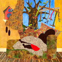
Paula Drysdale Frazell - Nap Time, 2015
acrylic paint and fabric on canvas
Another recent favorite artist, and one who I think deserves - and will get - more attention as time goes by, is Paula Drysdale Frazell. Her mixed-media works are less related to cut-paper collage than they are to painting and, in a sense, quilting, as they combine paint, fabric, and printed paper (such as maps) in colorful and playful compositions that draw from childhood memories and other family stories. Her works are both charming and thought provoking, making for a tricky balancing act that she handles comfortably.

Three of the artists in this show are strictly collagists of the cut-and-paste variety, forming a core for this selection, and being easily appreciated by any of us who have ever tried that medium (myself included); they are Niki Haynes, Juan Hinojosa, and Michael Oatman, all of whom have appeared in other local shows recently, and whose work remains fresh and fun.

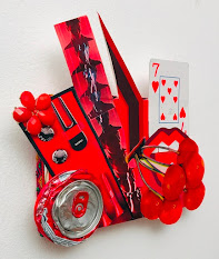
Juan Hinojosa - Lava, 2020
mixed media on panel with plastic,
soda can, wall paper, jewelry, ribbon
Hinojosa is easily the flashiest of this group, delving into consumer culture with abandon, embracing the brightest of colors and materials and, in the case of two works in this exhibition, utilizing metallic surfaces as a background. Eye-catching, to be sure, but for my taste a bit superficial.

Haynes, in contrast, hews to the mystical. Here, she presents a group of six small collages that coolly spook you with eyes that are watching from on high. Her technique is almost alarmingly simple, but it takes a lot of experience to get to simplicity and have it work so well, and Haynes has it.

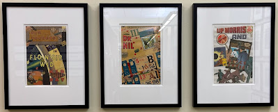
Oatman throws us a curveball by installing a body of 26 comic-book collages he made in 1983, during the summer after his first year in college. I'd glimpsed these somewhere before, and was delighted to see them again, as they are witty, well crafted, and totally consistent with the work he is making today, nearly 40 years later. It takes courage to reveal early work, and in this instance I think it pays off.

The other artists in the show, which opened on Oct. 1 and will run through April 17, are Fern Apfel, Danny Goodwin, Henry Klimowicz, and Melinda McDaniel.

*Full disclosure: I recently joined the board of directors of the Friends and Foundation of the Albany Public Library, which has some input into programming at the branches, including arts programming.

Michael Oatman - three examples from the collage series A Boy's History of the World in 26 Volumes (+1), 1983
photo by Michael Oatman


Monday, December 6, 2021

Short Take: Fence Select 21 at ACCR

A New Blank Tablet: January 20, 2021 12:00 PM EST, oil on cradled hardwood by Susan Hoffer, is the juror's top choice in Fence Select 21
I’ve been remiss in taking so long to get to this year’s Fence Select show at the Arts Center of the Capital Region in Troy, because it always features a wide swath of the region’s best and upcoming artists, and it ends this Saturday. But, as I am often forced to say, better late than never.

This year’s edition of the show was juried by Dan Cameron, a noted critic whose local presence seems to be increasing lately, and the 51 artists included are overall quite worthy. I regularly refer to this annual exhibition as “the other Regional,” and this year’s edition pretty much lives up to the title; seven of the included artists were also in the 2021 Mohawk-Hudson Regional, and several others have been in previous editions of that show.

William Fillmore's Red Warning #2;
in the background is a painting
by D. Colin
photo provided
My biggest quibble with the current edition of Fence is that only a few of the selected artists have more than one work in it (specifically, six artists have two each) and those works aren’t presented together in any case. But the gallery looks good with the show as installed, and there are very few clunkers in it (I’ll leave it for you to decide which they are).

Among the outstanding pieces to my eye and mind were the following:

  • First-prize winner Susan Hoffer’s impressively self-actualizing studio view titled A New Blank Tablet: January 20, 2021 12:00 PM EST
  • ORT Project Rockwell-Nelson’s Anthropocene Epoch: Eat the Rich, a super-sharp photograph that features a live baboon in an oval-framed still life arrangement
  • Chris DeMarco’s lush, yet delicately colored photographs of a trailer park
  • Karen Gerstenberger’s two coastal monotypes
  • Jaime Courcelle’s oil on canvas It’s Not Goodbye
  • Take Out, a timely and wry nod to Edward Hopper by Marion Reynolds, and
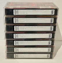
  • Michael Oatman’s elegiac stack of unwatched 9/11 videotapes (shown below)
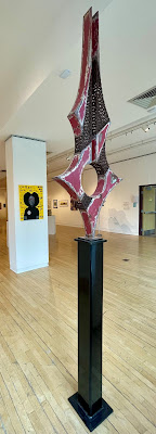
The exhibition’s other prize-winners are Royal Brown, for a futurist reinvention of found objects; Jeff Wigman, for a Bosch-like painting on wood panel, and William Fillmore, for a strikingly geometric steel sculpture.

The ACCR is open every day but Sunday; Fence Select 21 ends Saturday, Dec. 11.

Sunday, November 28, 2021

A parallel play of Parallel Plays

Sculptures and drawings by Chris Duncan are part of a four-person show at the Schick
Art Gallery on the campus of Skidmore College
all photos provided
In an odd coincidence, two shows that are separated (joined?) by about 30 miles of Northway and overlapping in schedule have the same title: Parallel Play. The term refers to a behavior that young children at an early stage of development will engage in, where they do not interact, but play at the same activity side by side.

In the case of the first of these shows, which ends on Thursday (Dec. 2), Skidmore College’s Schick Art Gallery in Saratoga Springs has gathered four sculptors and is exhibiting works by each in both two and three dimensions – the parallel between those dimensions is what’s referenced here.

The other show, which continues through Dec. 18 at the Lake George Arts Project’s Courthouse Gallery in Lake George Village, is a solo by the Troy-based fiber artist Barbara Todd, who has mounted a multilayered installation of related works, exploring a parallel within her meticulous working process.

Wind, by Mary Neubauer
(DeWitt Godfrey's Ander in background)
Both shows are excellent examples of making the most of a small but high-quality exhibition space, and well worth a drive to see. We took that drive on Saturday, and it lifted our spirits amid sunny skies and frigid temperatures. I’ll discuss the Schick show first, as it ends so soon.

Co-curated by Schick staff and Skidmore sculpture professor John Galt, this Parallel Play features the work of Chris Duncan, DeWitt Godfrey, Coral Penelope Lambert, and Mary Neubauer in a slightly crowded installation of approximately 35 works covering a healthy variety of media. A few additional works are exhibited in a display case near the entrance to the Saisselin Art Center, where the gallery is housed, and another is on an outdoor patio, underscoring the sense of a space nearly bursting its seams.

As with our exemplary toddlers, these four artists play nicely together, each pursuing strong directions while balancing into a whole that, for me, elevates an awareness of materials and processes. It’s not so common around here to see a showcase for sculpture and, though this work is mostly smaller in scale, the effect of three-dimensional objects, with their strong physical and tactile presence, is fully felt in this selection.

A DeWitt Godfrey drawing
The show’s premise, which places each artist’s two-dimensional works in juxtaposition with the 3-D ones is also effective. Three of the four include drawings (almost always the first building block of a sculptor’s ideas), while one features photographs. This last, Neubauer, derives her forms from massive weather-related databases, which could have been translated as well into graphic representations that may have felt like sketches, but as color photographs they come across more like finished works in their own right. Her sculptures firmly occupy the space around them, bulky, beautifully patinated, and displayed on custom pedestals.

Duncan, a sculpture professor at Union College, presents a total of 13 works here, revealing an artist in full command of his medium, whether paint on paper or anything you can crush or fold into a form and then embellish with color and texture. While Neubauer’s work clearly aims to discuss our changing climate, Duncan is content to express himself more obtusely, delivering emotional jabs with gloomy, calligraphic gestures and bright, shiny splashes of color.

Insipid Sun, by Coral Penelope Lambert
Godfrey is represented here by just two drawings and one steel sculpture, but they dominate one wall of the gallery and provide perhaps the strongest pairing of those two media in this show. His on-site installation entitled Ander evokes the natural growth pattern of a many-celled organism, while putting the viewer in touch with the straightforward process of cutting sheet steel into loops and then letting it rust. I always like an artist who can produce work that is both relatable and innovative, and Godfrey handily delivers on that promise.

I found Lambert’s work the most challenging in the show. She combines cast iron and welded steel with felt flocking, creating a contrast of the stereotypical masculine and feminine traits of hardness and softness. Her drawings are playful, even childlike, while her three sculptures shown here are as serious as military hardware. That said, rarely have I been so unable to resist touching a work of art in a gallery (generally a harsh no-no), in this case seduced by both color and texture.

A segment of Barbara Todd's installation at Lake George Arts Project

Barbara Todd has become a friend, but before I ever knew her, I was struck by her big, abstract quilts as seen in the Mohawk-Hudson Regional. Over the years, Todd has participated in other local group shows, but the current one at Lake George Arts Project is her first solo in recent memory, and it is a smash.

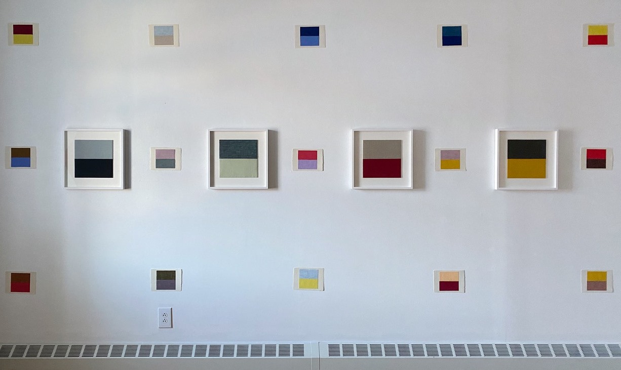
Combining miniature fabric-swatch sketches, medium-sized finished works of the same materials, and five larger quilts, her Parallel Play has been installed in three overlaying matrices of theme and variation that sing in vibrations of pure color.

Dragon Fried Fish, Albany, NY, January 12, 2014
At first glance, the casual viewer may not understand what Todd has going on here, and that's understandable - in all but a few of the pieces, there's nothing more to meet the eye than two juxtaposed rectangles of colored fabric, forming a perfect square on a background field of white. But Todd's persistence in this pursuit has a cumulative effect, as her tendency toward reds and yellows, greys and blues, builds into a secret but knowable language, like semaphore.

It could help to understand that every work (and there are several dozen, at least, shown here) is based on an actual experience, a sighting captured in a photograph that forms the starting point for the work. So what may appear to be simply a soft purple over a cool grey is also a specific time and place: Morning mist, Highway I 90 near Utica, October 8, 2016. And so on, and on.

In addition to the layers of private meaning in each linen piece, there are varying textures, weaves, and mixtures of thread that make up the colors, providing a lot more to reward close inspection than one might expect. Beyond that, Todd has developed some of the selected moments into larger quilts, made of luxurious wool fabric, which are warm and inviting, even while still having been built upon cool, color-theory bones. These five works are the stars of the show, but the overall installation glows brightest. See it if you can.

Friday, September 17, 2021

All Together Now at The Hyde, the Tang, etc.

Installation view of Summer Bomb Pop at The Hyde Collection; from top, left are
works by Myron Stout, Sarah Braman, Mindy Shapero, Robert Reed, and Steve Roden
Though summer is on the wane, a constellation of shows that began to emit from Skidmore College's Tang Teaching Museum in the spring will continue well into the fall, and so could nicely serve as a buffer to the inevitable end of our warmest season.

All Together Now is a wonderfully conceived project in which Tang curators, other art venues' curators, and Skidmore students collaborated to bring elements from the Tang's collection into other spaces, where they interact with related works from those museums' collections. It's my impression that this concept was birthed by the COVID-caused closure of the Tang to non-Skidmore viewers for more than a year (it reopened to the public on July 10th), and a desire to bring some of its holdings into the community during this shutdown. It also fostered some cool collaborations, and fed fuel to the fire of those students' educations, which is a core mission of the Tang.

The resulting eight exhibitions, six of which are still on view, cover a lot of ground, from sculptural wooden hat forms, to 19th-century photographs, to contemporary abstract paintings. Among the collaborating institutions are The Hyde Collection in Glens Falls, Yaddo and The National Museum of Racing in Saratoga Springs, and the former Brookside Museum (now the Saratoga County History Center) in Ballston Spa. Two of the shows have closed - one at Saratoga Arts and one at the Tang; and two are not easily accessible - at Yaddo and the Saratoga Performing Arts Center; so I recently visited the four that remain, including one at the Tang that opened on July 10 (the prior one closed in June).

From left, works by Augustus Thompson, Bridget Riley,
Richmond Burton, and Man Ray are grouped in
Summer Bomb Pop
all Hyde photos by Arthur Evans
The grand tour, taken up with a culture-vulture friend riding shotgun, proved to be exhausting but awesome. We started at the northernmost point, where recent works of art from the Tang's holdings are blended with selections from the Hyde's Feibes & Schmitt collection of 20th-century abstraction in the museum's main gallery. (The Hyde has several other worthy shows also currently on view, but we'll focus on just this one for now.)

Summer Bomb Pop: Collections in Dialogue is rich in significant stand-alone works, or in tasty juxtapositions if you choose to view it that way, with a smattering of explanatory labels that delve into the history of some of the works and artists on view. Most of the labels are student efforts, but several are by prominent art critic Dan Cameron, and add worthwhile insights.

The show's title (taken from a 2008 painting by Chuck Webster that leads the installation) is a clear message that this should be fun - and it delivers. I was surprised after immersing myself in what seemed to be a great big show, that there are only 26 works in it, but many are both large and complex, and they powerfully command the spacious gallery with scarcely a false note.

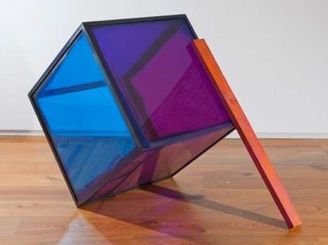
Sarah Braman - Fall Friend
Introductory wall text states that Summer Bomb Pop intends to "stimulate compelling new conversations in American abstraction," which it has achieved by careful selection from both collections, resulting in a satisfying representation of well-known names (Man Ray, for example) and fresh discoveries (at least to me). Some of my favorites included Augustus Thompson's 2014 acrylic painting Untitled (Like a Kingsnake), Ellsworth Kelly's 1980 shaped oil painting Diagonal with Curve XII, Blue #611, and Sarah Braman's 2012 sculpture Fall Friend, which Cameron describes as "motivated by an urge to spruce up the visually drab ... Minimalist Art movement of the 1960s."

What struck me most about this show is that so many young artists today are continuing and expanding on the Modernist traditions of abstraction, even as postmodern art has long since dived into a maelstrom of other modes of expression, including video, performance, environmental art, and all manner of identity politics, along with anything else you can imagine. I had no idea minimalism and abstraction were still so alive and well, and I am delighted to find that they are, and playing so nicely at the Hyde with their estimable forebears.

Four Greens, Upper Manhattan Bay, 1957
Our next stop was the Tang itself, where we were greeted by a mind-boggling collection of well over 100 postcard collages by Ellsworth Kelly, all lovingly matted and framed in soft white. Grouped more or less chronologically (or thematically), and covering nearly 50 years of playful exploration by the artist, they are drawn from a total of 400 such works still held by Kelly's surviving spouse, Jack Shear, who has generously loaned them to the Tang.

Front Street, 1978
Simply entitled Ellsworth Kelly Postcards, this is one of the most exciting art shows I've seen in years. Not only are the images almost universally witty, visually sharp, accessible, and clearly related to Kelly's more "serious" art, they provide a window into the artist's process that few exhibitions do, which is quite a gift to contemplate.

All but a handful of the works on display retain the diminutive scale of a standard postcard (typically 3 1/2 by 5 1/2 inches), and most combine very few elements to create a powerful transformation of the mundane into the - dare I say? - transcendent. One is particularly struck by how precisely Kelly has again and again fitted two disparate elements into a cohesive whole. Simple? You try it!

Images des Antilles (Stephanie de Monaco) 1984
It may seem easy to play around with paper every day for fifty years or so but, I promise you, it's very hard work and, in my opinion, represents a triumph by the artist over the vexing problem of life itself. 

Walking through the Postcards show, I tried to imagine old Ellsworth toiling away at a little desk upstairs while everyone else was at the beach or drinking by the pool. He was a very soft-spoken guy (we met once, briefly), and modest, despite his wealth and success; these tiny creations mirror that personality.

I went away elated, and deeply impressed at Kelly's persistence. I will be going back to this one.

Working our way south, we next stopped in Saratoga Springs at the National Museum of Racing, a very expensively built and beautifully managed operation I'd never before visited (sorry, but my interest in horse racing is basically zero). We were there to view a small but significant installation of Eadweard Muybridge's photographs of animals in motion, part of the Jack Shear collection at the Tang, which were paired with three of the  Museum of Racing's horse paintings by Henry Stull.

Four photo sequences by Eadweard Muybridge are shown
with a painting by Henry Stull at the Museum of Racing
When Muybridge was commissioned by Leland Stanford in 1870 to use stop-action photography to prove that a galloping horse will have all four of its hooves off the ground at once, the expectation was that this would happen when the animal's legs were all extended in a great leap forward. Instead, the proof was achieved - but with the surprise result that the four hooves would only be off the ground while gathered under the horse's belly.

The concise installation at the Museum of Racing, entitled Muybridge and Motion, perfectly illustrates the impact of this revelation by showing a Stull painting from before 1870, in which a race horse is depicted with its four hooves extended, and two Stull paintings from after 1870, where the horses are depicted correctly with their hooves gathered underneath. All three paintings are prime examples of such art, and enjoyable to examine. While the Muybridge photographs on view do not include his original experiment, they do include a similar sequence, a nice smattering of other horse studies, a nifty sequence of fallow deer on the run, and a couple of grids that show the motion of common birds in flight (a pigeon and a red-tailed hawk).

A wooden hat form
made in New York City
Our final visit was to the Saratoga County History Center in Ballston Spa, where a very engaging display of hats and hat forms is spread onto shelves and in vitrines. The five wooden forms (also known as blocks) are from the Tang collection, while the 25 hats, covering an impressive range of styles from the newsboy cap to ladies' elegant bonnets, are from the History Center's collection.

A nice printed booklet accompanies the show, which is entitled The Social Lives of Hats, providing solid descriptions and well-founded historical notes, all of them researched and written by Skidmore students. I must comment on the hat forms as really cool objects, works of art in themselves, even if by accident. But I may be biased, as I happen to possess a couple of similar wooden forms my uncle rescued from the streets of Manhattan decades ago.

The shows I've reviewed remain open through the following dates (more details are here):
  • Summer Bomb Pop at The Hyde, through Oct. 31
  • The Social Lives of Hats at the SCHC, through Oct. 31
  • Ellsworth Kelly Postcards at the Tang, through Nov. 28
  • Muybridge & Motion at the Museum of Racing, through Jan. 2
An installer poses hats and hat forms at the Saratoga County History Center


Thursday, April 8, 2021

Jamie Rodriguez at the ACCR

Totenkopf, Die Werbung, The Invisible Enemy - installation by Jamie Rodriguez
Jamie Rodriguez is one of the more interesting artists to have emerged on the local scene in the last decade or so, and his current solo exhibition at The Arts Center of the Capital Region in Troy is a well-earned showcase of his latest work.

A frequent prize winner in the annual Mohawk-Hudson Regional, Rodriguez has distinguished himself with challenging, multilayered installations that combine painting, drawing, and sculpture, often to a confounding effect, and this show, entitled Warenfetischismus: Commodity Fetishism is no exception.

Montserrat Landscape #1
oil paint on canvas 2019
I noticed from the first time I saw his work that Rodriguez is a very skillful painter, and this exhibition showcases that aspect of his art by featuring 15 oils on canvas, most of them sun-washed landscapes in an Impressionist style that clearly evokes Cezanne and Van Gogh. The four large mixed-media installations that comprise the remainder of the show all incorporate similarly executed paintings, a stylistic innovation I don’t recall having seen employed by any other artist.

So, labels aside, Rodriguez is a creator who ably applies whatever materials he needs to make his statements – and those statements are ambitious, on a global scale. These installations evoke international politics, with references to Nazi Germany, Soviet Russia, Communist China and capitalist America; environmental issues, including water shortage, habitat loss, and pollution; economic matters such as the commodification of food; religion, via icons and altars; and historical references in the form of architectural elements, decorative tilework, and weaponry.

Argumentum ad baculum, (Fact Check:
To The unhinged and useful idiots, the
Revolution has been canceled as part of
culture, No Justice, No Peace for Wendy's,
The Rubicon has been crossed) -
2021
(detail view of installation)
The last item is perhaps the crux of this work, which openly concerns itself with war and conquest. But the naturalistic concerns are also central, as Rodriguez deploys multiple animal figures - foxes, lambs, raccoons, and various rodents among them - as avatars. His statement accompanying the show offers clear insights into his intentions, while welcoming viewers to make their own interpretations of the work. In part, it says: These narratives can draw attention to many different topics, that can be interpreted in any way the viewer connects … I want to evoke emotion and awareness of the individual to confront the issue of how art functions within a particular set of social and cultural patterns, historical perspectives, and belief/faith systems, while maintaining a sense of humor and humility.

That’s a lot to pack into any work of art, and Rodriguez gives it a good shot. My overriding response to this show is that it has a potent sense of urgency. The sprawling, highly detailed tableaux incorporate a great many carefully constructed elements, which undoubtedly have taken a lot of time to create, yet they still feel improvised, even slapdash in a way, as though the artist feels too pressed to add even the slightest extra bit of finish to his product. Only the paintings appear polished, serving as a counterpoint to the roughly representational sculptures into which they are integrated.

It’s enough to make you breathless.

Warenfetischismus: Commodity Fetishism - Artworks by Jamie Rodriguez will remain on view through April 16.

Polarity Integration: The Universal Game, Zwischenzug, Spiritual Algorithm, end game-"Transcension", Think, Think Tank? Paradigm Shifts
mixed-media installation by Jamie Rodriguez, 2021


Sunday, March 7, 2021

Earthly at Esther Massry Gallery

An installation of numerous works by Julie Evans is the focal point of Earthly
all photos provided

The current five-person show at The College of Saint Rose's Esther Massry Gallery in Albany is a lively, cohesive example of curatorial ingenuity.

While each artist in the show is highly skilled and clearly worthy of attention on her own, in this setting the five women's works take on greater complexities of meaning through their interrelationships, losing nothing of individual strength in the bargain. The theme of the show, which is entitled Earthly doesn't shout - in fact, it's so subtle you could miss it altogether - but it succeeds in holding the collection together organically.

Odessa Straub - Supplemental Soul Suppository 2019
I don't have a favorite in this show, though I'd say the layered, lyrical installation of nine ink-on-Mylar assemblages by Julie Evans is its focal point. Dated 2011-2014, these mixed-media organic abstractions retain their freshness, enhanced by the playful nature of their presentation here, in which an unframed series of swooping and morphing forms adhered directly to the wall serves as a lattice to connect the more stolid framed and mounted works.

Also installed directly on the walls are three of four sculptures by Odessa Straub (the fourth being a freestanding floor piece). Straub has a Surrealist bent, with a Dadaist sense of humor and surprise. How else could one so elegantly combine such inapt objects as a live underwater plant and a leather speed bag (the type used by boxers to train), among other witticisms? There's also an undercurrent of mad-scientist menace to Straub's combines, while they are still sleek, playful, and colorfully pleasing.

Meg Lipke - Garden Gates II 2020
Meg Lipke also works in three dimensions, but her two pieces in the show play off the wall as pumped-up frames that become their own pictures. Lipke's more modest piece (which is untitled) has multiple openings in a pillow-like structure of stuffed fabric, with highly vivid coloration activating its upbeat claim on a small square of wall space. Her much larger Garden Gates II, also made of painted stuffed fabric, is less bright and slightly droopy - but, at nearly 9 feet tall, its presence is clearly stated.

Yet another sculptor, Tamara Zahaykevich, is represented by a group of five pedestal-mounted forms that hold together quite nicely as a group, though they span well over a decade of production from 2007 to 2021. Like Evans' work, these lean toward abstract biomorphism, with a limited color palette and carefully worked surfaces.

Two Tamara Zahaykevich sculptures
Variety comes as Zahaykevich works these pieces' surfaces in many different ways, from meticulously detailed to roughly scrubbed. One piece, entitled Robert Wisdom is more architectural, as were some of Zahaykevich's pieces that were included in the excellent Cut and Color show that recently ended at the Albany Airport Gallery.

The overall installation of earthly is somewhat sparse, which allows for one side of the gallery to remain unlit for viewing the wall-projected video contributed by Laleh Khorramian. Entitled I Without End, the nearly 7-minute-long time-lapse animation is a curious vision of sad romance, played out by carefully cut orange peels in a miniature chateau-like setting.

Khorramian's soundtrack ranges from lightly industrial to orchestral, including atmospheric voices at times, and it sits comfortably in the gallery space, not loud, almost soothing. Her imagery is at turns abstract and representational, but its real magic comes in the unpredictable movements of drying organic material over time, and it is surprisingly affecting. I don't have a lot of patience for longer-running video clips in a gallery setting, but this film held my attention for two complete viewings.

Credit is due the two curators of Earthly, Saint Rose Associate Professor of Art Susan Meyer and Massry Gallery Manager Erin Sickler, who've assembled this grouping with sharp eyes and clear minds, allowing the whole to honor each of its parts. The show will remain on view through March 17.

A still image from Laleh Khorramian's 2008 animation I Without End 

Sunday, February 28, 2021

Terry James Conrad: Object Permanence at Opalka Gallery

Terry James Conrad adjusts his musical installation at the Opalka Gallery.
all photos provided
We’ve all heard of the three Rs - Reduce, Reuse and Recycle – and most of us know that the first two are the more effective approaches to problems associated with waste. But they’re also harder to do, so we’ve tended to focus on recycling, which, also known as remanufacturing, has more and more clearly been revealed as not much of a solution at all.

Tin cans reduced to essential shapes
It’s admirable to try to reduce our production and consumption of stuff, but there’s a conundrum in it: Doing things – which often means making things – is what gives our lives meaning. And that goes double for studio artists. Just try to imagine all your favorite creators having built their careers without leaving behind a trail of stuff. Not at all likely.

All of which makes the unusual approach to making art that Terry James Conrad has pursued so fascinating. Currently the protagonist of a solo exhibition and series of events at Sage College’s Opalka Gallery in Albany, Conrad has taken that second R to heart, and made Reuse his raison d’etre. The result is both intriguing and – perhaps a surprise - esthetically appealing.

One of Conrad's presses in use - the paper
is at the bottom, under the cans
Conrad is essentially a printmaker, though this installation also includes numerous small sculptures, four handcrafted wooden guitars, and a large musical apparatus, in addition to three homemade printing presses that are being actively employed during the exhibition. The level of skill involved in all these works is extremely varied, from pounded, foil-wrapped tin cans that evoke outsider art to fancy woodworking and metalcraft on the guitars. Somewhere in between is the Rube Goldberg-esque music machine, which Conrad set into sonorous motion during my visit. (He’s in the gallery every Thursday adding a residency component to the show.) Unlike many sound installations, the contraption’s rhythmic emanations were not unpleasant or intrusive; rather, they suited the room and the other art in it quite nicely.

It’s worth trying to explain about those presses. Conrad has invented a unique method of printing, which uses gravity to create downward pressure on a matrix of folded, joined, and grouped tin cans that are placed on top of the printing paper. Each press is a multilayered stack of found stuff, not all of it functional, but all of it adding to the overall visual and symbolic effect of the conglomeration. After homemade inks are piped into the interior spaces of the cans, where they pool and soak for several days, an embossed and colored image will be permanently impressed upon the page, formed of deep lines from the cans’ edges and flowing colors within and around them.

Conrad has embellished these found cans with colored foils 
Conrad makes his inks from everyday sources like walnuts and rust, and uncommon ones, too, such as silt taken from 565 meters below the ocean. Many of the more than 30 finished prints in the exhibition are displayed without frames or glass, making it easy to examine their soft textures and subtle variations in tone. Others are shown in frames, most notably a suite of black-on-white lithographs embellished with pastel-colored frames - but the unframed works are the stars of the show.

Four Conrad prints
The prints are abstract and have equally abstract names, and they are fun, funky, even stylish, with geometric forms and an array of mostly muted colors. Their method of display appears to be yet another Conrad innovation: Angled out from the wall on painted wooden supports, and placed well below the usual eye-level of gallery art, they invite relaxed intimacy and close examination. The experience is enhanced by the opportunity to also examine the tin-can constructions that made these prints, as they are also on view in the gallery, along with a number of simpler transformations of tin cans that evoke early Modernist minimalism.

The show is billed as a survey, with prints ranging throughout the last 10 years. Most of them have white backgrounds, but a triptych entitled Benthic is brown and soft like suede, fully stained with walnut ink around its other colors and floating shapes. Benthic is also larger than the other prints, and super-fresh (dated 2021), suggesting a strong current direction.

Terry James Conrad: Object Permanence will remain on view through March 13. The Opalka Gallery is open to the public, with generous visiting hours that include Thursday evenings and Saturday afternoons. I highly recommend that you make time to see this outstanding show by a uniquely dedicated and talented artist.

Benthic 2021 - monoprints by Terry James Conrad


Saturday, January 16, 2021

Kingsley Parker: An artist who cares

A Single Vine Invades
the 70-foot Canopy, Kinderhook, NY
acrylic on re-used drop cloth
The artist Kingsley Parker is unusual in a number of ways.

For one, he adeptly works in a wide variety of media – drawing, painting, sculpture, and printmaking among them. Few artists can pull this off (two examples that come to mind: Michelangelo and Picasso), but Parker does it with aplomb.

Parker also works at wildly different scales, from quasi-miniature to monumental. Additionally, his style can range from detailed realism to total abstraction (including forays into the teasingly humorous), all of which he does, again, with apparent ease.

Finally, Parker has a habit of engaging with a subject, wringing the life out of it (in a good way!), and then moving on to something entirely different - yet another approach that few artists can successfully navigate and most would be well advised to avoid.

Against these odds, Parker throws caution to the wind. And, though there is a thread (I promise you) that binds it all together, I’m not sure that is uppermost in his mind. He just seems to plow ahead with a relentless singularity of focus.

Winter Birch, Mt. Merino, Hudson, NY
acrylic on re-used drop cloth
Most recently, these impressive abilities were on view in a tight solo show at Thompson Giroux Gallery in Chatham, which closed on Jan. 3. Other Parker works were included in the 2020 Mohawk-Hudson Regional at the Albany Institute of History & Art, which also just closed. The Regional featured online video talks by many of the selected artists, Parker’s being one of the more engaging choices (you can watch it here), and that’s what really got me interested in seeing more of his work. Catching the Thompson Giroux show on its last day proved to be a very satisfying fulfillment of that curiosity.

Indecisive, Chillmark, Mass.
acrylic on re-used drop cloth
Entitled A World of Hurt, the show featured eight very large acrylic paintings on re-used canvas drop cloths, along with six sculptural pieces of various size and materials, and numerous works on paper, some of them mounted and hung and many more in flat files. All but one of the large works and several of the smaller ones are tree portraits, lovingly rendered in natural settings with a variety of atmospheric light conditions. I was told that an additional piece in the same vein was stored in the back – at 130 inches, too tall to hang on the wall.

People who know me well understand that I’m not a huge fan of electronic media and their ubiquitous glowing screens – I’ve often said I’d rather just stare at a tree. Or I could just stare at a Kingsley Parker painting of a tree. The best of them have sufficient detail to hold hours of attention (as they clearly did for him). These homages are carefully observed and obviously quite deeply felt. As I do, he loves these fellow beings and is heartened by their presence in our world; equally, he laments the threats they face as a result of our presence in theirs.

Thing 2 - Found wood, vines, used coffee filters,
acrylic paint, wire, styrofoam, tar, hay, old bucket
I think Parker’s dedication to the environment and his desire to express that through his art is a strength, despite the potential for such an approach to devolve into insubstantial messaging. Lesser artists over the centuries have tried and failed to maintain the highest standard of artistic quality (however measured) while issuing a pointed message, but Parker succeeds, moving the viewer not with the message but with the transcendent power of the art itself.

That he cares so much only adds to this success, because it drives the work forward. Clearly a sensitive soul, Parker effectively applies that sensitivity to the media he employs. Whether in delicately brushed renderings of undersea fauna, carefully placed hills of tiny twigs representing a clear cut, or hauntingly depicted midnight-dark forests, Parker’s technique wins hearts and - there’s always hope – minds.

I’d only been vaguely aware of Parker before these two exhibitions, and I’m sorry it took so long, but it has most certainly been worth the wait. Check out more of his work at kingsleyparker.com.

Unclaimed Luggage - found luggage, used coffee filters, fabric