Get Visual is the grateful recipient of a grant from The Christos N. Apostle Charitable Trust
Showing posts with label hudson. Show all posts

Wednesday, July 15, 2020

Galleries are re-opening! (Part III)

Installation view of Willard Boepple show at Pamela Salisbury Gallery
photo by Peter Crabtree
When I heard galleries were starting to emerge from the pandemic darkness and open their doors again to visitors, I beat a path to Hudson, which has the busiest gallery scene in our region. A friend there had made me aware of a large show by Rodney Alan Greenblat at Hudson Hall, and we were able to wangle our way in even though it was early in the week (it's open afternoons on Fridays, Saturdays, and Sundays by timed entry to avoid overcrowding, with guided group tours at 4 p.m. each day).

Lemon Eye Home Rainbow Device
by Rodney Alan Greenblat
Though I was already a bit familiar with Greenblat's painting, this was a revelation in that the show features several very big sculptural pieces from decades past, along with a profusion of very recent work, most of it in two dimensions. Being highly productive hasn't hurt Greenblat at all - the quality is remarkably consistent - and he is clearly having a whole lot of fun, not surprising from an artist whose greatest success involves creating children's books, cartoon characters, and video games.

Many of Greenblat's pieces include a sort of avatar called Lemon Eye, whose cheerfulness seems undiminished by wisdom. I think we can all use some of that right now, and I absolutely loved the show, which is entitled Something to Look Forward To. It continues through Aug. 23.

Pamela Salisbury Gallery was my other primary target on this mission, because it used to be John Davis Gallery, which was always my favorite in Hudson (not meant as a knock on the many other worthy galleries there!) and which I hadn't seen yet under the new owner's management.

Fence 5.2.20 BB, 2020 - screenprint by Willard Boepple
Pamela proved to be as gracious as her predecessor, and the space is virtually unchanged (phew!). So is the quality of the work on view, in this instance four separate solo shows that maintain a high standard and will satisfy anyone's need for rich colors. I particularly liked the screenprint variations in a show by Willard Boepple that is presented on two floors in the main gallery. Boepple also offers a terrific series of neo-Constructivist sculptures, some of them in small-scale 3D-printed versions that are quite charming. Boepple is a colorist of the first order, and this show is not to be missed.

It Won't Rain, 2020
watercolor on paper by Maud Bryt
In the gallery's rear carriage house, a multi-level barn-like structure, Maud Bryt, Richard Kalina, and Ying Li each have a floor to spread out in. Of those, I was most drawn to Bryt's subtle, suggestive watercolors that reflect actual sites and landscapes, but feel more like interior journeys. All four shows will run through July 26.

I also visited Carrie Haddad Gallery, where Jeri Eisenberg, Louise Laplante, Allyson Levy, and Lori Van Houten are joined in a group show entitled Natural Worlds. Though unified by the theme, this group of four is very disparate in style and media, offering a likely match in taste to a broad range of art lovers. My choice would be Eisenberg's ethereal enlargements of flowers and leaves (see image at end of this post). The show continues through July 26 has been extended through Aug. 9.

Shelter, 2020 - gouache by Jenny Kemp
The Lake George Arts Project's Courthouse Gallery just reopened on Saturday, July 11, with a solo show of paintings by Jenny Kemp, a favorite artist of mine for years, who I recently reviewed as part of a group show at Carrie Haddad. Her Lake George exhibition features a hefty swath of brand-new work, and continues through Aug 14.

The Hyde Collection in Glens Falls has announced it will re-open on Saturday, Aug. 1, by appointment only. Visits will be limited to seniors and high-risk individuals from 10 a.m. to noon, then will allow the general public from 1 to 5 p.m., Thursday through Sunday each week.

The National Bottle Museum in Ballston Spa has re-opened, and its Jan Rutland Artists' Space currently features a show that had just been mounted when the shutdown hit. A is for Abstract in the Adirondacks! is open from 10-4, Tuesday through Saturday, through Aug. 1.

Also in the northern zone of the Capital Region, Schuylerville's Laffer Gallery re-opened on June 13, leading the charge with a typically classy three-person show featuring Robert Moylan, Tracy Helgeson, and Regina Wickham. A Cultivated Vision will continue there through July 26.

Acacia No. 3, 2018, Japanese Kozo paper infused with encaustic by Jeri Eisenberg


Tuesday, February 25, 2020

William Stone "Apperception" at Hudson Hall

Seated and Seatless 2006
Serendipity was my friend a week ago when I was in Hudson on a Tuesday for business unrelated to art, but ended up seeing a really cool art show anyway. Galleries aren't generally open at that time of the week in weekender-centric Hudson, but Hudson Hall was, and William Stone's solo show there proved to be worth the trip by itself.

Entitled Apperception, this collection of nearly 30 works spans the past decade (with a few earlier pieces) and provides a good range of freestanding and wall-mounted examples of this very witty sculptor's output. Working mostly in wood, Stone likes to play games with our perceptions by transforming familiar objects and materials with both dry and playful attitudes.

Some of the wall pieces use found paintings as their foundation, combining respect and irreverence in equal measure to elevate such mundane objects into something more. These include Orogeny, where a mountainscape has been jigsawed so it pops off the wall, and Signatures, a favorite piece of mine in which Stone has excised and lovingly reframed a constellation of just the signatures from half-a-dozen or so garage-sale paintings.

Live Edge Out 2018
Other wall works feature unfinished bark or slabs of lumber as the picture itself, flush-mounted or framed suitably in raw wood. These sculptures were not equally successful, but they all have the quality of making the viewer see something freshly, a worthy purpose for a piece of art. The rest of Stone's work in this exhibition (all of it freestanding) accomplishes that same goal quite neatly.

I should stop for a moment here to note that Stone is not just playing - he executes each piece with consummate craftsmanship, creating cleanly finished objects that use the qualities of fine woodcraft to mimic functionality, while simultaneously undermining it.

Fall Line 1991
So when Stone transforms three nondescript wooden chairs into one extraordinary one, by slicing them apart and reassembling them, you end up with a perfect illustration of the cliché "greater than the sum of its parts." And you can still sit on it.

Other altered chairs make up a good part of the rest of the show, along with more complex pieces of furniture apparently built from scratch. Another favorite of mine shown here is among the most recent - Stair Share, from 2019, evokes an Escher illusion, but it's neither illusory nor impossible. Rather, it is both pointless and potentially handy - a clever bit of tongue-in-cheek commentary on our fascination with finely crafted objects and their uses.

I enjoy Stone for his simplicity - or directness - and for his sly sense of humor. You will, too.

Hudson Hall (aka Hudson Opera House) is in the middle of Warren Street and is open every day. The exhibition runs through March 15.

Stair Share 2019

Friday, September 6, 2019

Pulse at Carrie Haddad Gallery

Pulse artists include, from left, Jeanette Fintz, Dai Ban, and Ginny Fox
photo provided by gallery
An outstanding show of abstract art is currently on view at Carrie Haddad Gallery in Hudson, but you'll need to get there soon, as it closes on Sept. 15. Pulse: Color & Form in a Visual Rhythm features the paintings of Jeanette Fintz, Jenny Kemp, and Ginny Fox, and the sculptures of Dai Ban. The four artists works are successfully mixed in the installation, but the gallery's several rooms also provide areas that focus on each artist individually, a best-of-both-worlds scenario.

Dai Ban - If You Touch Me, I Will Push You to the End
precision board, lacquer paint
I was already familiar with two of the artists (Fintz and Kemp), but the bodies of work presented here were mostly new to me so, along with the discovery of Ban and Fox, the show felt very fresh. Fintz is given pride of place among the selection, with her latest large-scale paintings displayed in the big front room of the gallery - and, frankly, they deserve it. Blending tight, mathematically precise forms with free, liquid washes, in a scaled down desert palette, Fintz's layered images are both striking and subtle. They draw from the impact of form and size, but also from the lasting power of complexity. Truly great stuff.

Ginny Fox - C18-9, acrylic on two panels
Ban's wall-mounted constructions hark back in form and color to both early and late Modernism, evoking Russian Suprematists as well as '60s minimalists, but they still feel contemporary, perhaps due to their elegantly crafted shapes and surfaces. Built of thick planes combined into angular reliefs, then finished with flat pigment or bright metal leaf, his pieces are lively explorations of dancing motion. The evocative titles he gives these works add a surprising emotional element, further placing them squarely in the present. 

Jenny Kemp - Raised, acrylic on linen panel
Kemp paints in parallel stripes, often curving them into sensual shapes that evoke body parts or other natural forms, but the work remains essentially geometric. Her masterful use of color relationships helps give these works the depth required to fascinate. Seeing her paintings in this exhibition gave me solace for having missed Kemp's solo show at Union College's Mandeville Gallery last year, though, to her credit, these are newer works. She moves fast and is definitely one to try to keep up with.

Forgive me for saying it, but I feel Fox is the weak link here. Her smeared and scraped acrylics seem to have some depth, but I doubt they could hold any serious viewer's attention for very long.

Jeanette Fintz - Permanently Temporary #1, acrylic on canvas

Monday, December 3, 2018

Katie DeGroot at Galerie Gris, Hudson

Blue Diva - watercolor on Arches paper 4'x3'
Sometimes, when I am explaining my aversion to spending too much time on the internet, I will tell people "I'd rather just stare at a tree." I wouldn't know whether Fort Edward painter Katie DeGroot cares for the web or not - but she has me beat soundly on the second count.

DeGroot's solo exhibition of prints and watercolors at Galerie Gris in Hudson is a delectation of trees: Their branches and leaves, along with the other living things that thrive in their company, including lichens, mosses, fungi, and ferns, are the stuff of her personal obsession.

Hah! - watercolor on Arches paper 30"x23"
DeGroot has spent many years now with her method of collecting intriguing fallen branches, or whole logs, and then lugging them to her studio, where she paints lovely, playful interpretations of their forms and colors on pure white grounds. This latest crop of paintings (all from the last nine months) is joined by a series of monoprints, aptly entitled Fall, that depict gatherings of leaves.

On a recent visit to the gallery, DeGroot explained to me that the monoprints are made by painting in watercolor on a polypropylene sheet called YUPO, and then transferring the paint to paper. The result has characteristics that are subtle in their differences from a direct watercolor on paper; and the process gives the artist a more spontaneous experience, both because the paint lays down in unexpected ways and because the image is reversed. I enjoyed the simple directness of this series.

Accessories III - watercolor on paper 24"x18"
But the paintings really captivated me. It's possible I brought a bias to the show - I'd just returned from the Olympic Peninsula in the state of Washington, where mosses et al reign supreme, so I was primed. But DeGroot's work is winning enough all on its own: Surprisingly colorful (she insists the shades are representational), dancingly gestural, at times outright goofy, and, in these newest pieces, often more textural and patterned than in the past, they reward close and repeated viewing.

I noticed that some of the paintings play less with chromatic range and more within a black-and-white palette. This is natural, as many of the subjects are birch branches, but it also appears to be a purposeful narrowing of focus by the artist.

Apart from the fun and fascination of the bigger works' colors and shapes, the details of these paintings reveal a world of plants (and things that may not be properly termed plants) that one not accustomed to the natural sciences may be surprised to discover. My amateur herbalist wife, for example, would immediately see and identify species here that I can only guess at - but even to the untrained eye, DeGroot shows how rich and real this world is, with its many characters living in symbiosis, and records it in a delightfully fresh way.

The show, informally titled "The Singular Elegance of Trees," after an article by DeGroot that was published last year (read it here), is on view through Jan. 18, 2019. Gallery Gris' hours are Friday-Sunday, 11-5, or by appointment.

Inonotus Obliquus Duet - watercolor on Arches paper 60"x45"


Saturday, July 28, 2018

Richard Butler at BCB Art

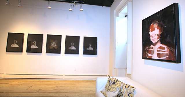
Installation shot of Richard Butler's drawings and paintings at BCB Art in Hudson
photo provided
You've heard Richard Butler - he's the lead singer from the Psychedelic Furs, with the wonderful bass/baritone voice featured on the hits "Love My Way" and "Pretty in Pink" - but you may never have heard of him as an artist. Currently presenting new drawings and paintings at BCB Art in Hudson in a show entitled Happinessisthespace betweensorrows, Butler amply demonstrates his skill in that department, along with a witty darkness that should come as no surprise from an original '70s-era punk rocker.

Small Ashwednesday oil on canvas
What struck me first looking at Butler's paintings is the fact that this guy is truly a painter - not some star who decided he wants to paint now, but a trained artist. Indeed, he graduated from art school in the United Kingdom, where he grew up before making it in music and settling in the United States (he now lives in Beacon). Butler loves to push the paint around, while crafting representational images (all the work in this show are portraits) that, up-close, are juicy and smooshy.

Not much of a colorist, Butler's palette hews mainly to shades of black and white with a bit of red, green, or brown mixed in, but he holds a great deal of attention to light and the way it bounces off of or activates surfaces such as the skin and moist eyes of his sitters.

Amanitadreamer 2
The sitters appear both lifelike and severely altered, whether by heavy makeup in the form of a black cross, bandages, or even flaying. However, the work is more contemplative than grim, more theatrical than painful. He plays with words in the titles, many of which reference the Catholic holiday of Ash Wednesday, but some of which are more poetic, such as Hypochondriachost and Whateverwhereverwhenever. Again, no surprise from a successful songwriter.

Gallery owner Bruce Bergmann told me he encouraged Butler to get back into drawing, and the show includes several chalk drawings on black paper that have a pleasant floating quality, with ghostly busts emanating spindly lines of energy or light. These evoke Giacometti's wasted creatures, but also connect to the paintings and extend the Ash Wednesday theme of the smudged cross on the forehead.

Overall, it's a strong show with a fresh perspective, some nice, arty obsessiveness, and great technique. It runs through August 12.

Large Ashwednesday oil on canvas


Saturday, January 23, 2016

Carrie Haddad and other Hudson galleries

Kahn & Selesnick, Oak-Man Falls 2015, archival inkjet print
I drove over to Hudson last Sunday to meet a friend for a pizza at Baba Louie's (it was delicious) and check out the Photography show at Carrie Haddad Gallery. Haddad typically focuses on painting, but her gallery (the longest-standing in Hudson at 25 years old) has always shown photography as well, and this seemed like the perfect opportunity to enjoy a contemporary showcase for the medium.

Gain Peachin,untitled collage 2015
We were not disappointed, as the exhibition featured a wide array of traditional and postmodern styles, ranging from Jerry Freedner's bucolic Catskills landscapes to Newbold Bohemia's tacky domestic dramas and Gail Peachin's clever, tiny cutouts.

K+S, Charlotte - Apricot 2015
The show includes 12 artists but gives the lion's share of space to the duo Kahn & Selesnick, whose elaborately detailed fantasies have evolved from neo-antique sepia prints to richly colored inkjets. Just a few of K&S's new works are monochrome, and those work very well, but here we see mostly color among the 20 images presented and, frankly, it is a bit distracting. That's because the pictures still evoke timelessness, yet the coloration in most of the prints is noticeably 21st-century.

Among the black-and-whites, we get shades of steam-punk macabre (think Joel Peter Witkin), while the color images of various individuals floating in a shallow pond surrounded by flora and ephemera lean more in the direction of a nursery rhyme.

Stephanie Blumenthal, Light Blue Square 2015, archival inkjet
My favorite work in the show is by Stephanie Blumenthal, who alters highly detailed black and white pictures of bare trees and vines by overlaying blocks of color, with solid black highlighting on the naturally calligraphic gesture of the vine forms. This crossing over of media (that digital tools do so well) is a rich vein in contemporary photography, and will offer continued opportunities for artists to innovate for decades to come.

What I particularly like about Blumenthal is the simplicity or her approach, creating a pure marriage of three strong sensibilities: lushly detailed photography, color-centric painting, and calligraphic line. The resulting series of pictures (which augment each other effectively) takes the viewer to a place of deep observation that is at the heart of all the arts.

Eric Lindbloom, Pine Woods #28 2003, gelatin silver print
I also loved seeing several small, square silver prints by Eric Lindbloom, not only for the nostalgia factor but because they are so beautifully seen and crafted. These date back a number of years (from 1999 to 2009), as does with much of the rest of the work in the show, for which I will register a mild complaint. It's one thing to do a retrospective, or to bring out previously unseen art from the past - but in my opinion it's a no-no to present stale art in a feature exhibition.

The other photographers included in Photographs (which has been extended through Feb 14) are Birgit Blyth, Jeri Eisenberg, Lisa Frank, David Halliday, Robert Hite, and Joseph Maresca.

Michael Theise, Safe-Keeping, oil on panel
While in town, we decided to check out a few galleries we hadn't seen before. One of them, Peter Jung Fine Art, is open only by appointment or chance; the lights were on, so we jumped at the chance to stick our noses in. And what a place! Three floors of comfortable, neatly organized space bristling with antique and contemporary paintings (plus a few photographs) of very high quality, warmed by the very personable Jung, another longtime Hudsonian (he arrived in '92). Though he emphasizes 19th-century landscape paintings, Jung was also featuring the recent trompe l'oeil work of Michael Theise, among many other living artists.

We extended our immersion in painting with a stop at Gallery Gris, where a solo exhibition of abstract oils By Kylie Heidenheimer that was scheduled to end on Dec. 21 was still hanging. The gallery specializes in color abstraction, which is a weakness of mine as well, so I greatly enjoyed this new discovery. Heidenheimer and the other gallery artists (whose works we glimpsed in the back room) are first-rate examples of the genre, and co-owner Todd Gribben was a gracious host. I will be back.

Kylie Heidenheimer, Sweep 2015, oil on canvas

Wednesday, November 30, 2011

Victoria Palermo: RAUM at John Davis Gallery (and other Hudson shows)

cant and wont - platinum cured silicone rubber


Here's a heads-up for serious followers of contemporary art: There's less than a week left to see the exhibition Victoria Palermo: RAUM at John Davis Gallery in Hudson, and you don't want to miss it. If Palermo is new to you, this is as good a time as any to start following her work; or if, like me, you've followed her career for decades, you will be deeply gratified to see this amazing new work.

Palermo (no relation to Blinky), has always worked intimately with color - painted onto found sticks, poured onto paper from a nail-polish bottle, printed in patterns like wallpaper or, in this case, infused into the jellylike body of sheets of pure silicone rubber. Equally, Palermo works with form - her work relates to abstract approaches, but never completely leaves the referential realm - and she is as much a designer as she is an artist. In other words, she has always carefully constructed her pieces, even though there is also a degree of expressive freedom in them.

more or less
The earliest pieces I know of hers verged on expressionism; this new work, instead, pulls from the purity of Modernist architecture to develop miniature worlds of space and light - and, of course, color. Her nine freestanding works in this show are all on the scale of a model, and are presented near eye level on pristine stands crafted of white panels set on top of galvanized steel legs.

This elevated point of view is effective, helping us to get in close and experience the little spaces from inside and out. Moving around them, their varying degrees of transparency and translucency create ever-changing blends of color. One can also imagine that different lighting, especially the cycle of natural light through a day, would add to this engaging process.

Like many artists today, Palermo gives her works curious titles that, like the pieces themselves, hover between the literal and the fantastic, such as no beginning no middle no end, and cant and wont (apostrophes purposely missing). Some of the titles are more playful, as are some of the pieces they label, like bookish, plaidish, and in candyland. Speaking of candy, this work tantalizes the sense of taste by closely resembling jelly candies (I'm waiting for one to be titled Turkish delight); forget the nearly irresistible temptation to touch these gooey, wiggly structures - you'll struggle with the temptation to take a bite.

domino theory
In addition to the sculptures, Palermo has created a number of relief pieces in the same material that are mounted in frames under glass, an effective and less expensive alternative approach that retains the physical fascination of the other work but lacks the changeability of the full-round pieces (one is shown at left); the show also includes a few acrylics on paper that read more or less as sketches of architectural ideas related to the sculptures.

Take note: Victoria Palermo: RAUM ends on Sunday, Dec. 4. The gallery is open Thursday to Monday from noon to 5 p.m.

Rating: Must See


Also showing in Hudson (through Dec. 11) is a five-woman collection playfully dubbed Hudson River School of Women at Carrie Haddad Gallery. Haddad's annual landscape show has no surprises, but this is a worthy showcase of regular gallery artists who are all very good painters of landscape themes (the tongue-in-cheek title does not announce any real school here).

Jane Bloodgood-Abrams (an untitled piece of hers is shown at right) comes closest to the Hudson River School style, in that she favors mystical skies and sunsets; her larger paintings are rather misty (which may bother others like me who don't see as clearly as they used to), while the smaller ones virtually glow from within.

Juliet Teng works in a style that recalls the great American painter Wolf Kahn; like his, her treed landscapes are recognizable but stretch the boundaries of natural color to interesting places (a piece of hers is shown below). Similarly, Tracy Helgeson sometimes reverses color from sky to ground to trees, but Helgeson's palette is narrower than Teng's, relying largely on neon pinks and reds, where Teng ranges through the whole spectrum.

Perhaps the most intriguing of this group is Laura Von Rosk, whose style over the years remains consistent, but who grows subtly stronger over time (or else I am growing subtly more receptive to her style over time). These small, intensely hued and highly polished works on panel play a little game with viewers, by representing sweet, folk-artish fantasy landscapes in all seasons, but always clearly referencing strong female forms in mounds and V-shapes. Also represented in the show, by just two large, textured paintings of birches, is Susan Stillman.

Rating: Recommended
Pink Trees - oil on canvas by Juliet Teng

Another fine show in Hudson is a retrospective of works on paper by D. Jack Solomon at the Hudson Opera House, a nice public space in the open central foyer of a large performing arts center. I have written at length about Solomon's work here, so these comments will be brief - suffice it to say that this selection of 25 years' production is a very fine representation of the artist's evolving styles.

Comprising samples from several large bodies of work dating from 1986 to 2011, 25 Years in the Hudson Valley - On Paper offers some wonderful surprises even to those of us who already know him, and firmly supports my opinion that Solomon is one of the area's most important painters. The show runs through Dec. 10; the gallery is open daily from noon to 5 p.m.

Rating: Highly Recommended
Restoration - mixed media on paper mounted on wood by D. Jack Solomon

Thursday, October 13, 2011

Are We Having Art Yet? Bill Griffith at BCB Art

Irreverent, absurd, existentialist - Bill Griffith’s Zippy the Pinhead embodies these traits as only a character born out of the San Francisco underground comics scene of the 1970s could. Yet in 2011 he is going stronger than ever, in syndication to about 200 daily newspapers, out in a new book, and now appearing in an inspired exhibition at BCB Art in Hudson.

Titled Are We Having Art Yet? Selected Drawings 1978-2011, the show presents numerous original inked versions of daily strips, several inked originals of a 1990 Zippy calendar, a few pencil renderings of early Zippy covers, and signed inkjet prints of other Zippy material. All the work on the walls is in ink or pencil – i.e. no color – and was, of course, created for reproduction, so it has that special quality of blacks and whites, of hatching and cross-hatching, that gives all graphic art a certain eye-appeal.

But, rather than let the monotony of monochrome get overwhelming, Bruce Bergmann, the gallery’s owner, has placed most of the work along a bright yellow rail, backed by a garish band of the same yellow with a pattern of big, red polka dots. The design scheme is taken from Zip’s costume, but it also imparts a properly carnivalesque atmosphere to the exhibition. Yes, it says, you may be in an art gallery, but you don’t need to take anything too seriously here.

An art calendar drawing by Bill Griffith
As these are comic strips, naturally the show is a hoot; but what makes it really special is that all the strips are specifically art-related. It is certainly a comic fan’s delight – but it is also an art critic’s paradise. Griffith went to art school and attempted a career as a painter before stumbling into comics in 1969, and he loves to send up the posturing of serious artists and pundits. Jokes about Picasso, Giacometti, Pollock and Magritte here coexist with jokes about Ingres, DaVinci, ancient Greece and cave art.

With the irrepressibly idiotic Zippy as his guide, Griffith has no fear, and the results are hilarious.

For most, including myself, Zippy is an acquired taste. His bizarre appearance, politically incorrect moniker and – above all – chronically off-the-wall pronouncements are not going to be for everybody, even those of us who are used to edgy stuff. But he grows on you – his sweetness, his persistence, his inability to grasp basic reality – it all adds up to irresistible charm.

Whether you like the humor or not (and in the case of these strips, it helps to be conflicted about modern art), seen up close in the original, the drawings show that Griffith is no pretender – he’s got the chops to draw anything well, and he’s got the graphic sense to know what to draw and what to leave out. It’s clear, crisp communication.

While much of the work is simplified, and much of the content goes in the direction of one-liners, some of these drawings also have a great deal of complexity built in, and with lengthy perusal will yield new secrets. Mostly, though, it’s about the humor of absurdity and, in this particular selection, the absurdity of the art world. Which works real well for me.

Rating: Highly Recommended

Monday, August 23, 2010

Hudson Galleries

I've missed some important exhibitions this summer in Hudson, but I'm happy to say several really good ones are showing there currently, so it's anything but too late to take advantage of the remainder of the summer season in this regional art mecca.

First up (beginning with what will end soonest and going on from there) is a fine display of large-format color photographs by Victoria Sambunaris at Nicole Fiacco Gallery. The pictures are direct responses to 19th-century Western landscape photographs, updated by being in color, but otherwise only different in scale than the sort of works they pay homage to.

However, while the spirit of this work is similar to the geological-survey work of the past, these changes in scale and color do a lot to change the overall effect. Sambunaris has a knack for choosing scenes that include physically tiny details that reveal 21st-century truths, nearly hidden though they may be in the eye-pleasing atmospherics of these big, smooth prints.

The work is savvy and expertly crafted. As in most Fiacco exhibitions, the presentation is almost too spare, with just seven images spread around the big, white box of a room. Also on view in the more intimate upstairs space are several unframed ink drawings by Troy artist Gina Occhiogrosso, titled The Road. Both exhibitions run through Sept. 4.

John Davis Gallery is featuring Caroline Ramersdorfer, an international sculptor with local ties, along with several other gallery artists in the four-story rear carriage house space. Ramersdorfer often works on a monumental scale (well documented in wall panels on view in the gallery), and the gallery's ample courtyard accomodates one such piece; however, the rest of the work on view is modest in size, and some of it is notably tiny.

If you thought that contemporary artists no longer carve marble, this show will be an eye-opener. Ramersdorfer's work, however, does not look backward. Neither does it present objects meant to be walked around and admired in the traditional way of three-dimensional carvings. Rather, most of the pieces in this show depend on the viewer's willingness to look through their multiple layers from a certain point of view, from which they tend to take on an almost illusionistic degree of depth and complexity.

Ramersdorfer's forms are abstract, though they could be understood to represent microscopic visions of organic or chemical materials, and they play with a nice variety of the textures that a medium like marble can take on, as well as some translucency. A couple of the smaller pieces are executed in wood (natural or painted), which works well enough as a study ("maquette" to some), but did not impart the same feeling as the completed stone carvings.

If you go to Davis, be sure to check out all four floors of the carriage house, a marvelously old and crusty structure, which serves well to display drawings by Constance Jacobsen, paintings by Farrell Brickhouse and Lois Borgenicht, sculptures by John van Alstine and Jon Isherwood, and a giant banner of an installation by Sam Sebren. It all ends on Sept. 12.

The most important show in Hudson right now, and probably one of the more significant shows to be mounted there in some time, is a retrospective of Edward Avedisian at Carrie Haddad Gallery through Sept. 19. It's almost unheard of for Haddad to devote the entire main floor of her gallery to just one artist, but in this case it makes a lot of sense, because the Avedisian we see there is at least three artists all by himself.

There is the master of color-field stripes in the front room, the smearer and splatterer in the middle, and the almost Pop-style renderer of domestic interiors and exteriors in the back. For me, Avedisian's stripe paintings are irresistibly beautiful and yet transcendent, making the other abstracts seem cloddish in comparison; meanwhile, the representational paintings are extremely competent and were, apparently, necessary for the artist as he transitioned from New York City life to sleepy Hudson in the '70s.

This is truly a must-see exhibition on the level of the finest galleries and museums anywhere. Avedisian, who was once a very sought-after guy on the New York art scene, left all that behind - not to work quietly in the country while maintaining a city presence, but to cut himself off from it - and the quality of many of these paintings (dating from 1960 to 2003) clearly demonstrates that he had the stuff if he had wanted to remain.

Instead, he melted into near-obscurity, then died in 2007, leaving behind a very impressive legacy we are lucky to have a chance to see before collectors disperse it all.

Carrie Haddad Photographs is also breaking from tradition with the inclusion of a painter, Lionel Gilbert, in the lineup of three artists on view through Sept. 26. This experiment succeeds (unless you have a problem with a gallery that has the word photographs in its title showing traditional paintings), largely because the two photographers, Kim McLean and Harry Wilks, though quite different from each other, both take a decidedly painterly approach.

The focus is on McLean, a voraciously inventive and ambitious maker of extremely detailed digital constructs that, though they use some photographic source material, really read more as paintings. They refer both directly and indirectly to major historical photographs, while evoking the lighting, techniques, and surfaces of more recent media such as CGI films and video games.

I've never been a huge fan of the created photographic image, and I find the artificiality of McLean's work somewhat tedious (though I have no doubt many others find it endlessly fascinating). But I have to admit that his exuberance is catchy, and his colors are simply gorgeous, even when muted to a nearly monochromatic palette in certain strong examples.

The more understated, but still pretty wild prints by Wilks (example above left), and the vintage modernist oils by Gilbert (example below) are also well worth seeing, though I wish there were a bigger selection of Wilks' work.

Another show worth checking out (though I missed it on my visit), features paintings by Frank Cressotti and Barbara Friedman at BCB Art through Sept. 19.

Friday, March 12, 2010

Hudson Galleries

Spring was in the air, and a nice walk for the whole length of Warren Street in Hudson yielded the expected treasure from the region's most concentrated collection of art galleries.

Karen and I went to help a friend celebrate her part in a show, took in others that were having events and openings, and topped it off with a superb dinner at Ca' Mea, where Massimiliano greeted us warmly and invited us to visit him at his other eatery in Cortona, Italy, if we were ever in the neighborhood. For the food, in this case, no need to go to Cortona!

So, on to the art. First up, a collection of four painters presented as View Four, on exhibit through March 20 at Nicole Fiacco Gallery, whose pristine white cube of a room is probably the most perfect exhibition space anywhere north of New York City outside of a museum. The four painters - Robert Roane Beard, Stephen Courbois, Jeanette Fintz, and Enrique Kico Govantes - naturally are arrayed one on each wall, but with almost too much white space to go around and an annoying (for me) total lack of labeling.

Though they are shown in the same exhibition, the connections among them are a bit vague, centering on color and geometric pattern as methodic foci. Taken individually, I was most impressed by Fintz, whose modestly-sized acrylic triptych on wood panels and much bigger pair of acrylics on canvas played a complicated call-and-response. With shapes derived from a systematic application of the circle and hexagon, played out in a bottomless-well of expressiveness, Fintz applied challenging palettes of blue, green, and pink in one large piece called Andalusian Shards #2 (shown at top of post); staring at it is a bit like falling into the sky.

Also inspired by nature - including the human kind - are the four seasonal squares by Govantes (Winter, Karen's favorite, is shown at right; Summer is shown above). I like the energetic brushwork, the strong color shifts, and how Govantes strikes a balance just midway between abstract and figurative. Though it's a clichè to reference the seasons, he does it extremely well - look at the way Summer vibrates and you feel its heat.

Beard's work is directly taken from landscape, some Irish, some Columbia Countyish, and he does it on a very small scale - no bigger than about 5 by 7 inches (one is shown at left). His skill and style are easy to like, but the work seemed a bit frivolous to me, reminiscent of the once-overly popular graphic artist Folon.

Courbois is somewhat the odd man out in this group: His extremely dry approach to an exploration of muted colors in repeated shapes is quintessential Modernism (which is to say early 20th century). Not properly referred to as a painter, he employs a very subtle technique similar to chin collè printmaking to make contemplative constructions like the one shown here.

This is the kind of work that only serious art lovers can really get much out of - a narrowly focused theme-and-variation that you must really work to appreciate. I'm not lazy, but I prefer artwork that reaches out more ardently to the audience.

That would be a fair way to describe much of what has been brought together for the annual Painted Cities exhibition at Carrie Haddad Gallery, on view through April 11. This year's edition of the show is bristling with positive energy and some very fresh work, including lush "drawings" by Paul Chojnowski that are made from nothing more than water and fire (the one shown at right is titled Evening on the Avenue).

Other highlights include a savvy, atmospheric view of Troy's industrial waterfront by Tony Thompson; Staats Fasoldt's masterful little watercolors; and a group of painted moments by Judith Wyer that evoke great street photography - not by dint of excessive realism but by their skillful observation and cropping (the one shown at left is titled Pedestrian).

An even more popular approach is taken by the Columbia County Council on the Arts, whose 14th Annual Juried Show is on view at the Hudson Opera House through March 28. Judged by University at Albany Art Museum Director Janet Riker, this year's show awarded first and second prizes in 5 categories (painting, photography, sculpture, mixed-media, and works on paper), as well as a best-in-show, so everybody gets a little glory.

Riker is no pushover, however, and the work in the show is strong in each medium, providing a terrific opportunity to get a good overview of a diversity of excellent artists from the region. My favorites are too numerous to mention, though I must credit Hunger Moon, a video by Alan Coon that plays on animal and human locomotion; Car Jack, an amazing, very large drawing on wood panel by Keith Batten; and a simple - but not simplistic - stack of bricks by Jean-Marc Superville Sovak titled It Can't Last (shown at right).

Also presenting a large number of artists in one space is the Limner Gallery, whose Emerging Artists 2010 will be on view through March 27. I confess it was my first time visiting Limner, though it's been open under the wise guidance of an outstanding self-taught painter named Tim Slowinski since 1987 (!!!). It proved to be a great, if late, discovery.

I like a gallery that sets a style, and Limner is very much in that mode. All the art tended toward certain ideas and aesthetics that reflect, but do not mirror, Slowinski's own: carefully crafted, realist or Surrealist, deeply into social commentary. Many of the works showed good chops, but one stood out as truly extraordinary - a color drawing by Roberto Osti called Agnostic's Flight (shown at the bottom of this post). You must see it up close to be totally wowed by this piece, and you will, I promise, be wowed.

Finally, a show of abstract paintings by Claude Carone is at John Davis Gallery through March 28 and, as I always find at Davis, the work is impeccable. Elegant, warm, but with a tinge of the dark side, Carone's work is evocative without being representative.

This impression is borne out by his titles: Wind in Tinehir (shown above at left) or Glorious Morning, for example, are not meant to merely label the painting. After scanning the artwork, then noticing a list of these suggestive titles, I saw one that sounded familiar. Sure enough, Diver's Vision referred to the very painting I was thinking of - formally similar to the others, but with an undeniable underwater tone.

Other paintings in the show range from bright and linear to mysterious and layered, from the pastel-light to the earthily charred. The size range is modest, from about 8 by 10 inches up to about 2½ by 3 feet, but the surfaces and color relationships are very rich. It's a show not to be missed.