Get Visual is the grateful recipient of a grant from The Christos N. Apostle Charitable Trust
Showing posts with label printmaking. Show all posts

Sunday, March 13, 2022

Robert Blackburn & Modern American Printmaking at The Hyde Collection

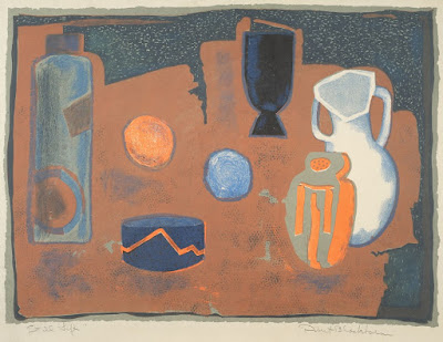
Still Life (aka White Jug), c.1950, color lithograph
all works by Robert Blackburn
The name Bob Blackburn is unlikely to ring a lot of bells with the average art viewer - but a show currently on view at The Hyde Collection in Glens Falls through April 24, could change that.

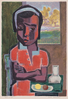
Girl in Red, 1950, color lithograph
Organized by the Smithsonian Institution Traveling Exhibition Service, and ably curated by Deborah Cullen, Robert Blackburn & Modern American Printmaking, is a show with a story that blends 20th-century American art history with African American history (in other words, highly relevant), while revealing a tremendous talent that was largely overlooked - but not necessarily due to the artist's skin color.

Because Blackburn dedicated himself largely to producing lithographs, etchings, silkscreens, and woodcuts for other artists, his devotion to his own career as an image maker took a back seat. He describes this choice himself in a quote on the gallery wall (one among many that perfectly accompany the works of art in the exhibition), saying "I was torn between building something which I thought had value and doing my own work."

In fact, he succeeded at both, by establishing printmaking workshops that forever changed the way postwar artists used those media, thereby significantly affecting the trajectory of contemporary art, and producing numerous powerful original works in the same media on his own time. Many viewers will be thrilled to see prints here by artists such as Robert Rauschenberg, Charles White, and Grace Hartigan - and those are great! - but I'll focus my comments on Blackburn's work, which makes up about half the show.

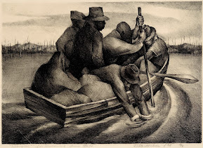
Refugees (aka People in a Boat), 1938, lithograph
It's immediately clear upon entering the gallery that Blackburn had tremendous ability as an artist. The first image, a lithograph he executed at the age of 17 in 1938, shows an already accomplished skill level, and a mature vision in step with the times. Entitled Refugees, the piece shows the influence of prominent socially conscious work of the period, such as that by Diego Rivera or Rockwell Kent, but stands on its own as a Depression-era cry of concern.

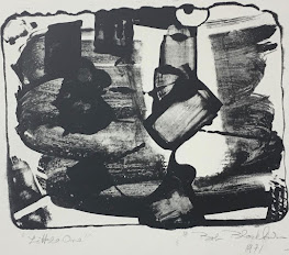
Little One, 1960s-1971, lithograph
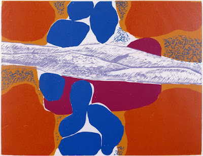
Later works move on from figuration into abstraction. Blackburn pointed out his thinking on this process saying, "illustration was one thing and creating vital space is another." Indeed, "vital space" is what he delivers in print after print, whether injecting that into the work of others through collaboration, or in his own masterful pieces.

I had so many favorites around the two large galleries devoted to this collection that I hardly know where to begin. But I will say this: the medium was only a starting point. Blackburn mastered many, and he innovated in them all. So there are prints in almost every technique (including cutting-edge forms) that fulfill Blackburn's creative promise while amply demonstrating his technical contributions.

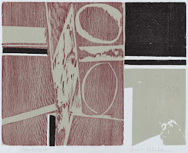
Woodscape, 1984, color woodcut
Among the characteristics that pervade the work, and which help it hold together as a singular body, are Blackburn's brilliant color sense, his compositional daring, and a playfulness that I honestly envy, all of which he maintained over more than 60 years, before illness slowed him down. Undoubtedly, the man worked day and night, and the artists he collaborated with provide quotes in praise of his constant willingness and easygoing personality - it seems they all loved being around the positive energy of Bob Blackburn.

It also seems Blackburn had no quarrel with his relative lack of recognition or fame, further underscoring the sweetness I feel when viewing his personal output. But make no mistake - that work is serious, and important. For each of the pieces I've selected to reproduce here, there are ten more in this wonderful exhibition that are just as good. Try not to miss it.

Blue Things, c. 1963–1970, color woodcut 


Sunday, January 2, 2022

Catch these while you can ...

What better way to start the new year than to catch up with an art show or two that you meant to see but got too busy to get to during the holidays.

There are a few good choices in the region that will end soon, including a great opportunity to take advantage of free admission at a world-renowned museum.

Return 2 Earth 2017, mixed media
by Alisa Sikellianos-Carter
First up, in order of ending date, would be the Annual Members Show at Saratoga Arts in Saratoga Springs, set to close on Jan. 8, closely followed by the annual Upstate Artists show at The Laffer Gallery in Schuylerville, which ends on Jan. 9. Both include a large cross-section of regional artists and are located not too far apart, providing a good opportunity to double up.

Two shows that will end on Jan. 14 also feature a great many regional artists: Gallery Mixtape, Vol. 1 at Collectiveffort in Troy, where a selection of BIPOC artists are showcased, and the Annual Members' Show at Albany Center Gallery. Well over 100 artists (myself among them) present one piece each at ACG, making for a super-eclectic viewing experience that is always popular with viewers.

An example of 20th-century Japanese
printmaking at The Clark
A solo show by one of the region's outstanding mid-career artists, Alisa Sikellianos-Carter, will re-open on Jan. 9 and run through Jan. 16 at Union College's Mandeville Gallery in Schenectady. Sikellianos-Carter, who was one of the three jurors of the 2021 Mohawk-Hudson Regional, works in large-scale mixed media with a healthy and entertaining nod toward Afrofuturism.

Perhaps most intriguing, an exhibition of 20th-century Japanese prints from the museum's collection will remain on view at The Clark Art Institute in Williamstown, Mass., through Jan. 30 - and admission to the museum will be free for the entire month. Competing Currents promises to be a highly pleasurable lesson on a unique corner of recent art history.

So, go forth and see some art! It will make a great beginning to your 2022.

Add note: This just in from the Albany Institute of History & Art - Fashionable Frocks of the 1920s, a fancy and fun romp among the clothing styles of the flapper era, has been extended through Jan. 9.

The Annual Members' Show at Albany Center Gallery is always a crowd-pleaser
photo by Daniel Joyce


Wednesday, August 18, 2021

Keith Haring at Fenimore Art Museum

Installation view of Keith Haring: Radiant Vision at the Fenimore Art Museum
photo provided
Keith Haring was born in 1958 (one month before me) and became a defining artist of his generation before he died of AIDS in 1990 at the age of 31. Keith Haring: Radiant Vision, on view at the Fenimore Art Museum in Cooperstown through Sept. 6 Oct. 11, tells the story of how that remarkable career happened, and explores what it meant. The exhibition uses a clever graphic timeline, wall text, and ample quotes from the artist to recount Haring's history, and features a broad and deep sampling of the artist's work (including more than 100 works from a private collection, and a very impressive gigantic etching from the Fenimore's collection).

A news release about the show states that Haring "was arguably the most accomplished and prominent American artist of the 1980s," a claim I can neither fully agree with nor effectively refute. As an exact contemporary of Haring's, I can only say that he never held a lot of interest for me, partly because of the very commercial nature of his work, and partly because, though incredibly successful, he didn't have the chance to reach his full potential as an artist.

Radiant Vision offers an excellent opportunity to see for yourself what you think about a young man whose contributions included helping to bring graffiti art and hip hop into the mainstream, extending the art-for-all populism of his good friend Andy Warhol, and combining art with activism, perhaps more successfully than anyone else, before or since. The latter two achievements are, to me, the more valuable, but all of it is astonishingly impressive for a person whose career lasted just 10 years.

Keith Haring is seen at an early exhibition
of his work at Tony Shafrazi Gallery in New York
photo by Allen Tannenbaum 1982
Haring was essentially a graphic designer whose pictures relied on super-simplified line drawings of iconic symbols to communicate primal messages, just as corporate logo designers strive to do. And he was incredibly good at it. He used pure primary and secondary colors, vivid unmixed paints and inks, big shapes, and empty backgrounds, along with words and symbols, to make exuberant, bold statements about life as he saw it.

As seen in this exhibition, Haring invented his own visual vocabulary - a crawling baby, angular barking dogs, leaping stick figures, etc. - and rode it to vast global dissemination. He also used these skills in eminently worthy campaigns against AIDS, apartheid, and drug abuse, work that is well documented here, and which shows how effective simple graphic art and youthful sincerity can be. 

However, there are a few outliers scattered here and there throughout the exhibition that hint at a much more subtle artist who may have been trying to emerge from behind the public Keith Haring. That artist worked looser, with less clearly defined boundaries, used thinner lines and more shading, and employed a less bright palette to evoke deeper meanings and messier emotions. Some of those works reminded me of Miro' and Picasso and, as I walked around the exhibition, I found that I liked that version of Keith Haring a lot better than the one we all already knew.

One of the best aspects of Radiant Vision is the way it demonstrates Haring's humility and humanity, through quotes on the wall, in which he repeatedly explains how much he wants art to be accessible to all, and through a charming TV show interview in which he asserts an almost selfless modesty, alongside a crystal clear vision. These were the things in the show that did the most to convince me of Haring's significance. Though it goes without saying, it's a terrible shame that he died so young. Despite his own almost superhuman optimism, I simply couldn't shake the sadness.

Checkerboard, polychrome assemblage 2020
by Laurene Krasny Brown
Also currently on view at the Fenimore are a pair of shows that opened a couple of weeks ago and will remain there through Dec 31. Toying with the World: Works by Laurene Krasny Brown and 
Believe In Yourself: What We Learned From Arthur, which features the work of illustrator Marc Brown, stand alone in separate galleries but are closely linked, in that the two artists are a married couple.

Marc Brown is known to anybody with kids through the Arthur books and TV series, and the exhibition does a fine job of sharing the process involved in creating those products. Brown is an absolutely first-rate illustrator and, like any successful commercial artist, he clearly works his tail off. It was great fun to see the thumbnail sketches and story boards that lead to a finished book, but even better to see the exquisitely detailed paintings that are so easily taken for granted once they're on the printed page.

Laurene Krasny Brown is a much more interior artist, working with modest materials to pursue an almost mystical personal vision built around the concept of games. Where I was expecting stuff more childlike, instead I found a persistent exploration of geometric and architectural themes, characterized by a soft palette of early-American colors in paper and gouache. Brown's playfulness was apparent, but tempered by the same seriousness that I've observed in certain active toddlers.

Both shows are well worth spending some time with. By the way, admission to the Fenimore is free for those 19 and under for the duration of these exhibitions - so feel free to bring the kids.

A painting by Marc Brown from Wild About Books


Friday, July 16, 2021

Nikolai Astrup at The Clark

Nikolai Astrup, A Clear Night in June, 1905–07, oil on canvas: That Nordic glow

This year, the Clark Art Institute in Williamstown, Mass., has taken a different tack with its big summer show. Rather than feature a blockbuster on the level of Renoir (2019), Van Gogh (2015) or Turner (2003), the region’s most venerable museum has mounted the first North American show ever of a little-known early-20th-century Norwegian painter named Nikolai Astrup.

Organized in collaboration with Norway’s KODE Art Museums, and curated by British art historian MaryAnne Stevens, Nikolai Astrup: Visions of Norway aims to convince its audience that Edvard Munch had an unjustly overlooked contemporary who – perhaps - should be regarded as his equal. It’s an intriguing and challenging argument to engage, and one that, in all honesty, can’t be concluded – but, in the process, we are given a strong show that is without a doubt well worth seeing.

The Parsonage, n.d, oil on canvas
I am delighted by the irony that, in this era of unrelenting wokeness in the arts, a leading museum is willing to stake its reputation on a dead, white, heterosexual, male painter. What nerve! What verve! What fun. Well, it could be fun, if Astrup weren’t so generally gloomy. But how can you blame him? After all, he lived in rural Norway, the son of a parson, sickly from an impoverished childhood, underappreciated.

Gloomy – yet glowing. Despite his isolated circumstances and shortened lifespan (he died in 1928 at the age of 47), Astrup burned with a passion for his chosen subjects, the Norwegian landscape primary among them - its particular light, its plants, its folk traditions, its rustic buildings, and its people. This passion led Astrup to work feverishly, not just in paint, but also extensively in Japanese-style woodblock printing (ukiyo-e), which he executed extremely well, whether in multiple colors or in monochrome.

Bird on a Stone, woodblock print
with hand coloring c. 1905–14
Fortunately, a significant portion of the expertly laid-out exhibition is devoted to the prints, including several examples of the original blocks, themselves alone worth the price of admission. But it is the paintings that dominate and best tell the story of a man in love with his rural existence and an ancient culture. This is expressed above all in the night paintings, which capture the peculiar half-light of the extreme North in summer and the opportunistic plants that explode in its short growing season.

We learn from the concise wall text that Astrup was an enthusiastic horticulturalist, and we see evidence of that in the lovingly rendered trees, bushes, and flowers that pervade his works. No shade of green escaped his searching eye, but he also exercised plenty of artistic license in his renderings, in one case featuring identical rhubarb plants in two entirely different landscape views.

Rhubarb, 1911–21, oil on canvas
We also learn that, mid-career, Astrup weathered a crisis in the form of negative criticism of his work in a Berlin exhibition, which caused him to rethink his approach and strive to modernize it. I can imagine that the comments attacked two weaknesses in his work, one of which would be equally derided today, and that is sentimentality. The other (and I’m just guessing) could have been his awkward handling of human subjects – if he’d given them half the life force he gave his plants, many of these paintings would be far better.

In any case, the later work is indeed stronger overall, as is particularly evidenced in repeated depictions of a Midsummer Eve bonfire ritual that Astrup recalls from his youth, when his strict parents forbid him to participate, as they considered it pagan. Several of these paintings and prints are presented in the final gallery of the exhibition, making a clear concluding statement about Astrup’s life, values, and skills as an artist.

Midsummer Eve Bonfire, before 1916, oil on canvas
While I’m not a huge fan of folklore, I enjoyed immersing myself in Astrup’s personal celebration of it, especially as he worked and reworked themes in paint and prints over many iterations. But I responded more viscerally, and with great pleasure, to his formal concerns, especially where color takes on its own life in certain paintings, and where otherworldly light emanates from his subjects.

This is most apparent in some of the landscapes painted at night, and in a couple of still lives made late in Astrup’s career in the interior of his home. For me, though the subject is quotidian, private, and momentary, the painter’s approach to it has taken it beyond those limits to the universal and the eternal. Perhaps, had he lived longer, Astrup would have followed this path to a place where the question of a revival would be moot.

But, whether he was truly a great modern painter, or merely a talented also-ran, Astrup’s contribution is significant enough to be worthy of the showcase he’s now receiving at the Clark and beyond.

Nikolai Astrup: Visions of Norway will remain on view in the special exhibition galleries of the Clark Center through Sept. 19; from October to May, it will travel to museums in Norway and Sweden.

Nikolai Astrup, Interior Still Life: Living Room at Sandalstrand, 1926–27
oil on canvas

Two additional exhibitions currently on view at The Clark are also of great interest. Claude and François-Xavier Lalanne: Nature Transformed is an intriguing collection of Surrealist sculptural works by a non-collaborating French couple who each innovated with materials to create striking visions inspired by nature. It will remain on view through Oct. 31 in a glass-enclosed gallery on the ground floor of the Clark Center that also affords views of several pieces by the Lalannes that are installed outdoors.

Erin Shirreff, Four-Color Café Terrace (Caro, –––––,
Moorhouse, Matisse)
 2019, dye sublimation prints
on aluminum and archival pigment print

In the café area downstairs in the Clark Center, and in the nearby Manton Research Center, are several large works by Erin Shirreff, a Canadian multimedia artist who combines sculpture and photography in unique ways. While her single long video stream and simplified photographic constructions are built with layers of references from other sources, they remain fresh, not derivative. Indeed, Shirreff's elegant abstractions are successful postmodern transformations and well worth spending some time with. The yearlong installation, entitled Erin Shirreff: Remainders, runs through Jan. 2.

Finally, Dürer & After, a new exhibition drawn from the Clark’s extensive holdings, is slated to open tomorrow (July 17) and remain on view through Oct. 3 in the Eugene V. Thaw Gallery for Works on Paper.

Sunday, February 28, 2021

Terry James Conrad: Object Permanence at Opalka Gallery

Terry James Conrad adjusts his musical installation at the Opalka Gallery.
all photos provided
We’ve all heard of the three Rs - Reduce, Reuse and Recycle – and most of us know that the first two are the more effective approaches to problems associated with waste. But they’re also harder to do, so we’ve tended to focus on recycling, which, also known as remanufacturing, has more and more clearly been revealed as not much of a solution at all.

Tin cans reduced to essential shapes
It’s admirable to try to reduce our production and consumption of stuff, but there’s a conundrum in it: Doing things – which often means making things – is what gives our lives meaning. And that goes double for studio artists. Just try to imagine all your favorite creators having built their careers without leaving behind a trail of stuff. Not at all likely.

All of which makes the unusual approach to making art that Terry James Conrad has pursued so fascinating. Currently the protagonist of a solo exhibition and series of events at Sage College’s Opalka Gallery in Albany, Conrad has taken that second R to heart, and made Reuse his raison d’etre. The result is both intriguing and – perhaps a surprise - esthetically appealing.

One of Conrad's presses in use - the paper
is at the bottom, under the cans
Conrad is essentially a printmaker, though this installation also includes numerous small sculptures, four handcrafted wooden guitars, and a large musical apparatus, in addition to three homemade printing presses that are being actively employed during the exhibition. The level of skill involved in all these works is extremely varied, from pounded, foil-wrapped tin cans that evoke outsider art to fancy woodworking and metalcraft on the guitars. Somewhere in between is the Rube Goldberg-esque music machine, which Conrad set into sonorous motion during my visit. (He’s in the gallery every Thursday adding a residency component to the show.) Unlike many sound installations, the contraption’s rhythmic emanations were not unpleasant or intrusive; rather, they suited the room and the other art in it quite nicely.

It’s worth trying to explain about those presses. Conrad has invented a unique method of printing, which uses gravity to create downward pressure on a matrix of folded, joined, and grouped tin cans that are placed on top of the printing paper. Each press is a multilayered stack of found stuff, not all of it functional, but all of it adding to the overall visual and symbolic effect of the conglomeration. After homemade inks are piped into the interior spaces of the cans, where they pool and soak for several days, an embossed and colored image will be permanently impressed upon the page, formed of deep lines from the cans’ edges and flowing colors within and around them.

Conrad has embellished these found cans with colored foils 
Conrad makes his inks from everyday sources like walnuts and rust, and uncommon ones, too, such as silt taken from 565 meters below the ocean. Many of the more than 30 finished prints in the exhibition are displayed without frames or glass, making it easy to examine their soft textures and subtle variations in tone. Others are shown in frames, most notably a suite of black-on-white lithographs embellished with pastel-colored frames - but the unframed works are the stars of the show.

Four Conrad prints
The prints are abstract and have equally abstract names, and they are fun, funky, even stylish, with geometric forms and an array of mostly muted colors. Their method of display appears to be yet another Conrad innovation: Angled out from the wall on painted wooden supports, and placed well below the usual eye-level of gallery art, they invite relaxed intimacy and close examination. The experience is enhanced by the opportunity to also examine the tin-can constructions that made these prints, as they are also on view in the gallery, along with a number of simpler transformations of tin cans that evoke early Modernist minimalism.

The show is billed as a survey, with prints ranging throughout the last 10 years. Most of them have white backgrounds, but a triptych entitled Benthic is brown and soft like suede, fully stained with walnut ink around its other colors and floating shapes. Benthic is also larger than the other prints, and super-fresh (dated 2021), suggesting a strong current direction.

Terry James Conrad: Object Permanence will remain on view through March 13. The Opalka Gallery is open to the public, with generous visiting hours that include Thursday evenings and Saturday afternoons. I highly recommend that you make time to see this outstanding show by a uniquely dedicated and talented artist.

Benthic 2021 - monoprints by Terry James Conrad


Sunday, September 13, 2020

Masterful prints at the Fenimore Art Museum

Albrecht Dürer - Agony in the Garden (Christ on the Mount of Olives), 1508
detail of a print from the Engraved Passion series

It can be easy to overlook printmaking as an art form, especially in our current digital age, where a few clicks will get you a nice image made of ink on paper. But two very different shows currently on view at the Fenimore Art Museum in Cooperstown serve as timely reminders that it wasn’t always so easy, and that it still takes vision to make easy into wonderful.

All fans of visual art know the name Albrecht Dürer, but most of us probably didn’t know that Dürer “singlehandedly transformed printmaking from a craft to a fine art” in the late 1400s and early 1500s, as postulated and amply demonstrated by the traveling exhibition Albrecht Dürer: Master Prints, on loan to FAM through Nov. 22 from Pennsylvania’s Reading Public Museum.

Fall of Man from the Small Woodblock Passion, c. 1510
The show includes more than 20 examples of Dürer’s woodblocks and copper engravings, including all 16 of the “Engraved Passion” series. Though the prints are quite small (typically about 2.5 by 4.5 inches), they are packed with detail; and, though they are monochromatic, they feature an engaging range of tones and textures, emphasized by Dürer’s signature chiaroscuro style. A few examples of work by contemporaries who influenced or were influenced by Dürer are also included here, and they provide the context to support the idea that his work transcended illustration to achieve true artistic expression in a medium generally meant for popular consumption.

Not that Dürer eschewed popularity – on the contrary, according to the exhibition wall text, “his prints circulated throughout Europe, making him one of the most influential artists of his age.” Something like today’s YouTube or Instagram stars, he gave the people what they wanted, providing his own special twists in the form of naturalistic curiosities, bravura line work, and visual puzzles. The woodblock print Fall of Man provides one example of these strengths – whereas a simple rendering of Adam and Eve with the snake would do, Dürer adds other animals such as a bear (or is it a boar?) and a peeping lion, along with his classic personal logo on a trompe l’oeil metal tag.

Joachim and the Angel from The Life of the Virgin, 1504
Dürer honed his craft and his vision during a trip to Italy in his 20s – no surprise that exposure to the culture that spawned Renaissance art would make him a better artist, too – but his work still radiates a German sensibility in its emotional restraint and controlled, almost analytical approach. Equally, the religious and moral subject matter of these images speaks of their time and place, and presumably of Dürer’s Christian devotion, but there’s much more than Biblical storytelling to their content. Another fine example is Christ Shown to the People, in which several exquisitely detailed human figures, a darkly vivid forest, and a microscopic farming scene are all crammed into a small engraving, emulating some of the best qualities of Italian art of the time.

All in all, with a little patience (and maybe a magnifying glass, available for use in the museum), this display of Dürer’s master works will greatly reward any visitor.

Kykuit Estate, Tarrytown, New York
Flashing forward to the 21st century, an exhibition of beautifully realized inkjet-printed photographs by Steve Gross and Susan Daley entitled Blue Gardens makes a strong complement to the Dürer show.

Gross and Daley work as a duo, and they built this collection of images over more than a decade (mixed in with other projects), by visiting numerous venerable parks and estates to capture their seemingly timeless outdoor spaces using digital cameras.

The resulting show of 22 prints, all of them transformed to the mellow blue tones of a cyanotype, provides both a document of these special places and a lush and pensive visual style that the pair have cultivated over many decades of photographing landscapes and gardens together. The beautiful consistency of this group belies the diversity of its subjects, ranging from South Carolina to Upstate N.Y.

Untermyer Park, Yonkers, New York
All but two of the prints are a medium size for photographs (about 11” by 18”), which is small enough to draw you in close, but still big enough to allow you to enter the space and peruse the finely rendered details of plants, statuary, architectural elements, and water features (natural or man-made). Two of the prints are much larger (about 30” by 40”), which helps them work well when viewed from a distance, and emphasizes their strong compositional effects.

In many of these pictures, the sky is a powerful presence. This may have been part of the reason for printing in blue, or just a happy byproduct of the decision to render the gardens themselves in blue, but the effect of that choice works beautifully (I have tried to imagine these images in a classic grey monotone instead, and it doesn’t seem to work at all). In any case, the skies are crucial to the work precisely because, while the rest of the subject matter is virtually unchanged from its inception a century or more ago, the ever-changing sky captured in a fleeting moment firmly anchors the images as photographs, timeless though they may seem.

Blue Gardens will remain on view at FAM through Dec. 31.

Steve Gross and Susan Daley - Crane Estate, Ipswich, Massachusetts


Saturday, July 25, 2020

Recycled and Refashioned: The Art of Ruby Silvious at AIHA

Tea Shirts - watercolor, gouache, ink on used tea bags by Ruby Silvious
It's no secret that the greater Capital Region has long been home to a rich community of visual artists. The reasons for this are many, including location, job opportunities, cost of living, and numerous colleges and universities with strong art programs being nearby.

Most of these local artists succeed at various levels, and some are well established in other markets (such as New York City), but it's rare that one breaks out in a big way - so when that happens, it's cause for celebration. I therefore commend the Albany Institute of History & Art for doing justice to our latest local hero, Ruby Silvious, with a terrifically likeable five-year survey of her work.

I was lucky to have had the chance to visit Recycled and Refashioned: The Art of Ruby Silvious before the pandemic shut it down in late March, and I'm delighted that the museum, which has just re-opened to visitors, extended the show's run through Aug. 30, because this is a show literally everyone should try to see.

Like most successful artists, Silvious is incredibly hardworking, as evidenced by the striking quantity and range of the work in this show. But her impressive output doesn't come at the expense of quality - indeed, Silvious seems to get better the more she produces. So, while the number of works on view can be a little overwhelming (multiple viewings are advised), the repetition of many examples in her major themes serves to underscore the wonder of this artist's intensive daily practice.

That daily practice itself is a unifying theme here, as is an abiding interest in clothing (hence the fashion reference in the show's title). While Silvious employs numerous techniques, including drawing in ink, painting in watercolor and gouache, printmaking, collage, sewing - and more - the re-use of materials is an overriding methodology in her work. In addition to the used tea bags that are her claim to fame, Silvious paints on eggshells, acorns, pistachio shells, paint chip samples, leaves, stones and, yes, even paper. She also refashions packaging material into origami bras and fanciful shoes, and combines hundreds of miniature monoprints into grand kimonos.

Perhaps my favorite item in the show (among more than 200) is a ziggurat-like coil of small daily illustrations, itself featuring more than 100 separate images, which was made by drawing on an old adding-machine tape. Like a journal, it neatly and humorously represents the artist's little pleasures and worries, often recording food items (it's clear Silvious likes snacks in addition to hot beverages) and sometimes augmented with wry comments, written in flowing block letters. As I circled this looping chain of charming notations, I was dizzied as much by their seeming endlessness as by the rotating motion of my path.

Another favorite element of Recycled and Refashioned is a display of 11 artist books that date from 2015 to 2019, in which almost all of Silvious's various approaches are represented, with a few added ideas that aren't in the rest of the show (such as embroidered thread drawings of female nudes). I'm a huge fan of artist books, and I love the way Silvious gives herself the freedom to use that medium any way she likes, even hiding one of them inside a used candy tin.

In the same small gallery with these books are 18 small framed tea-bag paintings on the theme of museum goers. These incorporate tiny renderings of famous works of art, as viewed by figures outlined in black ink. I couldn't tell for sure whether the little paintings were somehow copied (say by digital printing) or actually painted by the artist - but either way, they work to draw us in to join our miniature fellow museum goers.

Though Silvious has omnivorous tastes in subject matter (I noted landscapes, architecture, other art, tea - of course, fruits and vegetables, flowers, birds, and people), her biggest obsession does seem to be fashion, and her biggest pieces in the show are full scale and (it seems) wearable, including two paper dresses and four kimonos. The origami bras number around 20, and there are 40 individual shoes made of paper, each a joyful explosion of feminine energy.

Still, the heart and soul of this exhibition is embodied in the paintings on tea bags - more than 60 in frames and more than 75 unframed in vitrines that I counted back in March. Additionally, it was recently announced that a series of 14 new tea bag paintings that Silvious made while under quarantine have been added to the show (and to the permanent collection of the Institute) since then.

There is a very nicely produced video in the first gallery that shows Silvious's process of making these paintings - from steeping the tea to the final multicolored work of art - and it brings home just how home-grown her art really is. The fact that it has carried her on fellowships to Japan, France, Italy, and all over the world in three published monographs, just shows how universally appealing this simple discovery became.

If it was just about the great ideas - re-using everyday materials, modifying junk-food wrappers, combining hundreds of prints into a kimono, or trimming a leaf with scissors - Silvious's work would be interesting. What makes it lasting is the strenuous dedication to craft, and the personal investment of her inner self that Silvious has brought to the unassuming process of making art from daily existence. This show represents a significant achievement by a local artist who's earned it. Let's celebrate that.

Wednesday, July 15, 2020

Galleries are re-opening! (Part III)

Installation view of Willard Boepple show at Pamela Salisbury Gallery
photo by Peter Crabtree
When I heard galleries were starting to emerge from the pandemic darkness and open their doors again to visitors, I beat a path to Hudson, which has the busiest gallery scene in our region. A friend there had made me aware of a large show by Rodney Alan Greenblat at Hudson Hall, and we were able to wangle our way in even though it was early in the week (it's open afternoons on Fridays, Saturdays, and Sundays by timed entry to avoid overcrowding, with guided group tours at 4 p.m. each day).

Lemon Eye Home Rainbow Device
by Rodney Alan Greenblat
Though I was already a bit familiar with Greenblat's painting, this was a revelation in that the show features several very big sculptural pieces from decades past, along with a profusion of very recent work, most of it in two dimensions. Being highly productive hasn't hurt Greenblat at all - the quality is remarkably consistent - and he is clearly having a whole lot of fun, not surprising from an artist whose greatest success involves creating children's books, cartoon characters, and video games.

Many of Greenblat's pieces include a sort of avatar called Lemon Eye, whose cheerfulness seems undiminished by wisdom. I think we can all use some of that right now, and I absolutely loved the show, which is entitled Something to Look Forward To. It continues through Aug. 23.

Pamela Salisbury Gallery was my other primary target on this mission, because it used to be John Davis Gallery, which was always my favorite in Hudson (not meant as a knock on the many other worthy galleries there!) and which I hadn't seen yet under the new owner's management.

Fence 5.2.20 BB, 2020 - screenprint by Willard Boepple
Pamela proved to be as gracious as her predecessor, and the space is virtually unchanged (phew!). So is the quality of the work on view, in this instance four separate solo shows that maintain a high standard and will satisfy anyone's need for rich colors. I particularly liked the screenprint variations in a show by Willard Boepple that is presented on two floors in the main gallery. Boepple also offers a terrific series of neo-Constructivist sculptures, some of them in small-scale 3D-printed versions that are quite charming. Boepple is a colorist of the first order, and this show is not to be missed.

It Won't Rain, 2020
watercolor on paper by Maud Bryt
In the gallery's rear carriage house, a multi-level barn-like structure, Maud Bryt, Richard Kalina, and Ying Li each have a floor to spread out in. Of those, I was most drawn to Bryt's subtle, suggestive watercolors that reflect actual sites and landscapes, but feel more like interior journeys. All four shows will run through July 26.

I also visited Carrie Haddad Gallery, where Jeri Eisenberg, Louise Laplante, Allyson Levy, and Lori Van Houten are joined in a group show entitled Natural Worlds. Though unified by the theme, this group of four is very disparate in style and media, offering a likely match in taste to a broad range of art lovers. My choice would be Eisenberg's ethereal enlargements of flowers and leaves (see image at end of this post). The show continues through July 26 has been extended through Aug. 9.

Shelter, 2020 - gouache by Jenny Kemp
The Lake George Arts Project's Courthouse Gallery just reopened on Saturday, July 11, with a solo show of paintings by Jenny Kemp, a favorite artist of mine for years, who I recently reviewed as part of a group show at Carrie Haddad. Her Lake George exhibition features a hefty swath of brand-new work, and continues through Aug 14.

The Hyde Collection in Glens Falls has announced it will re-open on Saturday, Aug. 1, by appointment only. Visits will be limited to seniors and high-risk individuals from 10 a.m. to noon, then will allow the general public from 1 to 5 p.m., Thursday through Sunday each week.

The National Bottle Museum in Ballston Spa has re-opened, and its Jan Rutland Artists' Space currently features a show that had just been mounted when the shutdown hit. A is for Abstract in the Adirondacks! is open from 10-4, Tuesday through Saturday, through Aug. 1.

Also in the northern zone of the Capital Region, Schuylerville's Laffer Gallery re-opened on June 13, leading the charge with a typically classy three-person show featuring Robert Moylan, Tracy Helgeson, and Regina Wickham. A Cultivated Vision will continue there through July 26.

Acacia No. 3, 2018, Japanese Kozo paper infused with encaustic by Jeri Eisenberg


Saturday, December 7, 2019

Embody at Mandeville Gallery

Firelei Baez - given the ground (the fact
that it amazes me does not mean I relinquish it)

acrylic and oil on canvas
There's always a mystery to strong group shows - does the curator start with a theme and then find artists that fit it, or does she start with some art she likes, and then discover the theme as it emerges? At shows like this I find myself asking, what do these artists have in common, and what brought them together? Is it taste? Meaning? Technique?

In the case of Embody, an outstanding exhibition on view at Union College's Mandeville Gallery through Jan. 19, curator Julie Lohnes has provided a number of intriguing threads to follow - and though I can't claim to have unraveled them all, it's great fun to try. She has also answered the origin question in a short essay at the front of a handsome catalog produced for the show (which the gallery provides free to visitors) - but where's the fun in that?

Chitra Ganesh - Sultana's Dream: Justice is Virtue, linocut
Going on with my search, I note that many of the ten included artists are from far-flung places - Haiti, Japan, Nigeria, Dominican Republic, and Iran among them - while those from the U.S. seem to have significant non-European ethnic ties: A strong indicator that the unifying principle of the show relates to expression of ethnic identity.

As the title implies, the works in Embody are all figurative, but the treatment of the human figure varies widely here, as does the range of techniques applied, from painting and fabric sculpture to drawing and several forms of printmaking. Still, it all pulls together, maintaining equilibrium.

One key to this delicate balance is that the overall quality of the work in the show is very high (though not perfectly consistent - a couple of pieces didn't quite hold up for me). That such a diversity of forms doesn't devolve into a mishmash is a credit to Lohnes's sharp curatorial vision. This consistency even stretches across shows - I recall, for example, one of the first shows she produced at the Mandeville was a 2014 solo by Jaune Quick-to-See Smith, who would have fit quite cleanly into this group.

Amir H. Fallah - The Light Within, acrylic on panel
Upon careful viewing, it becomes apparent that collage is the unifying element among this disparate swath of artists, even if most are not actually creating collages at all. The layering of images and conjunction of parts is more direct in some works, more subtle in others, but it's there, always. At the same time, there are, in equal parts, extremely vivid colors (especially in paintings by Amir H. Fallah, Firelei Baez and Didier William, in digital collages by Stacey Robinson, and in mixed-media prints by Saya Woolfalk) and superbly managed monochromes (in linocuts by Chitra Ganesh, mixed-media drawing by Simonette Quamina, and lithographs by Toyin Ojih Odutola). Being partial to neither, I enjoyed it all.

Perhaps the most difficult work in the show to grasp is a set of fabric sculptures by aricoco (Ari Tabei). These wearable pieces seem to want to be part of a performance, rather than exhibited in static poses. It was also terribly difficult to resist touching their multifarious textures and fasteners. Woolfalk's mixed-media digital prints struck me as the most accessible, with their seductively contemporary palette and smooth inkjet surfaces. The most compelling pieces in the show for me were two monumental drawings by Quamina that include torn assemblage and raw, textural graphite rubbings (a technique we all know from childhood that's not often seen in fine art). I also got a kick out of Robinson's slick Afrofuturist collages, which most literally exemplify the curator's stated source of inspiration for assembling this collection of artists.

In all, it's a hugely pleasurable and engrossing exhibition that's sure to compel a couple of good trips around the Mandeville's unique circular gallery space, housed inside an extraordinary building at the center of campus, the Nott Memorial.

William Didier - Kochon Sa a Lou / This Pig is Heavy

collage, acrylic and wood stain on panel