Get Visual is the grateful recipient of a grant from The Christos N. Apostle Charitable Trust

Wednesday, December 29, 2010

Best Shows of 2010

Larry Poons Monkey Liner 2008 acrylic on canvas

A year ago at this time, I summed up the first complete year of Get Visual with philosophical musings, memorable highlights, and encouragement to all of you to support the arts any way you could in these tough times. Well, it seems not very much has changed – Get Visual has completed another calendar year of reviews from our incredibly rich region’s offerings, and the arts are still taking heavy blows from the ongoing (though supposedly easing) recession.

Among the lowlights: NYSTI crashed and burned, swept away by multiple fiscal malfeasances; the city of Albany cut its entire $350,000 annual arts budget (to which the Common Council had the good sense to restore a fractional $65,000, targeting “small arts groups,” according to the Times Union); Proctors bought and sold a couple of buildings, forcing the move of the “working” artists’ studio to off-street quarters; and the number of art shows overall dropped significantly, as cash-strapped presenting organizations sought ways to cut costs (extending a show for a few months is a quick way to do that).

Despite the downs, there were at least 50 shows out there that Get Visual reviewed, and the traffic here has increased by just about 50%, jumping from 15,000 visits tallied in the first year to 22,000 in the second (for a current total of 37,000). And, while there may have been fewer exhibitions to track – though that did not save us from missing a whole lot of them, naturally – the quality of those exhibitions remained astonishing.

Though I was planning to break tradition and do a Top Ten list this time, the 17 shows on my “short” list will not whittle down that easily. Even so, as I said, important shows were missed, and while that’s almost unforgivable, please allow me to apologize foremost for failing to make it to MASS MoCA during 2010 (soon to be rectified!), and in general for any other worthwhile efforts that I didn’t catch. I welcome, and would greatly appreciate, any comments from readers that mention such worthy, overlooked endeavors.

So, with a little bit of category manipulation (but no further ado), here are the Capital Region’s best shows of 2010, each linked to its original review as it appeared on Get Visual):

Category One - Major Museums: As usual, there were summer blockbusters, and the one that stood out above all others was Picasso Looks at Degas at the Clark Art Institute (image at left). We were extremely lucky to have this international event make its only North American stop in our backyard, and it absolutely lived up to the hype – unless, for some reason, you hate great paintings, sculptures, drawings and prints. Also worthy of supreme status was Andrew Wyeth: An American Legend at The Hyde Collection, which should have been sufficient to convert any remaining doubters that Wyeth truly matters as a 20th-century artist; and Not Just Another Pretty Place: The Landscape of New York at the New York State Museum, which earned my first Must See rating (the system was only recently instituted) for the way it showcases the surprising depth, breadth, and quality of the NYSM’s permanent collection (and it’s still on view through March 3, hint, hint). Also mentionable in this category is the Norman Rockwell Museum’s excellent exposure of Norman Rockwell: Behind the Camera.

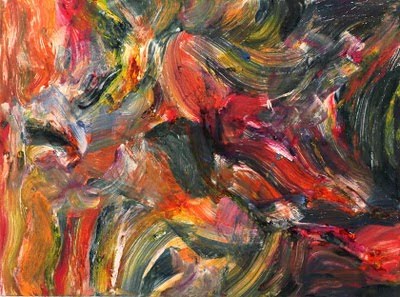
Category Two - Solo Exhibitions (large): A very crowded category, probably because I generally prefer the in-depth coverage of a solo to the smatterings of group shows – but maybe also because there just happened to be a bunch of great solos this year, and a bunch of those were pretty substantial. Top of the list, because it was as challenging as it was rare, is Larry Poons: Recent Paintings at the Esther Massry Gallery. Also very impressive: Jules Olitski: An Inside View at Opalka Gallery (image above at right); Edward Avedisian: Retrospective at Carrie Haddad Gallery; Carroll Dunham Prints: A Survey at the University Art Museum; and Fred Tomaselli at the Tang Teaching Museum. All were comprehensive surveys of important, innovative bodies of work that the curators and presenting organizations pulled off flawlessly. It’s worth noting that two of these shows were of prints (Dunham and Olitski) and one was of mixed media (Tomaselli) – it’s not always about painting.

Category Three - Solo Exhibitions (small): Again, many good choices here. The top spot has to go to Michael Millspaugh (once again, not a painter), whose exuberant, exhaustive installation at Lake George Arts Project set him apart from the everyday artists of this - or any - region (image above at left). Also worthy of year-end praise: Claude Carone: Paintings at John Davis Gallery; and Monica Miller: Diary of a Trespasser at Joyce Goldstein Gallery. Boxed Sets, a retrospective of dioramas and stage designs by Charles Steckler at the Perrella Gallery at Fulton-Montgomery Community College gets honorary mention here because, even though I didn’t actually see it, other similar recent shows by Steckler were unalloyed knockouts - I'm certain this must have been, too.

Category Four - Group Exhibitions: Reflections on Water in American Painting at the Arkell Museum (image at right) was a revelation, because traveling shows from private collections usually come off as self-serving and are rarely as great as the presenters would like to think. But not this one! Another group show that transcended the category by the sheer quality of juror Ian Berry’s selections was this year’s Fence Select at the Arts Center of the Capital Region. Also at the ACCR, Battlesight: Dispatches from Iraq and Afghanistan by International Photographers stood out as a hard-hitting, carefully planned combination of three photojournalists’ personal visions of war (oddly enough, it’s the only show of photographs that made this list). Then and Now at Albany Center Gallery effectively combined the seemingly unrelated talents of fiber sculptor Mimi Czajka Graminski, painter Iona Park, and photographer Jeri Eisenberg. And, finally, Here and There: Two Degrees of Separation, a show of 20 printmakers at the Union College Arts Atrium, again broke the mold by pulling together a very diverse collection and, somehow, pulling it off.

Notably absent here is The Jewel Thief, currently on view at the Tang; I predict it would have been on this list had I seen it yet. Please watch this space for a review of The Jewel Thief that will run soon. And have a fantastic year of art viewing in 2011.

Sunday, December 19, 2010

Media Watch (EMPAC show)

I try to pick up a Metroland (the Capital Region's alternative newsweekly) every Thursday, scanning the table of contents first to see if there's anything on visual art, but the last few months I've been left mostly disappointed in that regard. So I was pleasantly surprised to find that the current issue carries a review by Nadine Wasserman of the exhibition Uncertain Spectator at EMPAC in Troy.

Then, this morning, I found a feature article by Tom Keyser about the same show in the Times Union's "Unwind" section. So, needless to say, I'll be getting over to EMPAC ASAP to see what all the excitement's about, and I'm very much looking forward to the experience. True confession: It will be the first time I've ever been inside the Experimental Media and Performing Arts Center.

So, you can plan to read about my perspective on Uncertain Spectator in a pending post (the venue will be closed from Dec. 23-Jan. 2, so I'll probably wait till after that to publish a review). In the meantime, I hope all of you have a fun run at the Christmas and New Year's holidays. And please look here soon for a 2010 year-in-review as well.

-db

Friday, December 17, 2010

The Perfect Fit and Old Soles at AIHA

Based on publicity photos for The Perfect Fit: Shoes Tell Stories at the Albany Institute of History & Art, I went there expecting to see shoes as art, and art as shoes - but I was not prepared for the additional quantities of complex art about shoes that the traveling show also includes.

Organized by the Fuller Craft Museum in Brockton, Mass., which was once a shoe-factory town, The Perfect Fit is the type of show that reminds us of the large role traditional craft media now play in contemporary art. The Institute's three small upstairs rooms are stuffed with work by a geographically diverse selection of artists, all of it produced between 2004 and 2008 in almost every conceivable material.

Just so you get the idea, here's a partial list: silk, glass, ceramic, wood, wire, quilted fabric, painted fabric, beads, papier mache, embroidery, doll parts, bicycle parts, tools, precious metals, origami, handmade paper, recycled milk jugs, soil, honeycomb (yes, actual honeycomb) and canary eggs. And, of course, video - pretty darn bad video, at that.

Among the actually shoe-like creations, one lovely pair (by Jan Hopkins, shown at the top of this post) is crafted from grapefruit and cantaloupe peels; another exuberantly unwearable pair of boots (by Rebecca Siemering, shown at right) is entirely made of discarded scratch-off tickets.

Further expanding the media included are a pair of fake-fur-and-blown-glass telephones (the handsets are ladies pump-shaped) by David Fox; a sound sculpture featuring a wide fan of 416 bronzed baby shoes by Judy Haberl; and an elegantly cut, black-paper silhouette accordion book by Beatrice Coron.

A number of pieces make painful reference to the Chinese foot-binding legacy; others are equally humorous and lighthearted. Among the more fully-realized works of art are Nina Fletcher's Shoe Wheel, a mandala of discarded black pumps joined in an endless cycle, and Ito Horotoshi's Morning of the Snow Fall, a remarkably illusionistic sculpture in granite and marble of a pair of boots toeing some of the freshly fallen white stuff.

The most touching work of art in the show for me is Abby's Shoes, a tableau by Lissa Hunter of several framed black-and-white photos (rendered in paint and wood), sitting on a plaster shelf along with two tiny woven slippers. The accompanying text details a Korean two-year-old's adoption, and her subsequent sad attachment to the memory of her first pair of shoes, which she regrets having thrown away. This piece is on another level compared to the work in the show featuring complaints about shopping and fit.

After viewing The Perfect Fit, you are sure to see the art in many of the more than 60 pairs of shoes from the past three centuries featured in Old Soles, an accompanying vitrine exhibit taken from the Institute's collection.

Old Soles covers a satisfying range of examples in wood, leather, silk and so on, including a terrific pair of Frye-ish child's boots from the 19th century, that amazing silver pump shown above at right, and the silk slippers shown below, dated 1916.

Both shows end on Jan. 2, so you'll have to hurry.

Rating: Recommended

Sunday, December 12, 2010

Critical Stitch at Mandeville Gallery

The Pop and the political intermingle like two skeins of colored yarn in Critical Stitch, which opened in October and runs through Dec. 19 at Union College’s Mandeville Gallery. Curated by Lorraine Morales Cox, a Union professor of contemporary art and theory, the exhibition features fiber-based work by 12 artists from all over: Maine, Michigan, Newfoundland, Texas, Ohio, and Rhode Island all have representatives, while California and New York City have a few each in the show.

Considering that it was organized by someone whose “primary areas of research include feminist and postcolonial theory, critical race studies, and transcultural identity,” Critical Stitch actually offers a pretty enjoyable experience, with a sense of humor running through much of the content-charged art. The fact that it includes four men among the knitters and embroiderers adds to the intrigue of exploring its many facets and undercurrents.

Morales Cox has presented quality work in every case, even if some of the ideas are a bit overwrought or unoriginal. The skill employed by the artists ranges from appropriately adequate to outright impressive. For example, Lauren DiCioccio’s meticulously embroidered renderings of consumer detritus, such as the ubiquitous plastic bag with a happy face on it, and layered newspaper clips (one is shown above at right) show the potential of colored thread as a medium that transcends traditional crafts.

Two other artists, Margarita Cabrera and Alicia Ross, also make significant use of thread itself as a medium, but in different ways. Cabrera sews Oldenburgish facsimiles of small appliances out of leatherette (one is shown at left), leaving lots of loose threads to represent the hand work of the manufacturing process she is channeling from her Mexican roots. Ross, using computerized cross-stitchery, represents female objects of desire transformed from their commercial sources in pornography into oddly appealing yet repellent images (one is shown at the top of this post).

Among the men are two whose thicker threads in hooked rugs and needlepoint pillows present ironically softened visions of cultural touchpoints – Richard Bassett’s throw pillows fetishize the Kennedy assassination, while Rob Conger enters the realm of kitsch with his acrylic wall hangings taken from Disney and other corporate source material.

I found Johanna Unzueta’s installation of soft felt to be the wittiest piece in the show (and, not surprisingly, the least political). Color-coded to match the Mandeville’s décor, her faked utility pipes could evoke issues of stealth and terrorism and subversion, but are also just a fun thing to come upon. Also darkly humorous is Dave Cole’s woven and stitched bulletproof Kevlar Onesie, a chilling suggestion if there ever was one (shown above at right).

Some of the work in the show pushes a little further into traditional gender roles, such as Mark Newport’s goofy, oversized, knitted superhero outfits and Laurel Roth’s obscenity-laden PMS Quilt, featuring crocheted-together panty liners. More touching and elegant is Roth’s animal-based work, such as her Carolina Parakeet (actually a carved pigeon wearing the colors of the extinct bird, it is represented below at right).

Other work does little to inspire or break new ground. Barb Hunt has re-created a variety of land mines in yarn – something done far more effectively years ago by Conrad Atkinson using glass and porcelain; Vadis Turner bores by stitching the names of such role models as Britney Spears and Paris Hilton onto an antique quilt; and Tamara Kostianovsky’s mute presentation of fabric and fiberfill sides of beef (shown at the bottom of this post) seems to go nowhere, despite elaborate textual efforts to infer otherwise in the catalog accompanying the show.

Overall, Critical Stitch is a nicely produced, thoughtfully curated show of worthwhile but somewhat disappointingly clever conceptual art. I think it shows just how much academic theory has affected the contemporary artistic landscape. Even when dealing with extremely emotionally charged subject matter, these artists seem to have traded the raw feelings, passion, and intensity of a bygone age for muted, funded, and packaged products that aim mainly to please the elite who own galleries, confer MFAs, and write for art magazines. It would be self-flattery to believe in the power of such work to cause any real change, despite its political and cultural messages.

Rating: Recommended

Tuesday, December 7, 2010

Not Just Another Pretty Place: The Landscape of New York at NYSM

The Cut oil on canvas by Cecil Chichester

Most of us wouldn't immediately think of the New York State Museum as a place with a major art collection - after all, its mission targets education, and its most prominent permanent exhibits focus on topics such as history, anthropology, ornithology, and geology. Well, it's time to reconsider that notion, as the wonderful survey exhibition Not Just Another Pretty Place: The Landscape of New York features more than 100 works of art, many of them first-rate, and all of them taken from the museum's collection.

The exhibition, which opened in early September, fills the facility's large West Gallery and is organized under four themes: Recording, Romanticizing, Utilizing, and Imagining the landscape of New York. Within each of these major themes are a number of sub-themes, all of which are clearly and concisely explained on monochromatic wall panels. The overall design of the show and text panels is very well executed and user-friendly, with the exception that it is at times difficult to figure out which theme a sub-theme belongs to.

At the entry to the exhibit is the "Recording" section, which emphasizes the physical features of the New York landscape, and includes one of my favorite pieces in the show, a multicolored "textural" rendering of the state by the Geological Information Survey's computers. Other examples from this section are "Bird's Eye Views" that detail the layout of towns such as Jamestown, as rendered by a 19th-century lithographer; images of the industrial landscape as shaped by the abundant presence of lakes and rivers in New York; quaint house portraits ("The Domesticated Landscape"); and a sub-section titled "Capturing New York on Film" that includes a nifty group of 12 color lantern slides laid out on a backlit pedestal, and a jarring video presentation of some of the countless frames taken by the state every few years to document all 16,000 miles of New York's roads at the rate of 100 shots per mile.

The "Recording" section also includes the largest piece in the show, a painting about 20 feet long that depicts in an ever-so-slightly naive style the arrival of scores of tall ships in New York Harbor during the nation's bicentennial celebration in 1976. The most prominent vertical feature in this frieze-like tableau are the twin towers of the World Trade Center - a sobering reminder of our more recent history, and of the thought that 1976's cheery optimism can probably never be recaptured.

Next comes the "Romanticizing" section, where artistic expression takes on a central role. Here, the Hudson River School is prominently represented by a special zone dedicated to the Albany painter Asa W. Twitchell, and several other examples, the best of which is a dramatic and vividly detailed watercolor by Jasper Cropsey (reproduced at the bottom of this post).

Tourism is examined in the "Utilizing" section, which includes a wonderful two-sheet lithograph of Blondin Crossing Niagara Falls for Lloyd's News, as well as a sub-section on cityscapes that features many enjoyable surprises, such as pastoral views of the Flatbush and Bushwick sections of Brooklyn before they were citified, a village-like State Street, Albany, 1805, and two really nice examples of printmaking: Fairfield Porter's 1960 lithograph titled Sixth Avenue II, and a richly colored, geometric 1980 aquatint with a glowing, white Citicorp building by Kathleen E. Gallagher.

A related group of pictures from the sub-section "New York as Seen by WPA Artists" hangs nearby. The six included are outstanding examples selected from a large and ever-growing collection of such work that the NYSM began acquiring in 1943 (one is reproduced at the top of this post).

Also in the "Utilizing" section is a sub-section called "Embellishing the Landscape," which describes the 19th-century interest in elaborate gardens and shows fine examples of the type of wrought-iron fencing, bench, and decorative vase that such gardens might incorporate; a "rustic" bench, made of natural wood and perhaps meant to be placed along a woodsy path, is also included. These and other objects in other sections enliven the exhibition with their concrete three-dimensional presence.

The final section of the show, "Imagining," stretches from decorated plates and furniture to a posthumous portrait of the painter and inventor Samuel F. B. Morse (shown above at right), and also includes a dreamy Thomas McKnight silkscreen of a moonlit New York City under a blanket of snow. The show concludes with a sub-section titled "The Landscape of Memory," which introduces the art of Frank Eckmair, whose woodcuts are the focus of another current NYSM exhibition of the same name. I will review that show (which runs through next fall in the Crossroads Gallery) in a future post.

Not Just Another Pretty Place: The Landscape of New York continues through March 3, 2011.

Rating: Must See

Storm Across the Hudson watercolor 1883 by Jasper Francis Cropsey

Tuesday, November 30, 2010

African American Abstract Masters at Opalka Gallery

I went to see African American Abstract Masters at The Sage Colleges' Opalka Gallery expecting a history lesson - and I got one - but I was delighted to find that the history this show covers goes all the way to the present.

The Opalka has presented important shows of AbEx artists throughout its tenure, one of which was a solo a few years ago by Frank Wimberley, who has two pieces in this exhibition (including the one shown at right). That kind of continuity and adherence to a mission is nice to see in a college gallery, and we're lucky to receive the benefits of Gallery Director Jim Richard Wilson's deep and long-term interest in this vital segment of American painting.

African American Abstract Masters was curated by Mary Anne Rose and organized by Anita Shapolsky Gallery and Wilmer Jennings Gallery at Kenkeleba, both of which showed the work last spring in New York City. The current installment of Rose's choices features 14 artists, nine of whom are represented by two works each; of the rest, one has three pieces and four have just one in the show, making a total of 25 pieces dating from 1949 to 2009.

The broad time frame of the works included, and the many pairings (most of which bridge decades), affords wonderful opportunities to compare and contrast the evolution of painting styles, both in general and by individual artists. For example, Ed Clark's two pieces are dated 1978 and 2009 (the latter is shown at the top of this post), yet they are of similar scale, share the same medium (acrylic), and are both made with sweeping strokes of a pushbroom-sized brush. Even so, each has the feel of its particular time.

Conversely, Joe Overstreet's two paintings, also 30 years apart, could have been made by two different artists - the one from 1960 is loopily colorful and energetic, while the one from 1990 is in black and white and has strictly constructed geometry. Yet Overstreet can't be accused of inconsistency - each of these paintings ranks among the strongest pieces in the show.

Not all the work in the show is purely abstract. The earliest piece, Harlan Jackson's Mask No. II (from 1949; shown above at left), has the primitive art and rituals of Haiti as a source, and is properly placed in time at the apex of American painting's transition from Surrealism and Cubism into Abstract Expressionism. It reminded me of work from the same period by Jackson Pollock, before he launched into the drips, and truly reflects the roots of the AbEx movement.

Other transitional work in the show includes the Theosophistic 1953 Composition by Thomas Sills and Betty Blayton's two pieces, Forced Right (from 1975; shown at the bottom of this post) and Riot (from 1967), which have figurative references. Blayton is one of just two women in the show - hardly surprising, considering the time and context. While it was surely pretty difficult to make it as a black artist in the '50s and '60s, it was equally tough to make it as a woman painter in the macho world of Abstract Expressionists - so for a black woman it had to be nearly impossible.

The other woman, Alma Thomas, is represented by a watercolor, one of the few works on paper in the show. Hers is a muscular but muted study in red and black that has a nice dialogue going with a similarly sized piece opposite it that is one of the show's unqualified gems. Titled Study in Black and White, this gouache on paper is by Sam Middleton - but it could just as easily be by one of his far more famous contemporaries (say Motherwell or Gottlieb). No wonder it is part of the curator's personal collection.

Other notable works in the show include an outstanding Norman Lewis painting (shown above at right); the two Wimberleys (also about 30 years apart and providing a thought-provoking contrast); and the only print in the show, a sweet piece by the genius lithographer Robert Blackburn titled Faux Pas.

It's not too late to see African American Abstract Masters, but don't delay - the show ends on Dec. 12.

Rating: Highly Recommended


Also involving compelling abstract art, an exhibition at The College of Saint Rose's Esther Massry Gallery by Creighton Michael will have its artist's reception as part of the 1st Friday events for December (from 5 - 9 p.m. on Friday, Dec. 3). Michael, who will speak in nearby St. Joseph Auditorium on Friday at 7 p.m., uses three-dimensional "marks" to create works that range from wall-mounted squares of small objects to a room-sized installation - all of which he refers to as drawings.

Tangible Marking: The Dimensional Drawings of Creighton Michael opened on Nov. 14 and will continue through Jan. 23, when a special music performance related to the show will take place in the gallery.

For more 1st Friday information, click here.

Saturday, November 27, 2010

2010 Artists of the Mohawk Hudson Region at The Hyde Collection

There’s no way I could write an objective review of the 2010 edition of Artists of the Mohawk Hudson Region, held this year for the first time at The Hyde Collection in Glens Falls. I didn’t enter the show – which would immediately disqualify me from writing about it at all – but the 72 accepted artists include my studio mate, several people I represent in a corporate rental service, at least a dozen personal friends and acquaintances, a couple of professors at the college I attend, and even an ex-girlfriend.

So, please don’t expect me to offer a full critical assessment of this year’s art and artists. But – no worries – there’s still plenty to say about the show.

First, the new venue. No doubt there are people who were not pleased when this longstanding staple of the annual Capital Region exhibition circuit added a spot in its three-year rotation at the feet of the Adirondacks. That would mean a lot more travel for many of the people involved (49 hail from Albany, Rensselaer, and Schenectady counties or points south), and possibly smaller audiences than the show would draw at its Albany locations (the University Art Museum and the Albany Institute of History & Art). But I was thrilled, for a number of reasons, when I heard that the Hyde had been named as the new third wheel (replacing the Schenectady Museum, which changed its mission several years ago to showing only scientific exhibits).

The Hyde has a venerable collection, features plenty of lovely exhibition space, and is run by a team of consummate professionals – making it an ideal setting for the Regional. Bringing the show north seemed likely to attract new artists, and apparently it did, as this year set a record with almost 1,500 entries by 340 artists (though, curiously, only one of those accepted is actually from Glens Falls); it also revives the memory of the Adirondack Regional, a Hyde tradition that was dropped around 20 years ago. And it’s a great decision for the Hyde itself to take this opportunity to reopen its doors to the legion of local fine artists who will now refer to it as “their” museum.

So, how has it worked out this time? While there are a number of North Country artists in the show (some of whom have been in it before), the majority of included names are still rather familiar. This year’s juror, Charles Desmarais of the Brooklyn Museum, shows no particularly bizarre taste; the eclecticism of his choices appropriately represents both the region and the art world as a whole. Desmarais did choose to include more artists than usual, and in most cases just one work by each (somewhat like Ivan Karp, who selected 72 works by 71 artists for the 2005 show at the Albany Institute). This makes for a very broad but not very deep viewing experience.

Prize-wise, the Hyde has done reasonably well. In contrast to the 2008 Regional, which gave just six cash awards totaling $1,550, this year nine artists received a total of $2,450 in cash prizes (though the University Art Museum did better last year, distributing just under $4,000 in cash prizes to 12 artists). That's in addition to purchase prizes from the three sponsoring institutions and five gift certificates that were also awarded. As always, a nicely printed color catalog accompanies the show; it contains an informative introduction by Hyde Executive Director David Setford and an essay by the juror.


Desmarais begins his essay by saying "Modern Life is a negotiation between what things are and what they first appear to be." He then goes on to invoke the confusing and contradictory TV images of our current era, and then to either flatter or insult us (you decide) by pointing out that "artists, practiced liars that they are, tend to be great at sorting this stuff out." A purposely provocative introduction to a show that is, essentially, a snapshot of the concerns and sensibilities that our best local artists – and our culture as a whole – hold dear.

I do have a complaint or two about the show. One is its breadth – a strength to some, I think so much inclusion tends to place too sharp a focus on the curator's choices and not enough on the artists'. As a viewer, I would always rather see larger bodies of work by each artist in a group show so that I can better understand the whole of what that artist may be trying to say. Instead, when a curator (or juror) creates sweeping cross sections of scores of artists' individual works, it becomes too general a statement.

On the plus side, that general statement is precisely what many people expect the Regional to provide. Also a plus in this specific case is the arrangement of the installation, where chromatic and thematic groupings form a coherency that would otherwise be lacking in such a survey. It does make for a handsome appearance and some fun associations.

My other complaint must fall on the shoulders of the artists – and that is that a fairly thick slice of the work in this show is getting pretty stale. Too many pieces in this selection are dated 2008 or before and, as is no surprise with that being the case, I've already seen much of it (and so, presumably, have a lot of other art fans). C'mon people! It'll be 2011 by the time this show comes down – if you haven't got something good from the last two years, then maybe you shouldn't submit.

Freshness aside, the quality of the work in this Regional is almost universally high – the juror seems to have hit only a few wrong notes, and those he selected for prizes do seem to stand out (including the work reproduced with this post).

In addition, I would like to name a couple of pieces that were not singled out by the juror, but that might have been: Anne Diggory's luminous hybrid media piece titled let there be white and Joel Griffith's chilly, dusky acrylic painting titled House on West Kerley's Corners are both wonderful examples of the continuing power of traditional subjects (landscape and still life) to resonate. Another fine piece, titled Reading Room, by Regional stalwart Allen Bryan, shows what digital photography can do without losing the qualities of film photography.

And, speaking of photography, it is a pleasure to note that, 20 years after this competition ceased to bar photography from its submissions, film- and digitally-based media again make up a substantial portion of the work chosen (33 out of 93), including several prize winners.

Rating: Recommended

The 2010 Artists of the Mohawk Hudson Region exhibition continues through Jan. 2, 2011. An annex show of 14 additional works selected by the juror (and including nine artists not in the Hyde show) was on view at the nearby Tom Myott Gallery in the Shirt Factory but it closed shortly before my visit. Instead, I found a beautiful solo show by Saratoga Springs artist Regis Brodie that just opened there; it is well worth a visit.

Works of art, in order from top of post:

Jane Bloodgood-Abrams Presence, 2010 Oil on panel 24 x 24 in. The Hyde Collection Purchase Award

Deborah Zlotsky Piquance, 2009 Powdered graphite on vellum 40 x 25 in. Spiral Design Studio, LLC $250 Juror’s Award

Peter Crabtree Carter Campbell, 2008 Photograph 17 x 22 in. Grindle Custom Framing $100 gift certificate

John Hampshire Labyrinth 229, 2009 Permanent marker on panel 24 x 48 in. University at Albany Purchase Award

Gina Occhiogrosso Homework (Phase 1), 2008 Dollhouse with furniture, DVD player, lights 36 x 48 x 36 in. Maryann Bell $500 Juror’s Award

William Jaeger Along Bernard’s Wharf and Railroad, 2007 Photograph, inkjet print 22 x 29 in. NBT Bank $250 Juror’s Award

Tuesday, November 23, 2010

Battlesight at the ACCR


It's as though the International Center of Photography opened a branch in Troy. The exhibition Battlesight: Dispatches from Iraq and Afghanistan by International Photographers is that good, and that important.

Curated by Timothy Cahill, director of the Center for Documentary Arts at The Sage Colleges, and hosted by the Arts Center of the Capital Region in Troy, Battlesight presents the work of three very diverse photographers who share a common subject: War. Cahill introduces the show by explaining that we live in a time in which there are few mass-media outlets for such images, as opposed to the Vietnam era, when the war was brought into everyone's living room by magazines such as Look and Life and by the evening news on TV.

His point is that we are disturbingly unconnected today to the devastation being wrought in our names with trillions of our dollars, and that this represents a culture out of balance. Aside from the obvious question of whether the work of these (or any) photographers being shown in an art gallery (or anywhere else) can change that balance, one must acknowledge that our time is nowhere near as innocent as the '60s started out, and that people these days are more and more difficult to reach - that is, to move emotionally - with pictures (or anything else).

But it's certainly worth trying. And these three - if nothing else - represent a deep commitment to doing that without fear, year after year. Cheryl Diaz Meyer, Balasz Gardi, and Teru Kuwayama are excellent photographers and have each won many well-deserved awards. By bringing them together, Cahill has created a different context for their work than you would find in a book or magazine - and that is part of the reason this show matters.


Rather than comment on the content of the work, which most viewers will have no trouble understanding and interpreting on their own (and which is evident in the examples shown with this post), I'd like to point out some of the less obvious aspects of the exhibition and its trio of participants.

First, there are three distinct sensibilities at play here. Diaz Meyer, who won a Pulitzer Prize while working for The Dallas Morning News, is the traditional "objective" reporter, taking relatively uninflected pictures and putting them together to tell a journalistic story. Gardi, a Hungarian freelancer, comes from the grand European tradition of humanistic photography made popular by the Magnum agency; his work is clearly meant to be allegorical. Kuwayama, a graduate of the University at Albany, uses equipment and techniques more generally associated with artistic photography, and fulfills that promise by offering works that lean toward self-expression.

The statements made by each photographer support these distinctions. Diaz Meyer's emphasizes courage (a totally straight-ahead American take on reporters and soldiers doing their duty); Gardi's emphasizes the desperation of his marginalized subjects (who are presented as deeply - and universally - human); and Kuwayama's emphasizes his own various journeys, projects, and ongoing exploration (essentially casting him as the traveling seeker of meaning).

Cahill, as curator, is the fourth wheel - his selection, choice of print size and framing design, and overall installation of the exhibition add up to a uniquely orchestrated experience of this particular set of sensibilities. It is (I believe) his first attempt at organizing such an exhibit and, while not perfect, it is quite a successful effort. The viewer is taken on a ride into difficult territory and emerges at the end still whole yet subtly, perhaps imperceptibly - but definitely - changed.

Rating: Highly Recommended

Battlesight: Dispatches from Iraq and Afghanistan by International Photographers is on view through Dec. 19. There will be a second reception for the show during this Friday's (Nov. 26) Troy Night Out from 5 - 9 p.m.

Caption information, in order from top of post:

Balazs Gardi - An Afghan man holds a wounded boy in front of a house in Yaka China village, Korengal Valley, Kunar Province, East Afghanistan, October 20, 2007. The boy received several shrapnel wounds from a rocket as a U.S. air strike targeted a suspected insurgent position in a nearby house the previous night. The air strike killed five other civilians and injured at least seven villagers including children.

Teru Kuwayama - An ethnic Kyrgyz horseman, carrying an Afghan flag, patrols the Afghan border with Tajikistan. Wakhan Corridor, Afghanistan 2005

Teru Kuwayama - The ruins of Kabul. Following the retreat of the Soviet Army, internecine fighting between rival mujahideen factions leveled the city and displaced millions. 2002

Cheryl Diaz Meyer - Mini Bus - Corpses of children lay in a pool of blood in a minibus at an intersection near Hatif Haiyawi, an area loyal to Saddam Hussein, during the Second Tank Battalion's advance on the outskirts of Baghdad. Controlling civilian movement left numerous deaths as Marines responded to suicide bombers, soldiers posing as civilians and other ambush tactics. April 5, 2003

Balazs Gardi - U.S. soldier collapses in exhaustion during Operation Rock Avalanche, Korengal Valley, Kunar Province, East Afghanistan, October 25, 2007.

Cheryl Diaz Meyer - Dust Storm - Marine Staff Sergeant Brian Flaherty of New York, Delta Company of the Second Tank Battalion, disconnects a fuel bladder from a tank as a dust storm rages in Southern Iraq. The move north toward Baghdad was one of the most aggressive tank road marches in Marine history. March 25, 2003.


Also of note: Two other important exhibitions of photography are on view in Troy, and both will be part of the Troy Night Out festivities: Autobiography, featuring the work of Nicholas Walster and Susan Bartoldus, has been extended by the Photography Center of the Capital District through the weekend; and Iceland Landscapes by Michael Marston will have its artist's reception on Friday at Fulton Street Gallery (it runs through Dec. 4). I recommend both.

Saturday, November 20, 2010

An Immodest Proposal

When the city of Albany announced it would eliminate its annual budget of $350,000 for local arts funding, I sighed - and then got busy soliciting donations for my favorite ex-beneficiaries of the city's largesse. And when the New York State Museum announced it would be closed on Sundays beginning at the first of the year, I thought, "That sucks, but it was great while it lasted."

These cuts are the inevitable result of an economy in a tailspin and a culture that has always undervalued the arts and education. Yet I see hope, and it is exemplified by an existing community-based organization that is thriving right in front of our eyes: The Albany Public Library.

Funded as an independent tax district that the voters approved in a special referendum, the library system has blossomed all over the city with new and renovated branches that look beautiful and are always buzzing with activity. They are inviting, well stocked, high-tech, low-carbon edifices to the fact that Albanians DO care about culture and education, and are willing to pay to make it available to all citizens.


Why can't we do the same for Albany arts funding? The city has about 90,000 residents, which translates to about 35,000 households - so, for just $10 per household, that $350,000 can be replaced. I'm not sure how it's done (Dennis, Elissa, Holly - any advice?), but I think it's worth a try.

The big question remains: Would the city's voters approve a new tax for the arts, just as they did for the library? If so, we would suddenly look like the most enlightened community in the U.S. And we could look forward to seeing some pretty spiffy new arts centers, too.

Let's do it.

Wednesday, November 3, 2010

The Imaged Word at Albany Airport Gallery

For more than 10 years now, the Albany International Airport Gallery has been providing complex art-viewing experiences for travelers and those who await them; the current show there, titled The Imaged Word, continues that tradition by combining the work of 11 rather diverse artists whose themes relate directly or indirectly to literature.

Far more than a show of book artists (though a few of those included do clearly fit that description), The Imaged Word explores relationships between visual art and writing from many different angles. There are pieces that are almost completely formal, such as Fawn Potash's lovingly rendered black-and-white photographs of old books (one shown below at left), and those that are almost completely conceptual, such as Barbara Todd's ethereally poetic musings on simple stones and the words of Paul Celan.

The large, rambling gallery space upstairs at the airport is well suited to such an inclusive presentation, and its many glass partitions are put to good use in placing some of the abundant text that is included. While I tend to object automatically to art exhibitions that require people to stand and do a lot of reading, in this case it is both totally appropriate and, as many of the gallery's visitors are there expressly to kill time in a valuable way, largely welcome. Still, most of the art speaks volumes with or without the supplemental intellectual rigor.

One of the exhibition's most striking works, an inventive and suggestive wooden sculpture by William Ransom, is perhaps the least directly connected to writing, though it is accompanied by a passage from a T.C. Boyle story. Made from two long, interlocked branches of a tree and their respective sections of trunk, Hold Back Hold Forth (shown at top of post) evokes folk-art traditions while transforming its materials into a sort of two-seater merry-go-round. Like Boyle's writing (which I've always loved), it has a wry sense of humor combined with a feeling of impending doom.

The signature piece in the show is a hall-of-mirrors trick performed by Aaron Stephan, who has built a room-sized arch of venerable volumes and then multiplied it as far as the eye can see (shown at right). His installation is tucked into a corner of the gallery where its unfinished exterior suggests construction under way. I found this design detrimental to the pristine appearance of the rest of the gallery - but perhaps a finished exterior would have provided less of a surprise in the discovery of what it conceals.

Another installation, by Paul Katz, presents an excruciatingly detailed diorama of objects and paintings, all of them covered with obsessively delineated patterns of words from William Wordsworth's epic poem The Prelude (shown at bottom of post). It is a powerful piece in scope and scale, both humbling and inspiring in its representation of artistic diligence, and I think the most emblematic of the show's core theme of the interaction and inspiration between expressive media.

Also deeply imbedded in process are three intriguing small sculptures by Amy Podmore. One was directly inspired by a certain poem a friend of hers had written; for this exhibition, that person was then asked to create new poems in response to Podmore's other two works. This back-and-forth relationship can be quite common in the daily life of dedicated artists, but it rarely gets presented to the public as such, and so is a special addition to this collection.

Painter Gabe Brown includes two connected bodies of work in the show. Her colorful and somewhat fantastic (but modestly sized) paintings are hung in a tight group above a vitrine full of word-stuffed sketchbooks that provide their keys. Across the room, nearly countless blank books of varying size have been filled by Brown with sinuously undulating black lines of ink - one example of the artist-book mode that the show embraces.

In two other examples, Robert The and Scott McCarney have sliced their books into new, three-dimensional forms. McCarney's Last Lines of Poetry, made from one stripped volume, hangs above the gallery's entry stairway like a chandelier. The has modified two books (one shown above at left) by precisely excising the shapes of a scorpion and a scarab beetle from their spines, coolly upending our childhood recollections of playful pop-ups.

The other artists in the show, Fern Apfel (OK, what are the odds of having both a Fawn and Fern in the same show?) and Gayle Johnson have made deftly drawn and colored portraits of beloved books - Johnson's are campy pulp covers (one shown at right), while Apfel's are anonymous groupings that are mainly about color and patina.

The Imaged Word continues through Feb. 27, 2011, and is open from 7 a.m. to 11 p.m. daily.

Rating: Recommended

Friday, September 24, 2010

Julie Anne Mann: "Intrinsic Nature" at LGAP

During my annual pilgrimage to the Lake George Jazz Weekend last week I had the opportunity to look in on Julie Anne Mann's Intrinsic Nature exhibition at Lake George Arts Project's Courthouse Gallery. The opening reception was in session, and an appreciative crowd sipped, nibbled, looked, and listened while Mann spoke briefly about her three distinct styles as represented in the show.

Mann is based in Brooklyn but hails from Seattle, and her Northwest roots are (literally) present in the major portion of the work, which depicts trees that have grown on top of "nurse logs" in the rainforest on the Olympic Peninsula (example at right above).

The way this happens is that a big tree falls in the forest, and other trees sprout on top of it, absorbing its energy into their own growth while sending roots down around it into the ground. After a long time, the nurse log decomposes, leaving mature trees suspended a couple of feet off the ground by their own exposed roots.

Mann, entranced by the gestural aspect of these trees and their metaphorical relationship to other life forms, has carefully rendered portraits of seven of them in hand-etched silver leaf on large walnut panels. She emphasizes that the images are copied from photographs that she has taken, making clear to those unfamiliar with the rainforest that they are not inventions.

The rich darkness of the walnut combines nicely with the reflective glow of the silver to make an image (really, almost an object) that compels close attention. Mann explained that there is no direct connection between the walnut and the trees depicted (they are evergreens), which is slightly disappointing, but the finished pieces are no less beautiful for it.

A second body of work does consist of objects - manipulated memento mori that Mann painstakingly constructs of small animal bones, insect wings, seed pods, and other materials, sets into black velvet-lined cigar boxes, and has mounted in a cluster on the wall (example above). Each suggests a previously undiscovered creature, and is given a fanciful Latin name to match its appearance. Mann’s inventiveness and sense of humor make this vaguely morbid display highly entertaining, and her skill and patience in building these tiny puzzles is impressive.

Equally meticulous is Mann’s third method, in which a squadron of dried Queen Anne’s lace blossoms have been hung upside-down in the center of the gallery to form a swaying, circular disc about seven feet off the floor. Below them, blood-red resin droplets have pooled, representing the legend of the lacemaker queen’s pricked finger.

Though the three styles of art Mann uses are disparate, they hold together through their consistent concerns with issues around nature and change. It’s a show well worth seeing.

Rating: Recommended

NOTE: Starting with this review, I have instituted a new rating system. Because I rarely give space to shows I wouldn't recommend, the ratings will only be positive, ranging from Recommended to Highly Recommended to Must See. If I happen to review a show of doubtful worth, it simply won't be rated.

Friday, September 17, 2010

The Arc of a Life: Olitski at Opalka

Sometimes when a painter makes prints they seem to be a secondary medium rather than a part of the artist’s essential personal expression. The opposite is true of Jules Olitski: An Inside View, currently showing at the Opalka Gallery at Sage College of Albany, where the prints clearly delineate a vital thread at the center of the painter’s life.

An Inside View was organized by the Brattleboro Museum & Art Center in 2008, shortly after the celebrated abstract expressionist’s death, and has been traveling since then. We are fortunate that this wonderfully envisioned survey has a stop here (before it moves on to the Everson Museum of Art in Syracuse). Comprising 47 works from 1954 to 2007, the show is carefully culled into manageable groups from several distinct periods arranged chronologically around the big, bright room.

It isn’t always best to present a lifetime of effort in time order, but here it works perfectly. We begin with two groupings of small, dark etchings from the 1950s placed on opposite walls in the gallery’s large entry space. These have the immediate effect of communicating Olitski’s early and direct involvement with printmaking and its special qualities.

Some of the early etchings are presented in multiple states, further expressing just how different this medium is from drawing or painting. In one example from 1954, titled Drawing Number One, three states show the progression from a spare study of shapes to a smoke-filled gloom; though each clearly leads to the next, these three prints remain remarkably individual.

The five small prints opposite tell a different story. Each is a self-portrait, representing the first, fourth, sixth, seventh and ninth states of a 1956 series that, apparently, could have gone on forever. I don’t know enough about etching to explain the process, but the images (presented in order) bounce back and forth from sharply delineated lines and forms to blurred and heavy masses. In all of them, a recognizable face gazes over the viewer’s shoulder, lost in introspection; what is striking is how completely different in mood each of these young Jules Olitskis appears.

After the darker early work, we jump to a whole new world, full of color, possibility, and joy. Olitski’s Anna series of lithographs, from 1969, are a bit bigger than the etchings, open and playful, with loose scribbles of hue and floating shapes. Then, his 1970 Graphics Suite #1 takes it further, using the bright inks of silkscreen to present speckled color fields on a more substantial scale (28 x 36 inches). Here, rich shades of pink, blue, ochre, red, and purple are activated by their own textures and by marks and lines at the edges of the compositions (notably, of the eight, only one is horizontal).

Another jump takes us to 1986, where the piece titled Toora (seen at the bottom of this post) nails down the Graphics Suite theme into a contrasty, more energetic crystallization, before giving way to new gestural impulses in other silkscreens from later in the '80s. Then, Olitski adopts yet another medium, the monotype – and he never looks back. His seminal 1994 monotype Without Sin (seen at the top of this post) is pure, painterly gesture.

Further explorations hint at, and then depict, actual landscapes (supported by titles such as Lake Lorrain and Breaking Light), and then, in the artist’s latest years, return to figurative and symbolic representations. Finally, Olitski unabashedly celebrates the freedom of expression that comes to many elderly people by making smaller, more intimate monotypes of memories, childlike sailboats, a vibrant dancer, and a haunting face peering out of the darkness of the past.

This major painter has left a fine legacy in these prints. Be sure to see them.

Jules Olitski: An Inside View will remain on view through Oct. 31. A reception will be held from 5 to 9 p.m. on Oct. 1 (1st Friday). As part of the reception, Olitski's widow, Kristina, and daughter Lauren Olitski Poster will speak at 7 p.m.