Get Visual is the grateful recipient of a grant from The Christos N. Apostle Charitable Trust

Saturday, September 29, 2018

Running at 60

That's me, with the sunglasses, finishing the 2017 Jailhouse Rock 5K in 26:18
Few of you would know this, but I am a runner. Not one of those obsessive marathon or triathlon athletes, but a dedicated runner nonetheless.

I’ve always done sports and exercise, including soccer, cycle touring, 20 years in karate training (yes, I have a black belt), and 10 years of Senior League basketball. But running – to my surprise – has become my #1 choice to stay active and feel healthy.

Scientists agree – research has concluded that running at a moderate pace for 10-20 miles a week gives the maximum possible boost to longevity of any human activity (intriguingly, running more than 20 miles a week nets no further gains). No one knows exactly why this works, but the evidence is that it reverses the shortening of the telomeres on our chromosomes – a hallmark of the aging process – thereby increasing lifespan.

Having turned 60 a few months ago, this interests me now more than ever. I mean, I want to live long enough to do all the stuff I never seem to have enough time for. But that’s not why I started running. Actually, I always hated running. Even as an excellent school soccer player I was lazy. My high school friends who ran track and cross country never even tried to sell me on it – they knew I was hopeless – and, I admit, I still wonder how any kid could find distance running enjoyable.

But around 15 years ago I found myself too busy to do sports that take significant time so, with a YMCA close by, I began doing some treadmill running as a quick way to get that crucial stress-reducing exercise. But treadmills are dreadfully boring. So I began to run outdoors in good weather, following the advice of more experienced guys at the gym on where to go and how to do it correctly. I also decided to set a goal (otherwise, it’s tough to get motivated): To run a 5K race in a time I wouldn’t be ashamed of, which I accomplished after a few months of practice.

I didn’t keep notes, so I’m not sure what pace I was doing back then, but it was pretty much average for my age, and I was satisfied with that. I continued to run casually and race occasionally at moderate distances for a number of years, enjoying the obvious health benefits and sense of accomplishment that regular exercise will bring.

Only recently (say, in the last three years) have I begun to treat running as a sport, participating in more races, training in a more strategic way, and feeling a little more competitive about it. I even have a Garmin wristwatch now – it can track speed and distance, provide pacing alerts, and set up run/jog intervals, tools that have enabled me to improve as I apply some of the advice that more experienced runners have been nice enough to pass on.

Which reminds me – the second best thing about being a runner, after the health benefits, is the community. In contrast to my experiences with basketball, I have never had an argument with anybody involving running. Unless you’re in a race’s top three finishers overall, you’re really not racing against the other runners – you’re racing against time and the inevitable deterioration of your own body. So runners are always very supportive. I even had a guy once turn to congratulate me when I pushed past him at the finish of a trail race (I was trying to beat 30 minutes, not him). His positive response to being outpaced exemplifies the friendly atmosphere of the many races I’ve participated in over the years.

More about competing: When I was still in my late 50s (oh, so long ago!), I was at a distinct disadvantage in road races. Because race results are structured in age groups, usually in 10-year chunks, that forced me to compete against men five or more years younger. And, because age plays a huge role in sports ability, despite my natural talent and fairly serious effort, I’d usually finish in the middle of the 50-59 pack. I accepted that, never expected to win or place, and never did. Instead of trying to beat other similarly aged runners (some of whom are so much faster than me that it still boggles my mind), I’d be striving to match some previous effort of my own, or maybe even set a new personal best.

A medal for a geezer
But, as old Father Time has marched on, it’s gotten harder to keep up even with myself. And, right on cue, this 60th birthday year things are even tougher. Try as I might to improve – or at least maintain – I am simply weaker and slower than last year. Not that the running doesn’t still go well or feel good – it does! – but the same effort produces noticeably diminished results.

Then again, those 53-year-old kids that crushed me in last year’s races are no longer in my division – suddenly, I’m the baby in the group. And I’m still running pretty well compared to the past, making me far more able to compete with the over-60 set.

This new reality didn’t sink in until last week, when I entered the Dunkin Run, a 5K race that I run every year, always producing average results. My goal for this year’s race was to break 27 minutes (a feat I accomplished regularly in 5K runs last year but hadn’t done yet in 2018) and, with maximum effort, I reached it, finishing in 26:51. Mission accomplished, on to the next goal.

But then – to my complete surprise – the race results were posted and I learned I’d finished second in the division! I even received a medal.

So, now, I’ve got a new problem. The guy that beat me in this year’s Dunkin Run (a pretty speedy 65-year-old) did it by only 13 seconds. If I had been just a little better prepared, maybe kept to a more consistent pace – I could have taken him! As for those phenomenal guys in the 50-59 division? They were still minutes ahead of us – but none of them is anywhere near 60 yet. In other words, next year a first place finish is within my grasp!

So, it looks like I have a new goal. I’ll be sure to let you know how it turns out. But, for now - gotta run!

Friday, September 21, 2018

Three must-see shows in Albany

Installation shot of Sharon Bates's show Exhibit B at Opalka Gallery
Photo: Gary Gold
While group shows typically dominate the local landscape, especially at the highest-profile venues, we are currently blessed with three outstanding solo exhibitions that all recently opened in Albany, each by a seasoned veteran of the scene, and each representing a different major medium: Sculpture, photography, and painting.

Sharon Bates, founding former director of the brilliantly established Albany International Airport Gallery, is a master of color and combination. Her sculptures (along with some prints, drawings, and paintings) on view at Sage College of Albany’s Opalka Gallery occupy the ample space with wit and whimsy, but also with mystery and musing. The collection assembled there is deep and wide enough to get us inside Bates’s thought processes – which is a funky place to be. The show, titled Exhibit B, ends October 13.

Mark McCarty, a staple of local and national advertising photography for decades, has also shown personal pictures from time to time since the late 1970s, always impressing with his pitch-perfect technique and content, whether employing the highest form of available technology (such as Cibachrome prints made from 8x10 transparencies) or the lowest (very early iPhone pictures). Dubbed Cara Mia, McCarty’s current show at Albany CenterGallery is an extended portrait of his wife, featuring about 10 years’ worth of images in large-format black and white or gritty, grungy iPhone color. It runs through October 13.

Lori Lawrence, a longtime exhibitor of prints, drawings, and paintings until a recent fallow period, has re-emerged with a strong pop-up exhibit at 3Fish Coffee in Albany, in a collaboration with Albany Center Gallery, which hosted a solo show for Lawrence back in the ’80s, and appropriately provides this opportunity to her now.

Lawrence picks up where she left off, presenting about 20 vividly-hued paintings and mixed media works (most notably, several incorporate fabulous stitchery). The works reflect Lawrence's fascination with the natural world in a style both varied and all her own. The show continues through mid-December.

Thursday, August 23, 2018

The Fields at Art Omi

Rob Fischer - Pond House 2016
photo by Bryan Zimmerman, all photos courtesy of Art Omi
It’s been a tough summer, weather-wise, particularly for a venue like Art Omi, which relies on visitors willing to cover significant ground outdoors, typically on foot, to see scattered sculptural installations.

A friend and I took advantage of one of this summer’s few weekend days with no rain and sub-85-degree temperatures to hit The Fields (and woods) of Art Omi and check out some of this season’s offerings. While it was still a bit muddy (and, yes, a bit buggy), we had a great time. Sort of the opposite of golf (you know – “a good walk spoiled”): This was a good walk enhanced.

Among the highlights was the new Benenson Visitors Center. A bright, airy building that clearly takes some cues from the sculptures in the Architecture Field, it also includes an interior gallery space that featured a live electronic violin improvisation just as we arrived, played in tune with a strong collection of small abstract paintings by Thomas Nozkowski (see image at bottom of this post).

Tamar Ettun - Blue Inflatable 2015
While the rest of the folks in the room mostly watched the violinist (David Schulman, whose accompaniment worked well), I enjoyed looking at all the paintings as he played. Nozkowski has technical skills, but his strength is courage – it seems he will try almost anything visually, regardless of whether it looks like the last thing he tried, an adventurous spirit that I really liked for its boldness. Equally, the wandering threads of his imagery somehow held together anyway, imparting a sense of consistency to the body of work as a whole. A good way to start our own wanderings.

Once outside, we experienced a range of pieces both monumental and intimate – from current post-conceptual playfulness to stodgy (but still wonderful) geometric modernism. A lot of the work we saw makes some reference to nature, whether by depicting animals or including local plants, appropriately enough for the setting. Still, much of it was quite urban in flavor, and may have looked better among commercial edifices than among trees and meadows.

Carl D'Alvia - Lith 2016
But it’s a better idea to meander through meadows than city squares on a warm summer day, and Art Omi is an optimal place to do it. In fact, it’s a pretty big park, with miles of trails, so you are unlikely to see it all on a single visit. I’m not a planner, so I will admit I missed some stuff I wish I hadn’t – seeing it on the website afterward made me feel a little silly. Then again, we had some luck – catching Tamar Ettun’s Blue Inflatable on its very last day at the site, and glimpsing a couple of stages of the assembly of one of the park’s newest entries, the futuristic Transfers by Viola Ago and Hans Tursack (officially scheduled to open on Oct. 6, but it looked nearly ready to us).

And that’s part of the fun of The Fields – it is ever-changing. Art Omi is open daily year-round (except major holidays) from dawn to dusk, with free admission, friendly staff, and nice visitors, too. Also, by the way, it’s in a very beautiful corner of the world: rural Columbia County, where nearly every mile of two-lane road features ridiculously gorgeous views. Go when you can!

Installation view of Thomas Nozkowski exhibition
photo by Peter Mauney, courtesy of Art Omi


Saturday, August 4, 2018

Jenny Hutchinson at Lake George Arts Project

Lilium - oil paint on panel relief (wall-mounted)
I went out of my way recently to see a show by a favorite artist at a favorite venue, and it was well worth the trip. Jenny Hutchinson's work has regularly caught my eye over the last few years in group shows, where only a few pieces could be seen ... but this solo exhibition at the Lake George Arts Project's Courthouse Gallery in Lake George Village, entitled Shifting Perceptions, is a satisfying feast of 30 drawings, paintings, and constructions, many of them brand-new.

Jade - assorted paper relief
with colored pencil and watercolor
In the past, I enjoyed Hutchinson's work in the abstract, reveling in the shapes, colors, and dimensions of her papercuts - but I learned from this collection that her work is more directly taken from nature than I would have imagined.

The 12 small drawings on display provide a window into Hutchinson's thought process, as well as revealing an underlying element of her highly refined technique. The drawings are very graphic - solid black ink on flat white paper - and quite representational, depicting tree roots, wilderness landscapes, and houseplants in their fundamental forms.

Alstroemeria - assorted paper relief
with colored pencil and watercolor
From these drawings, Hutchinson builds elaborate yet honed designs in flowing line and rich color, often layering thin paper or thicker panel to add a third dimension. I find the work fun to look at, as it playfully opens sneak peeks through its surfaces, yet the intense but limited palette range that the artist chooses for each piece creates a sort of tension beneath the beauty, while shadows liven the layers.

An artist statement that accompanies the show says, "Each artwork draws inspiration from my passion for the beauty of the outdoors and plants. The selected color palette is informed by different times of the day and the lighting effect that impacts our apprehension of color." This seems to answer the question of why the work is so appealing, yet so much more than decorative - like nature itself, Hutchinson has learned to use color to deeply affect the viewer. It's a terrific show.

Note: If you don't want to miss this show, you must hurry - its last day is Friday, August 10.

Reflection (detail) - watercolor, colored pencil and acrylic paint
on paper mounted on stained wood

Saturday, July 28, 2018

Richard Butler at BCB Art

Installation shot of Richard Butler's drawings and paintings at BCB Art in Hudson
photo provided
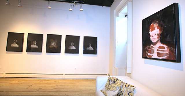
You've heard Richard Butler - he's the lead singer from the Psychedelic Furs, with the wonderful bass/baritone voice featured on the hits "Love My Way" and "Pretty in Pink" - but you may never have heard of him as an artist. Currently presenting new drawings and paintings at BCB Art in Hudson in a show entitled Happinessisthespace betweensorrows, Butler amply demonstrates his skill in that department, along with a witty darkness that should come as no surprise from an original '70s-era punk rocker.

Small Ashwednesday oil on canvas
What struck me first looking at Butler's paintings is the fact that this guy is truly a painter - not some star who decided he wants to paint now, but a trained artist. Indeed, he graduated from art school in the United Kingdom, where he grew up before making it in music and settling in the United States (he now lives in Beacon). Butler loves to push the paint around, while crafting representational images (all the work in this show are portraits) that, up-close, are juicy and smooshy.

Not much of a colorist, Butler's palette hews mainly to shades of black and white with a bit of red, green, or brown mixed in, but he holds a great deal of attention to light and the way it bounces off of or activates surfaces such as the skin and moist eyes of his sitters.

Amanitadreamer 2
The sitters appear both lifelike and severely altered, whether by heavy makeup in the form of a black cross, bandages, or even flaying. However, the work is more contemplative than grim, more theatrical than painful. He plays with words in the titles, many of which reference the Catholic holiday of Ash Wednesday, but some of which are more poetic, such as Hypochondriachost and Whateverwhereverwhenever. Again, no surprise from a successful songwriter.

Gallery owner Bruce Bergmann told me he encouraged Butler to get back into drawing, and the show includes several chalk drawings on black paper that have a pleasant floating quality, with ghostly busts emanating spindly lines of energy or light. These evoke Giacometti's wasted creatures, but also connect to the paintings and extend the Ash Wednesday theme of the smudged cross on the forehead.

Overall, it's a strong show with a fresh perspective, some nice, arty obsessiveness, and great technique. It runs through August 12.

Large Ashwednesday oil on canvas


Sunday, July 15, 2018

Keepers of the Flame at the Norman Rockwell Museum

Norman Rockwell Shuffleton’s Barbershop, 1950 oil on canvas
Note: This painting, currently part of Keepers of the Flame, was recently sold by the 
Berkshire Museum amid controversy; it will remain on view at the NRM through 2020, 
and eventually move permanently to the Lucas Museum of Narrative Art in Los Angeles
This summer's special exhibition at the Norman Rockwell Museum in Stockbridge, Ma., operates on several levels, and it offers the viewer pleasures and challenges on all of them. Keepers of the Flame: Parrish, Wyeth, Rockwell, and the Narrative Tradition, on view through Oct. 28, was curated by University of Hartford Professor of Illustration Dennis Nolan based on a fascinating thesis he has developed that traces the three protagonists' artistic lineage back through the centuries. The show also somewhat unusually includes Nolan's own colored-pencil-and-watercolor illustrations, something I was especially interested to see when I went there.

N.C. Wyeth In the Crystal Depths
1906 oil on canvas
Keepers of the Flame is organized into four rooms - three that each focus on one of the key artists (and his significant teachers), and one that sums up the whole concept. On the surface level, we can simply enjoy the show's more than 60 paintings and drawings for what they are: Expertly crafted works by the top artists of the "Golden Age of Illustration" (approximately 100 years ago) and their immediate and more distant predecessors. This level of engagement could be enough for the casual visitor, as there are many fine examples of work by the Maxfield Parrish, N.C. Wyeth (Andrew's father), and Norman Rockwell, all of whom are extremely likable artists, and the choices from the past that have been gathered from near and far to augment their works include a number of big names (such as Jean-Leon Gerome and Thomas Eakins), and many worthy pieces by lesser-known painters (Henry Siddons Mowbray and Jean-Joseph Benjamin-Constant were both happy discoveries for me).

William-Adolphe Bouguereau The Little Knitter
1882 oil on canvas
But the show also provides a deep layer of education - actually two layers of it, the first being the education of the viewer about these artists and the tradition of illustration they worked within. Here, too, there is plenty to work with. A conversation I overheard during my visit to the show is a perfect example of this element of the experience. A couple were viewing paintings in the room devoted to Parrish (where three William-Adolphe Bouguereaus were also on display), and the woman remarked that her own art-school training was explicit in distinguishing illustration from painting based on technique: that a painter must work from life - say, with a model or on-site landscape - and must not use a grid to lay out the final composition, while an illustrator can use any trick they like to create their design.

Being me, I butted in and offered my opinion that it makes more sense to distinguish by intention - that modernism pretty much took away arguments about technique or material in art, but that it still seems that a piece is commercial if its intention is to serve some purpose other than the artist's self-expression, and that it is fine art if it serves no other clear purpose (regardless of quality). I recall that we referred to one of the Bouguereaus for reference, but couldn't determine by looking at it if it was meant to tell a story (like an illustration) or if it was more clearly a product of the artist's personal expression. The man then added thoughts related to musical composition (turned out he's a professional cellist), citing similar arguments and disagreements in that field. The point? Not that we came to a consensus in defining illustration versus art, but that the exhibition had caused us to engage heartily on the subject.

George Bridgman Keeper of the Flame 1904
charcoal, ink and oil on board
(Later, I was delighted to find that some of the label copy that accompanied another Bouguereau went into specifics about his technique, noting that he worked from the live model and did not use a grid, which supports the "fine art" interpretation based on technical criteria.)

The other element of education that pervades the show is actually its raison d'etre: An intriguing, deep dive into the influence of teachers on their students, presented as numerous juxtapositions featuring label copy that persistently identifies all the artists as teacher, student, or both (e.g. Norman Rockwell, American 1894-1978, Student of George Bridgman; Henri Lehmann, German-French 1814-1882, Student of Jean-Auguste-Dominique Ingres, Teacher of Francis Coates Jones). Wonderfully, many of the juxtapositions went beyond strict pairings, with combinations of teacher in the middle and students on either side, or strings of teacher to student, that student then as teacher to another student, and so on.

Nolan has added text panels to this section of the show with reverse-chronological lineages that trace back through time from our three 20th-century protagonists to their common influences in the mid-1800s academies of France (and beyond). These strings are gathered together into Nolan's charming tree drawings, and each of the rooms is pointedly titled (i.e. "The Education of Norman Rockwell"), which further underscores his thesis.

Though I found the counting backwards a little hard to follow, this element of the exhibition was so unique, so meticulously researched and documented, and so passionately expressed, as to be quite irresistible. Nolan, who also wrote nine chapters for a big catalog that accompanies the exhibition, clearly spent many years on this project, and the effort shines through. Not that we remain mired in the past here - the final room includes a whopping interactive digital screen that works like an encyclopedia, allowing viewers (even two at a time) to tap Nolan's massive genealogical-style illustration of the artists' tree of influence and thereby learn the history of and see more images by each person represented. It's technology that has a purpose, that works, and that was actually fun to use (though I was disappointed to note that most of the visitors I observed just clicked on our three main illustrators, rather than digging into their historical counterparts, somewhat undermining the digital display's real point).

Adequate but acceptably brief label copy, and incisive quotes in wall texts augment the exhibition without overwhelming it. Still, it was a lot to take in, and I found myself often using conveniently placed gallery benches to grab breaks. But the quality of the show and the art in it kept reviving my interest. If you go (and I recommend that you do), allow plenty of time. It will be rewarded.

Maxfield Parrish Solitude, 1911, Oil on board


Saturday, June 30, 2018

Upon the Ground, Below the Water at Albany International Airport Gallery


It can be easy to forget that the Albany InternationalAirport Gallery is one of the premier contemporary art venues of the Capital Region, right up there with Skidmore College's Tang Teaching Museum and UAlbany's University Art Gallery. Even more impressive is the fact that the Airport Gallery claims this high ground under a mandate of showing only regional artists.

But, for those of us already in the know about the Airport Gallery, and aware of the strength of our local artists, it comes as no surprise that Upon the Ground, Below the Water, the current show there through Sept. 3, is quite a knockout. Featuring six artists in a broad range of media, the show's theme is, in effect, our landscape - but it approaches the subject indirectly, in part due to a leaning in the direction of watery subjects (liquid or frozen), and in part due to metaphorical elements among these artists.

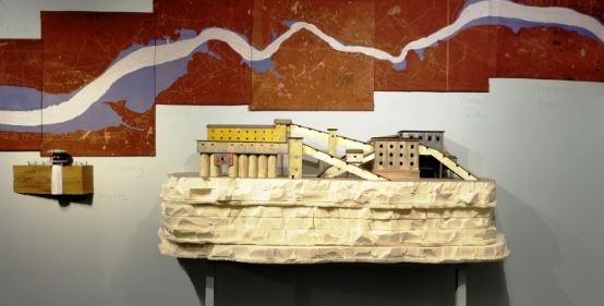
Kingsley Parker's 2018 mixed-media piece The Quarry
is paired with his 2014 wall-mounted UpRiver
The result is an immersive experience well worth a special trip to the airport (that is, if you're not already taking a special trip from the airport, in which case you'd be advised to budget an extra half-hour or so to peruse the show before going through security). As ever, the casual visitor gets a free half-hour in short-term parking, and you can get your parking ticket stamped at the Arts & Culture Program office or at the first-floor Departure shop for additional free time.

So, there's no excuse not to give yourself the pleasure of viewing Kingsley Parker's sprawling mixed-media wall piece UpRiver, or Richard Barlow's grid of 100 meticulous ink renderings of peeling paint transformed into new islands, or Daesha Devón Harris's masterfully evocative photo-collages under poetry-etched glass. And that's just a sample of the outstanding work in the show by these three participants (each offers other significant work as well).

Parker was the big revelation for me here. With his charming fixation on fishing vessels and inventive application of materials as modest as a #2 pencil and as labor-intensive as embroidery, he addresses environmental, economic, and graphic challenges in one fell swoop. It's a tour de force of art's profound ability to entertain, educate, and engage.

Terminus 2016 PLA print by Matt Frieburghaus
Among the other surprises in this collection (and there were several, all of them pleasant) were Matt Frieburghaus's many iterations of pure-white, 3-D printed icescapes, inspired by a residency in the far north. Made of PLA (polylactic acid), they feel both mundane and pristine; they are also elegantly complex in their geometry. It's the first time I've seen 3-D prints that really impressed me as works of art.

Also impressive are Tanya Marcuse's highly detailed color photographs of densely furnished plots of ground, which look natural (i.e. from life) but are actually carefully constructed of natural materials in situ, resulting in tapestry-like tableaux of the place at your feet. These beautiful images have a subtly morbid undercurrent of elegant rot - something like life itself.

Equally inspired by the small details at our feet, Claire Sherwood presents a series of pastel-colored rock-like forms modeled after stones large and small - those found in her backyard as well as in the pockets of her young children. Sherwood's technique seems to be a thing in itself - incorporating steel, plaster, paper pulp, acrylic paint, and encaustic, but the sculptures end up feeling fluffy rather than weighty.

In addition to his small drawings, Barlow contributes a very large, three-sided wall piece depicting ice floes, in the same chalk-on-blackboard-paint technique that he used for a drawing in last year's Mohawk-Hudson Regional at the Albany Institute of History & Art and, more recently, for two drawings in the MHR Invitational at Albany Center Gallery. Harris, along with her collage series of beautiful African-Americans from the past, contributes a newer group of photographs and a video that interpret a metaphorical river passage.

Fresh Disruption 2018 mixed media by Claire Sherwood


One more thing: Speaking of Albany Center Gallery, another outstanding collection of regional artists is featured in the current show there. Entitled Wonderland, it is very different from the Airport show - brightly colorful, mostly abstract - but equally eloquent in stating just how strong and deep the local lineup of creators is. It runs through July 13.